![]()
![]()
Work
-
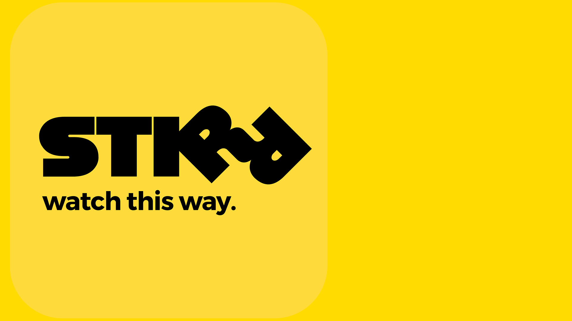
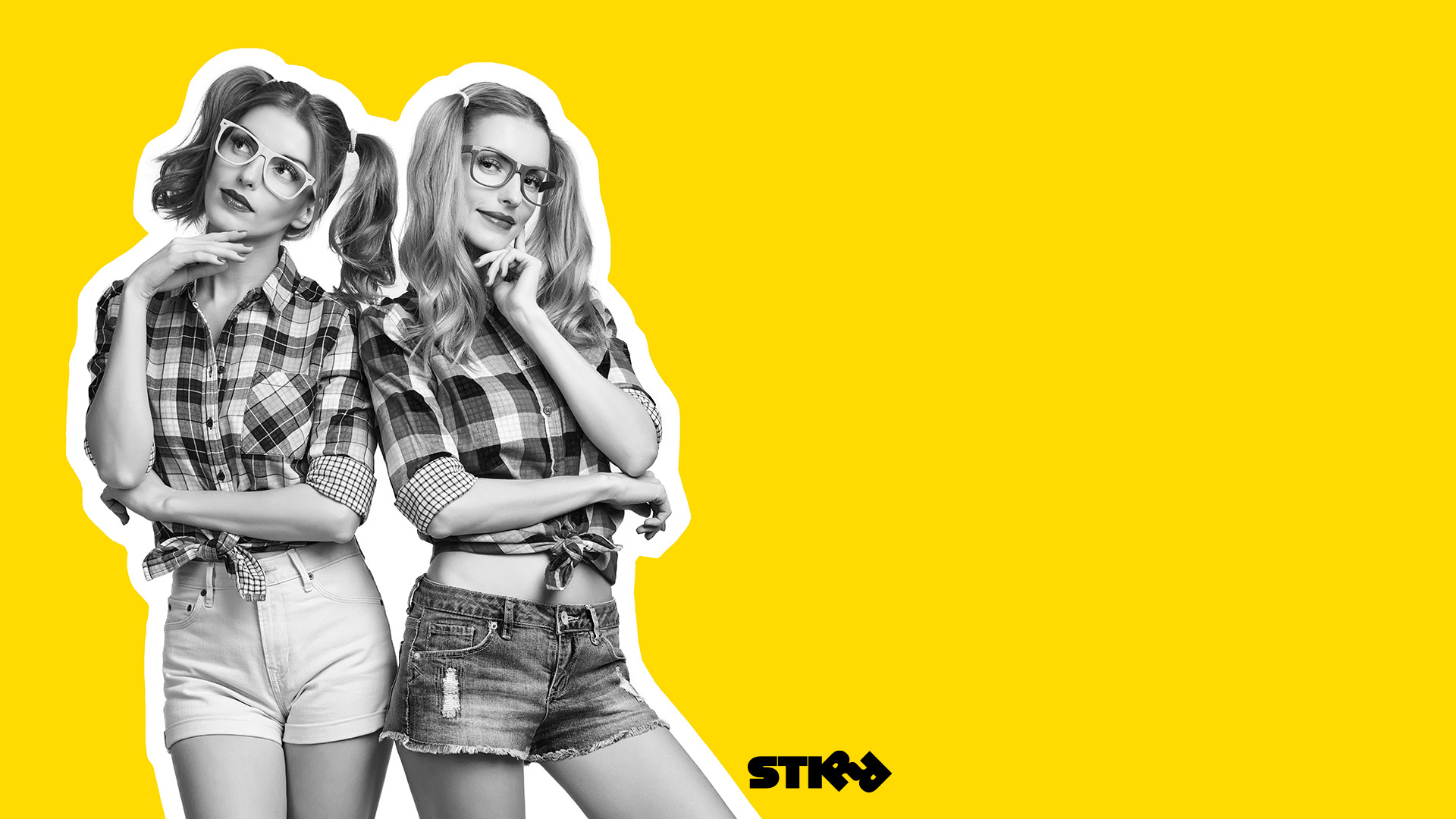
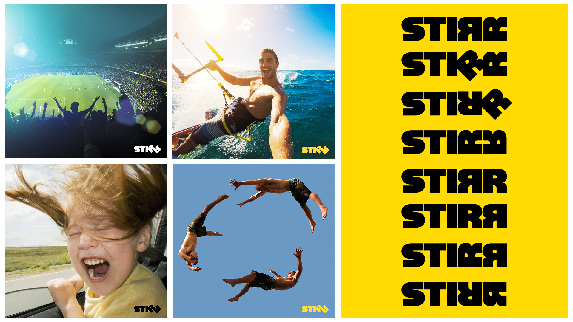
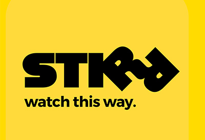
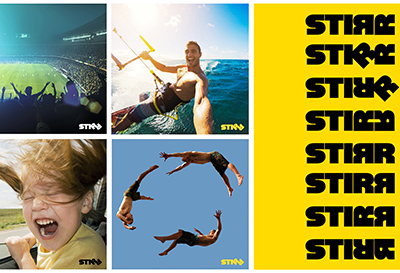
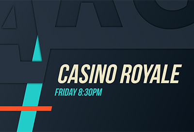
STIRR Brand
Client: SINCLAIR BROADCAST GROUP
Challenge
Launch a national TV streaming service in a mega-crowded space—differentiating the offering, cutting through the noise, and shaking things up.
Strategy
Create a challenger brand—one that’s:
- Bold—to stand out from the crowd.
- Disruptive—to break into a crowded scene.
- Broad—so it speaks to extremely diverse audience segments.
- Elastic—to adapt as the business model evolves over time.
Solution
A bold, iconic brand:
- Name is a short, kinetic verb that connotes:
- Stirring things up (disruption).
- Stirring the emotions.
- A cool mix of content & experiences.
- Also: Name is designed to pair well with place names for easy localization.
- Logo is “in your face”:
- Fat, quirky font is aggressive—yet good-natured.
- Intertwined Rs serve as playful, storytelling mascots—especially when animated.
- Vibrant yellow:
- Sets the look apart from competitors.
- Makes thumbnail pop on TV & app menus.
- Strong voice that’s assertive yet inviting.
Deliverables & Services
- Brand name
- Brand concept & story
- Visual identity system
- Brandbook

-
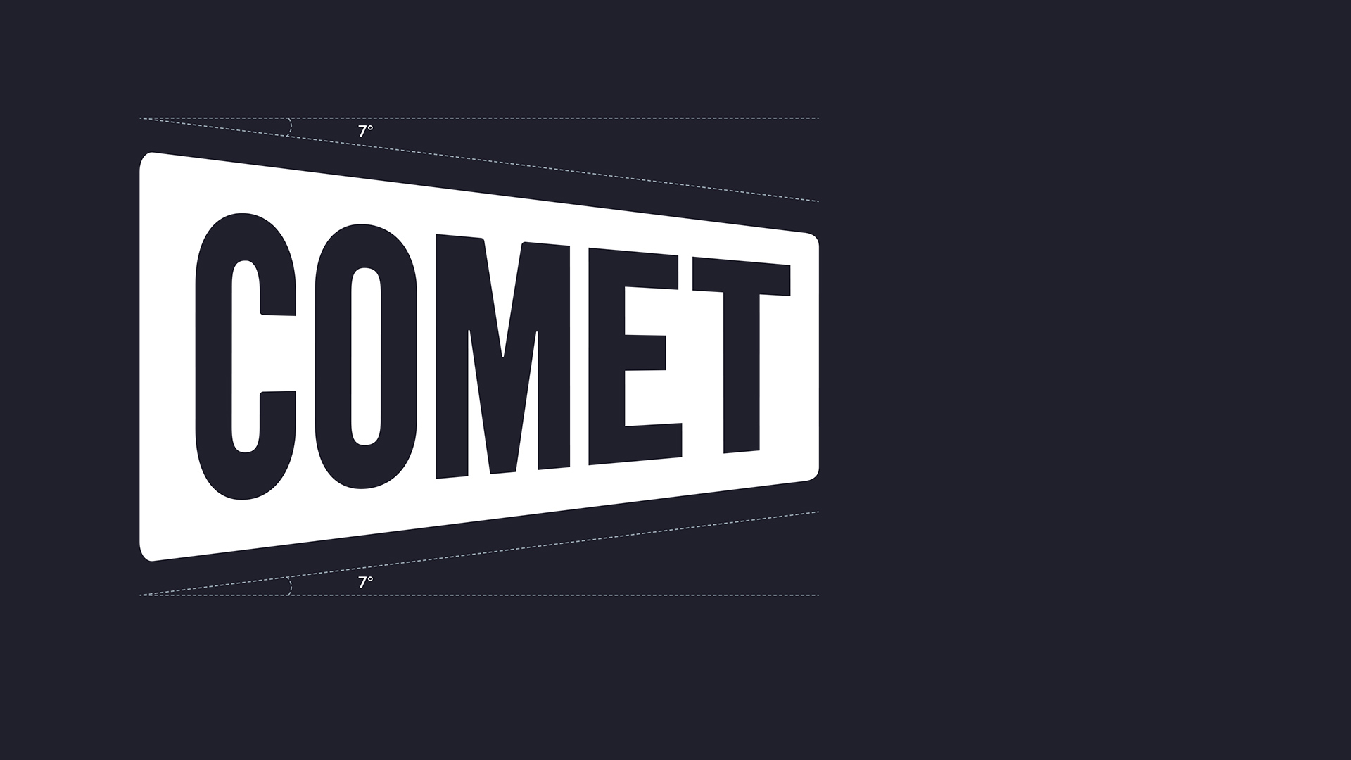
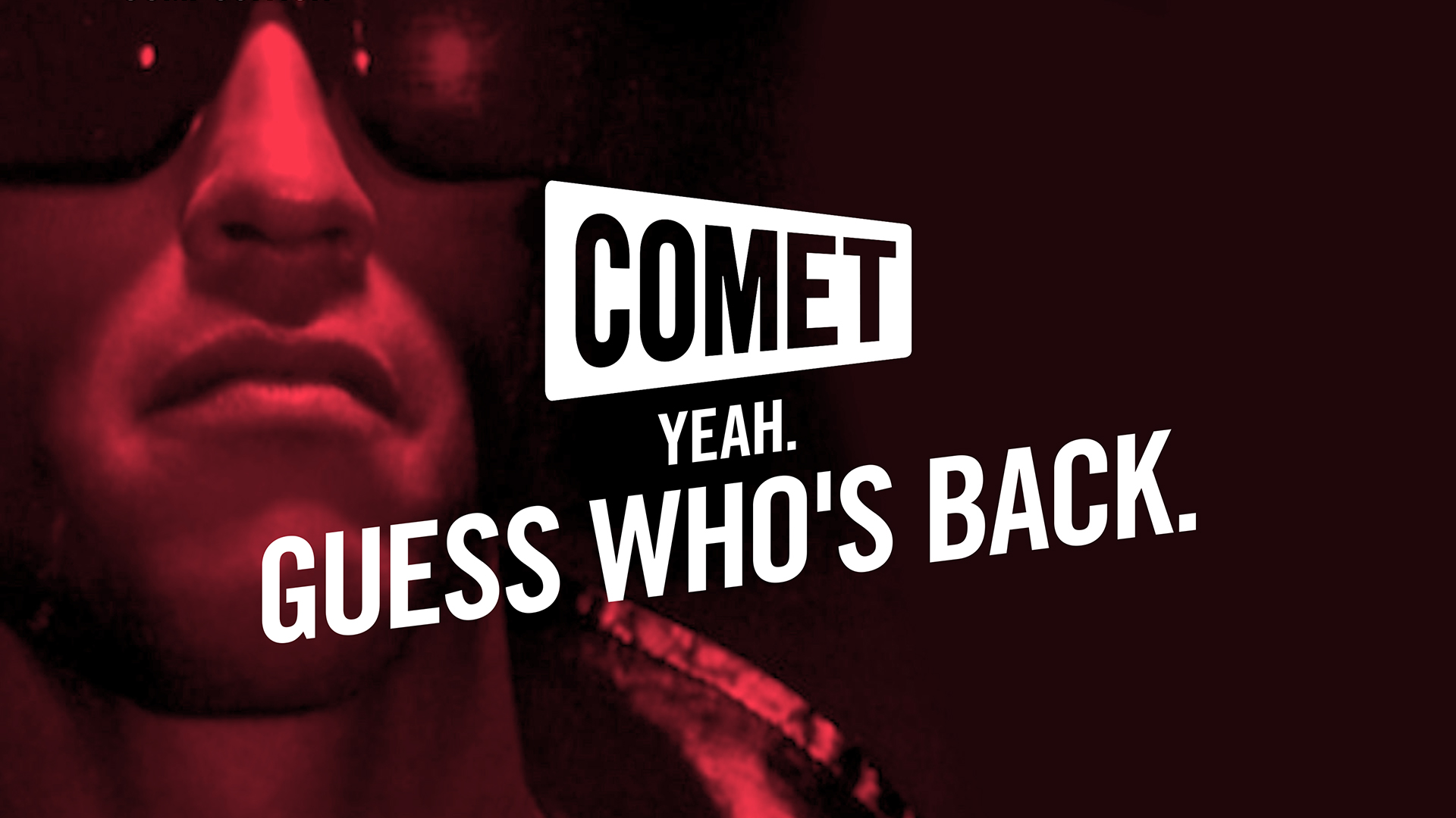
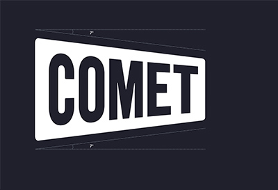
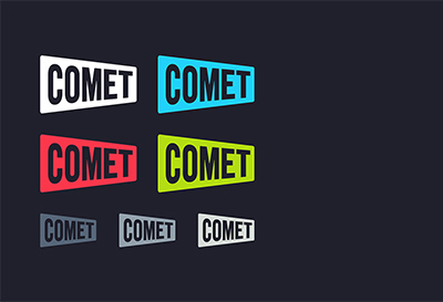
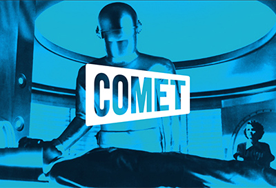
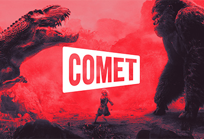
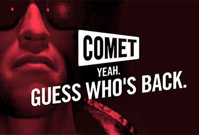
Comet Rebrand
Client: SINCLAIR BROADCAST GROUP
Challenge
Jumpstart a sci-fi TV channel that’s hit a wall—in both viewer & revenue growth.
Strategy
Transform a bargain brand into a challenger brand—the scrappy, authentic underdog:
- Differentiate sharply from the mainstream, “establishment” competitor—appealing to its disgruntled viewers & offering Comet as the “answer.”
- Up the visual style to put the brand on equal footing with top-tier cable channels.
- But ensure the brand stays quirky & never takes itself too seriously.
- Avoid losing existing viewers—some of whom like the existing brand.
Solution
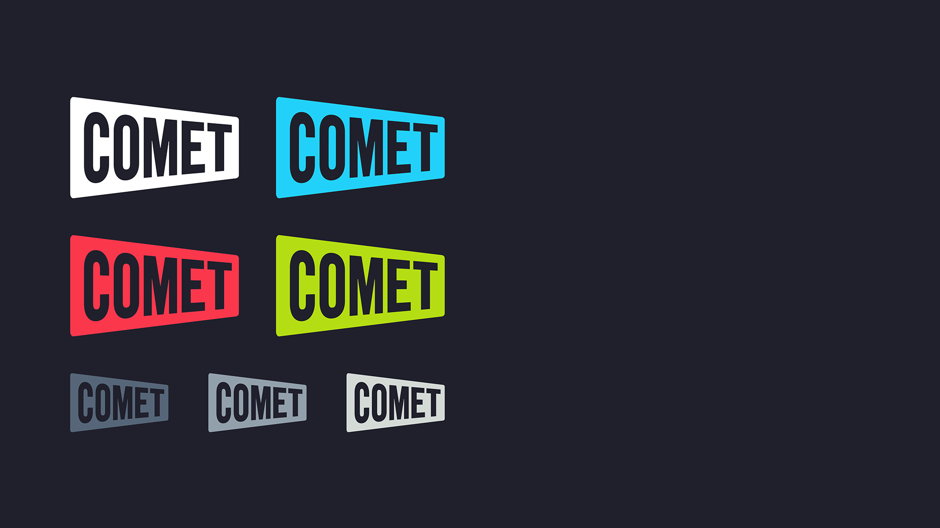
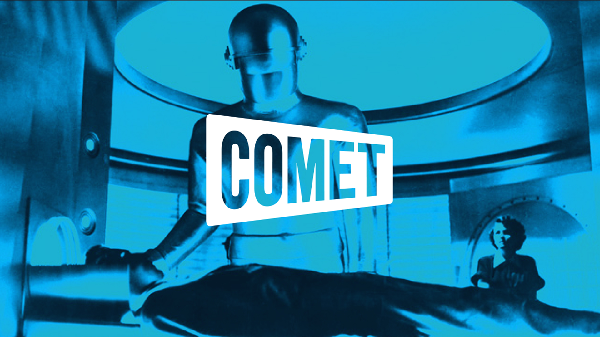
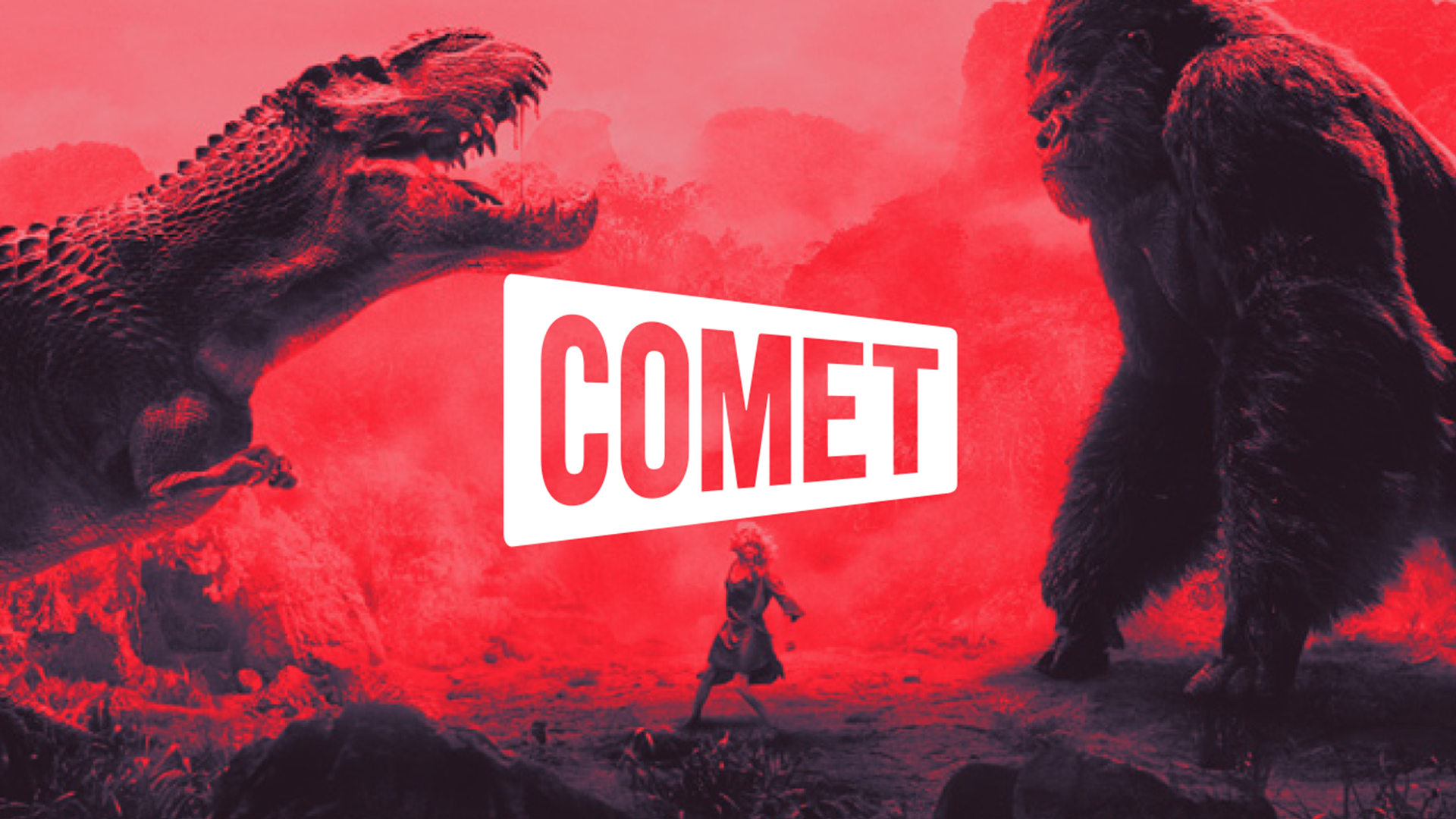
A quirky, odd brand that’s firmly rooted in the original—but sleeker & cooler.
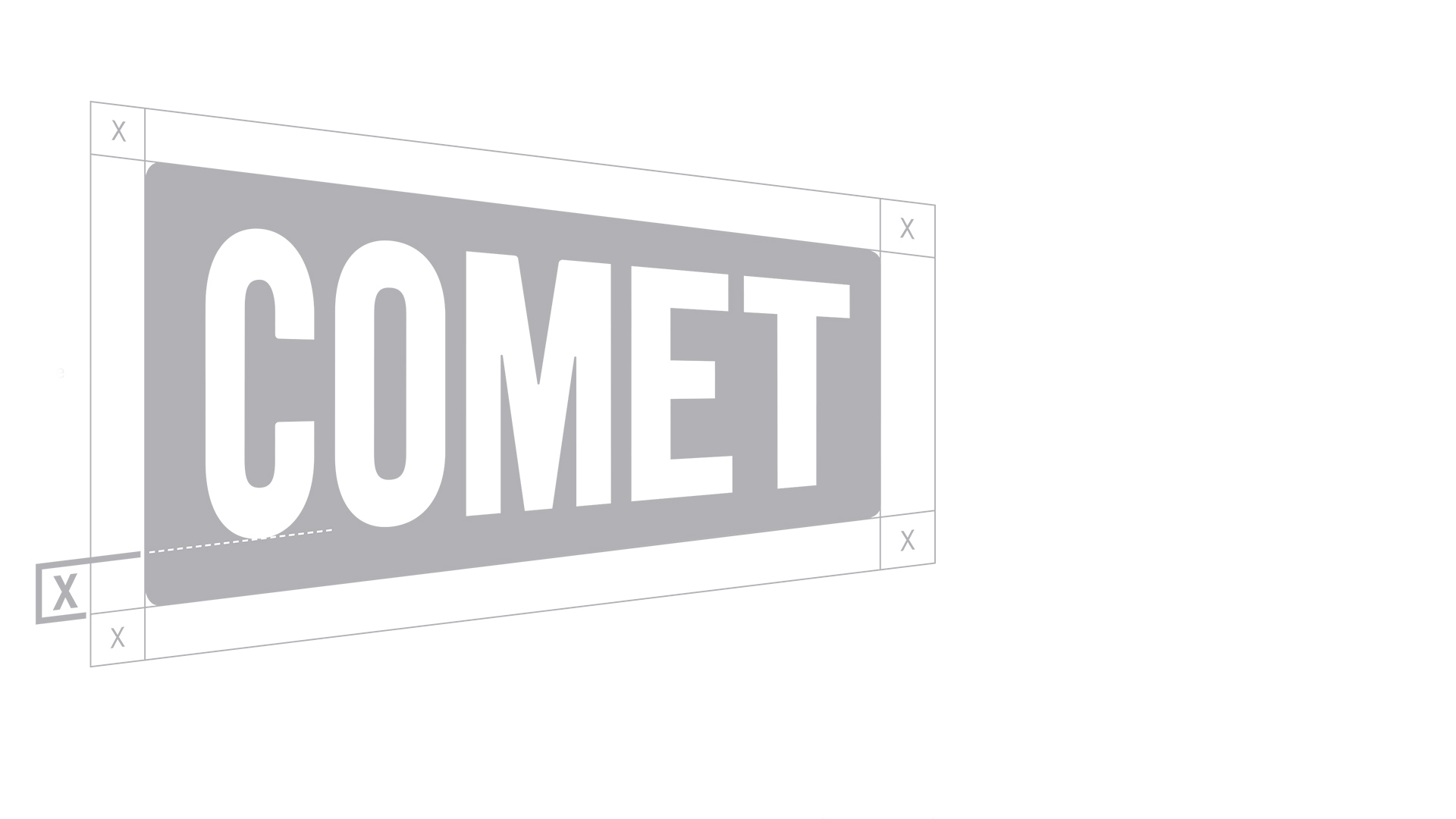
- Cleaner, more streamlined logo (since we weren’t permitted to make a completely new one).
- Brighter, more stylish color-accent palette—with clear usage guidelines.
- Striking new visual vocabulary—elements which have become the new brand’s “signatures”:
- Powerfully tilted headlines—always at 7°.
- Old-school MS-DOS cursor—a nod to kitschy vintage sci-fi that serves as a transitional element in motion graphics.
- New positioning that celebrates the brand as the “cooler alternative”—less predictable, less corporate, less rule-bound: the naughty younger brother.
- Authentic voice—one that’s quirky & offbeat, yet quietly confident—the nerd who’s cool with being a nerd.
- The “dual tonality” speaks both to the nostalgic, older “comfort zone” crowd while also resonating with a hip, younger “retro-cool” crowd that’s there for the kitsch.
Deliverables & Services
- New brand concept & evolved story
- New visual identity system
- New Brandbook
-
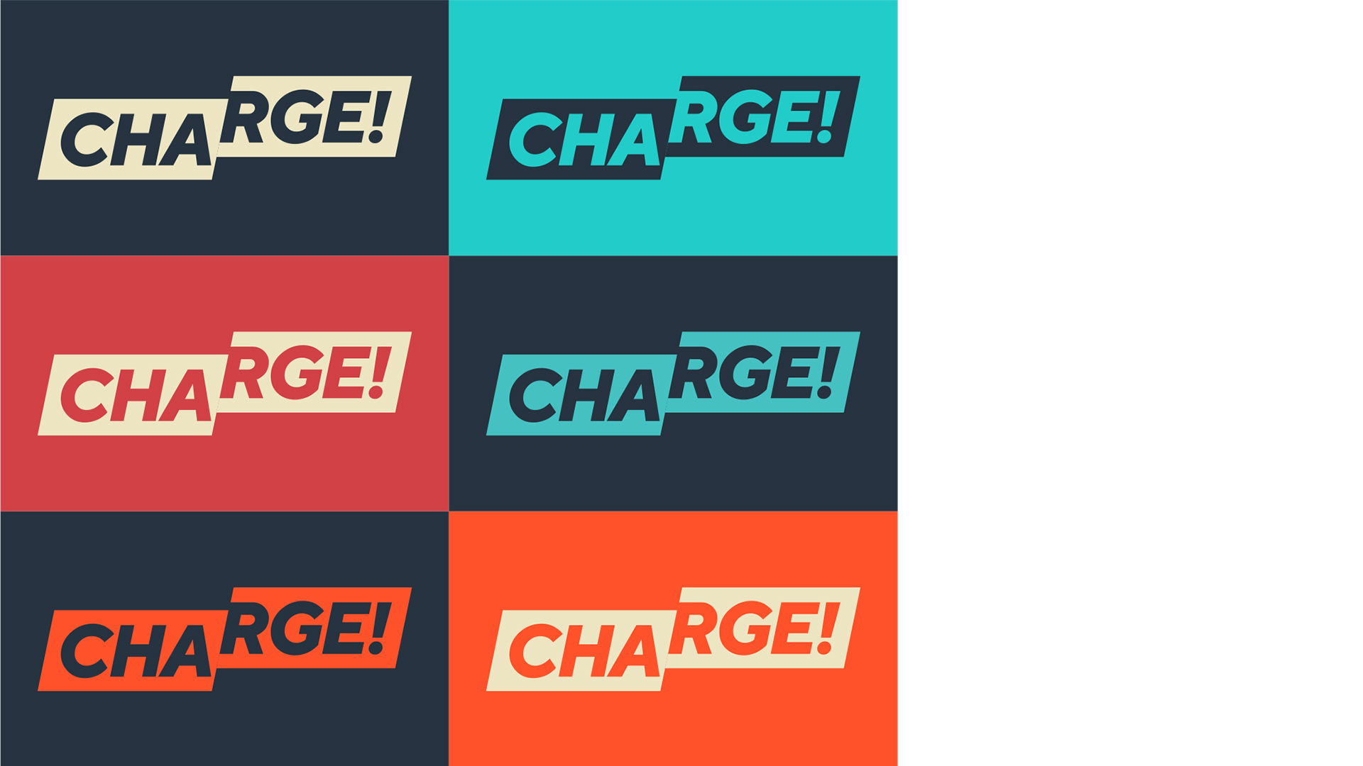
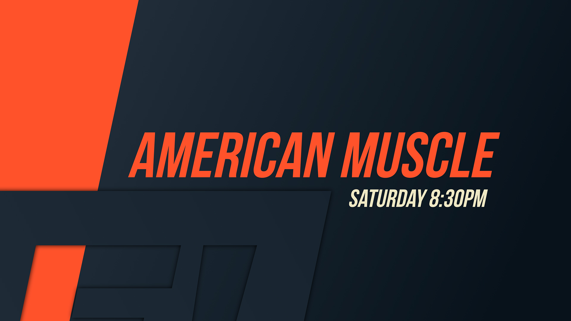
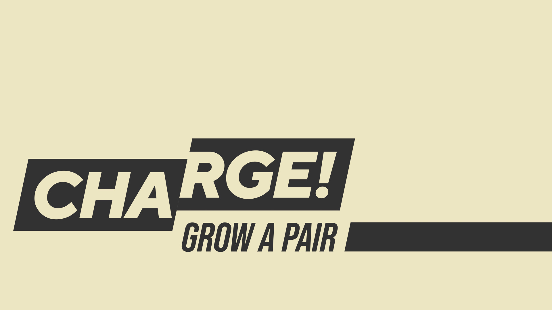
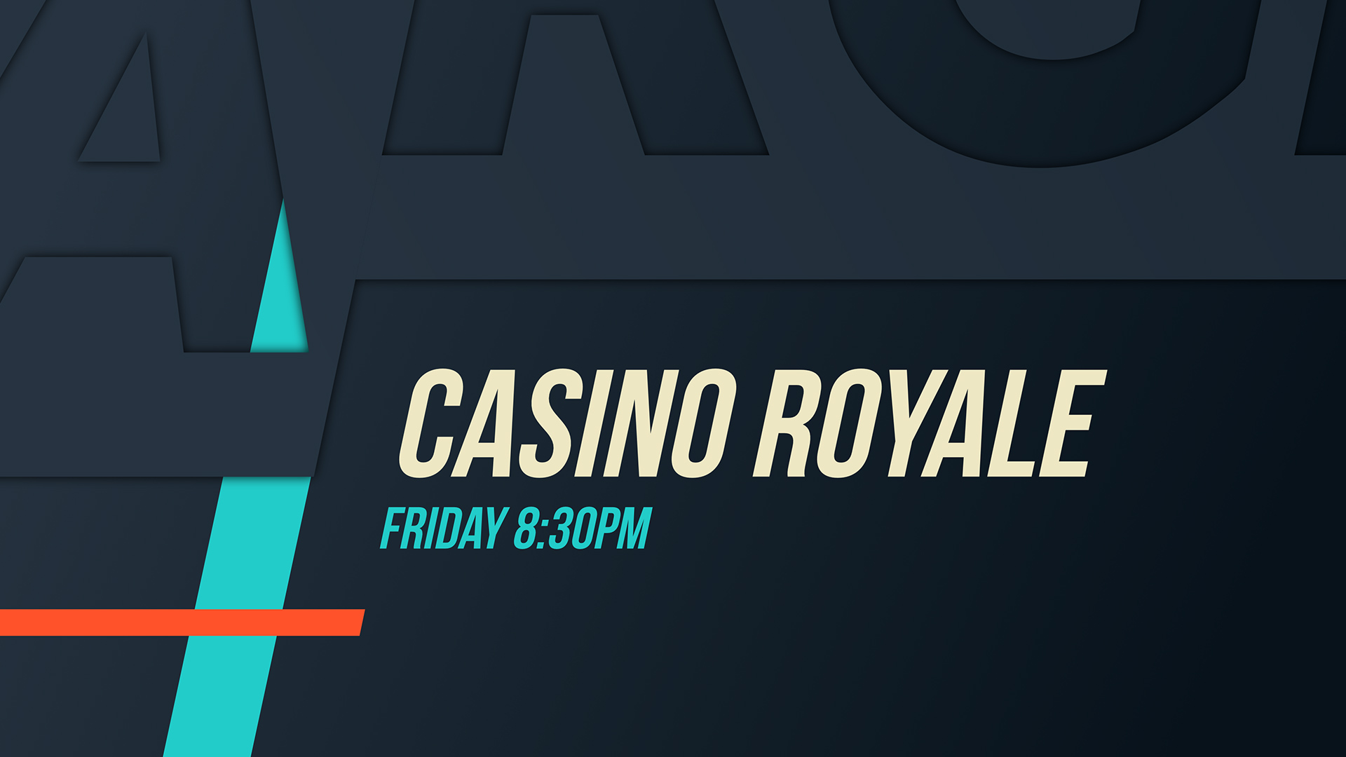
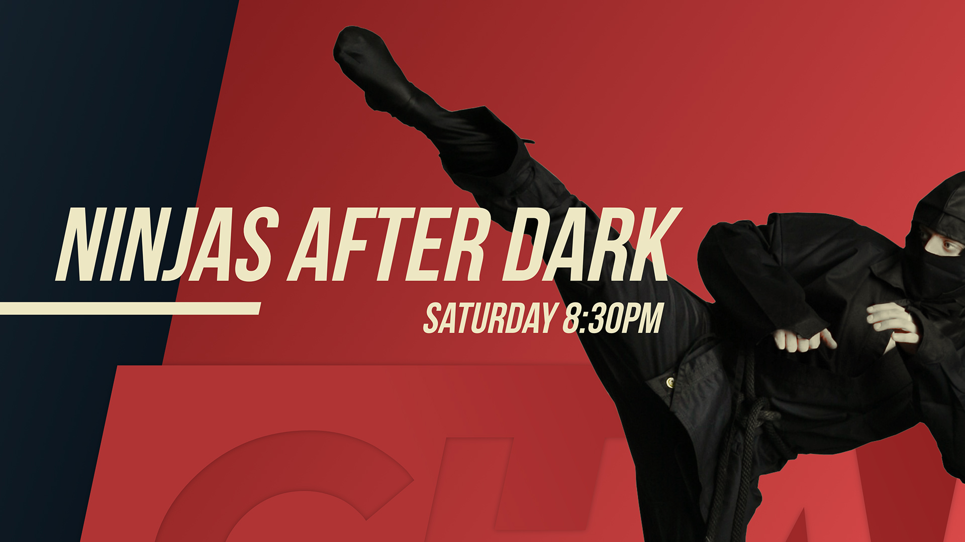
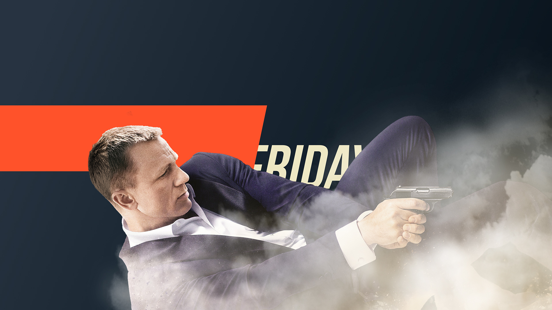
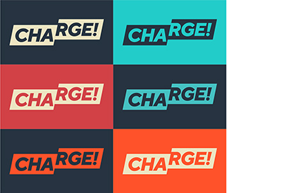
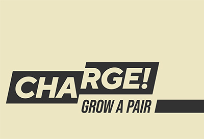
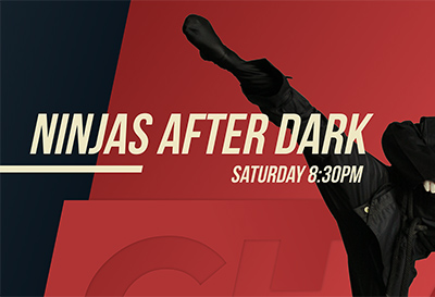
Charge! Rebrand
Client: SINCLAIR BROADCAST GROUP
Challenge
Breathe new life into a stale TV channel for men.
Strategy
- Find the opening: Look at failed men’s entertainment brands to understand why they failed; look at current ones to identify whom they’re neglecting.
- Add younger viewers—but keep the existing older ones happy.
- Evolve into a more distinctive look—without completely disconnecting from the original identity.
- Walk the line—making it unapologetically male but sensitive to modern attitudes about gender.
Solution
We gave the brand an extreme makeover—transforming a bland non-experience into a complete TV man cave:
- Went all-in as a men’s channel because we saw a hole in the market—but tempered it, avoiding toxic masculinity with good-natured humor.
- Created a new “dual tonality” that simultaneously rings earnest for older audiences and slyly kitschy for cynical younger ones.
- Cooked up a brash, in-you-face call to action: Grow a pair.
- Slashed the existing logo in half, displacing the two pieces along a dynamic “fault line”—to convey “fresh disruption” & provide endless opportunities for animation.
- Visual Style. Developed a sleeker, more distinctive look—still bold & masculine, but with a richer, warmer color palette, more gradients, & energetic diagonals. It’s versatile: can be dressed up for James Bond, dressed down for Walker, Texas Ranger.
Deliverables & Services
- New brand concept & evolved story
- New visual identity system
- New Brandbook

-
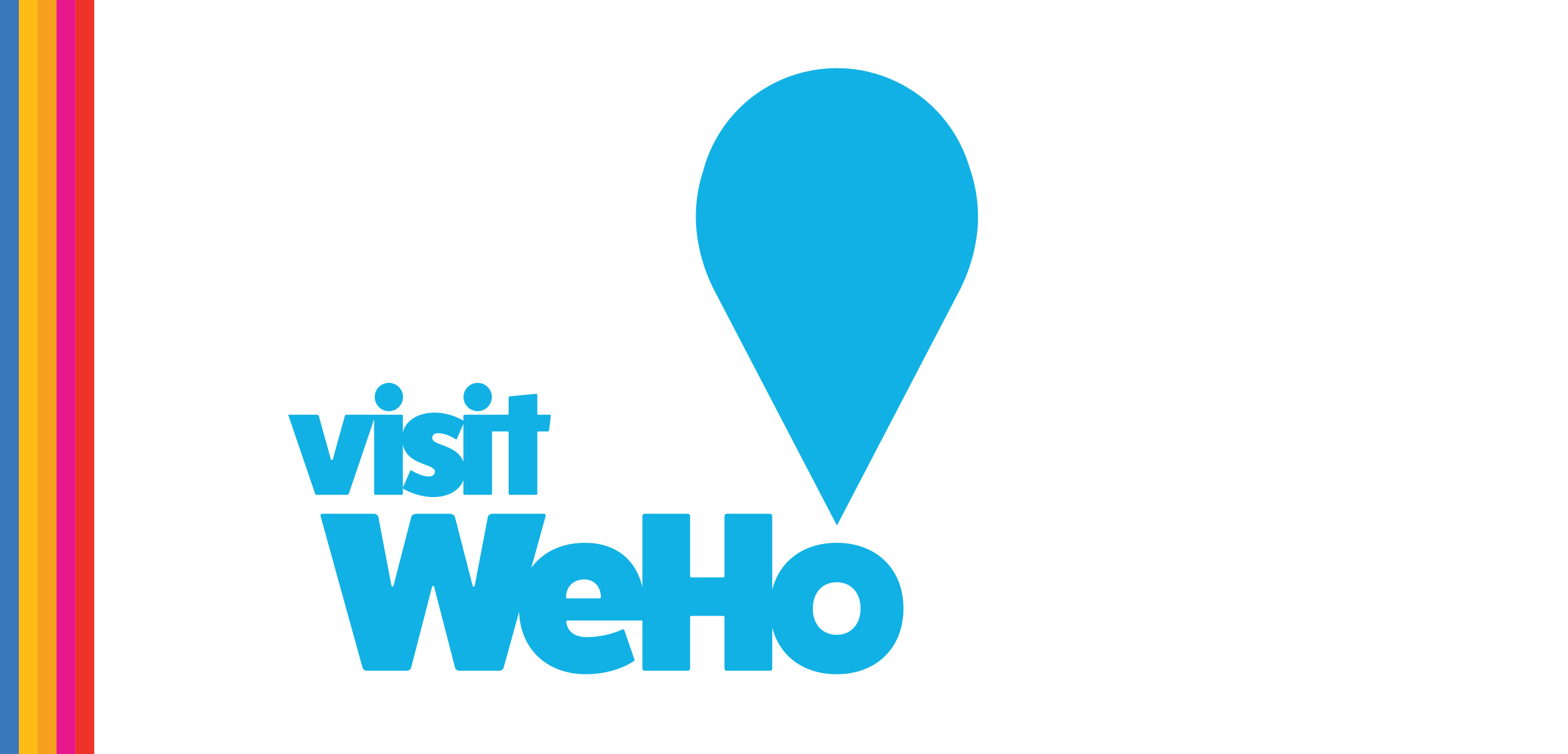
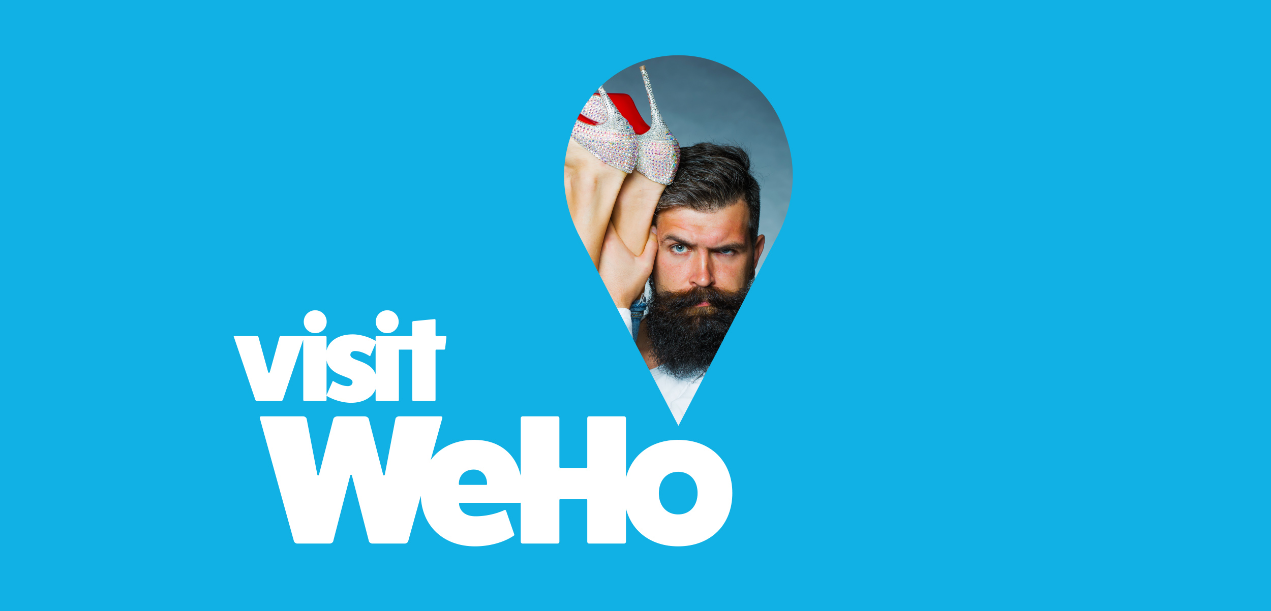
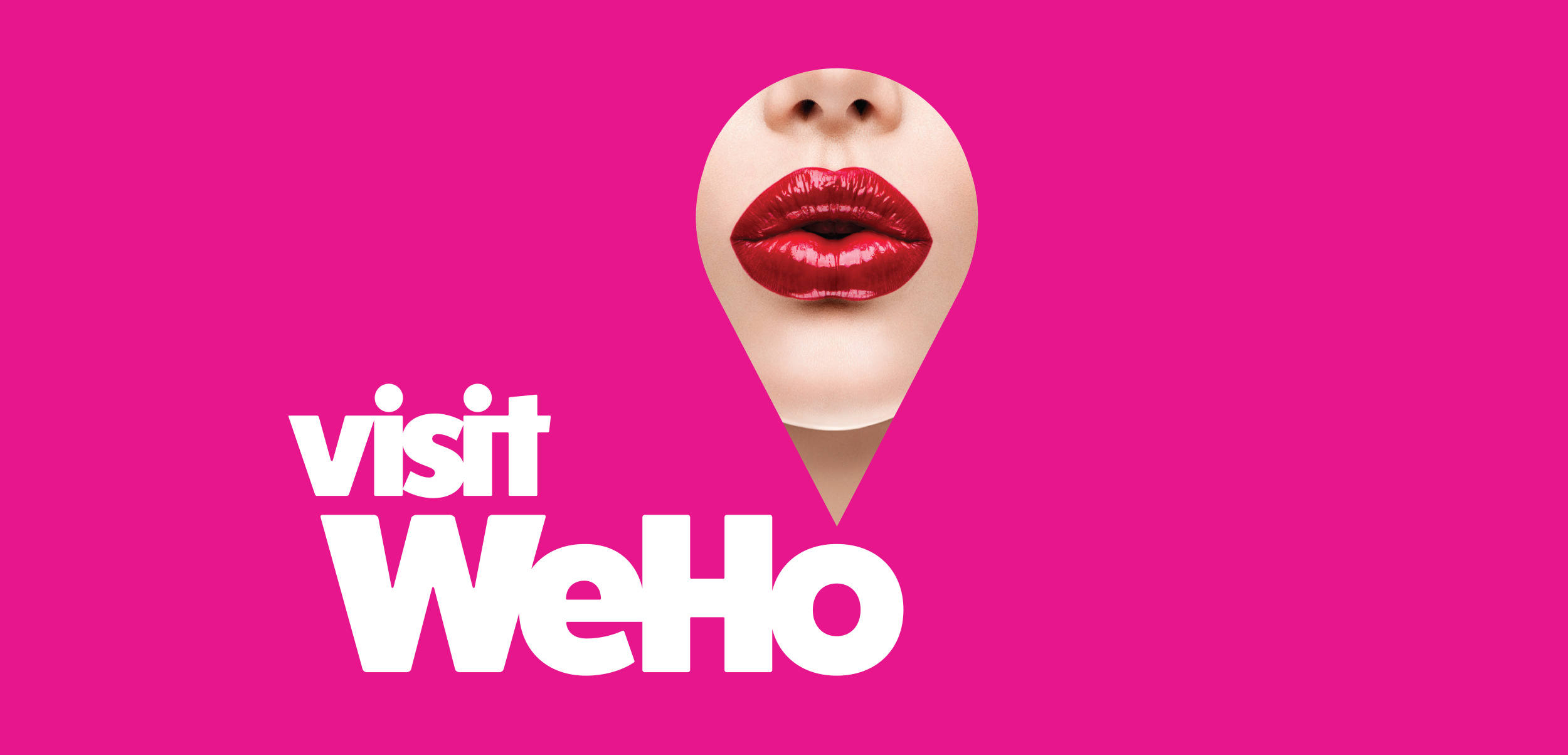
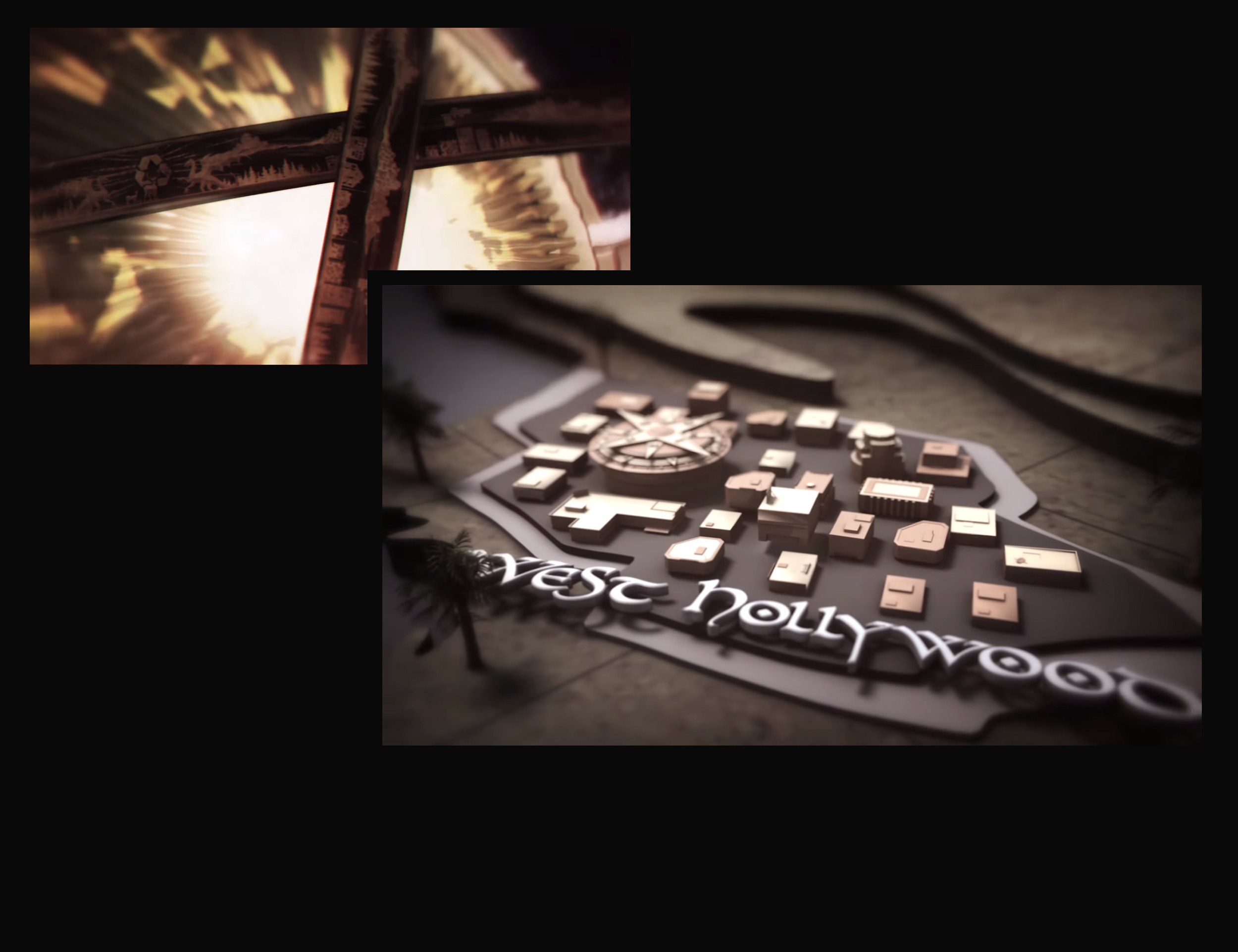
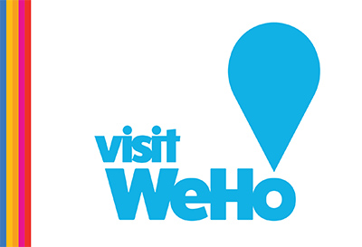
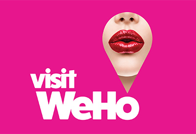
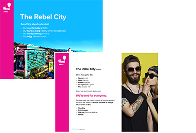
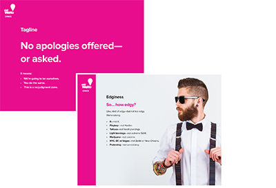
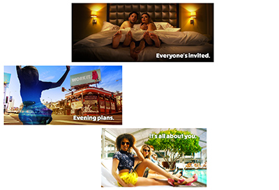
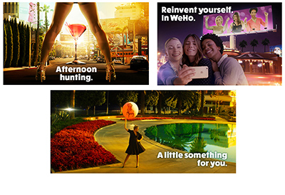
Visit WeHo Rebrand & Relaunch
Client: Visit West Hollywood
Challenge
Transform Visit West Hollywood’s boring, sterile brand into something that captures city’s unique flavor.
Strategy
- Turn the logo into an elastic storytelling device.
- Smash stale industry formulas—by avoiding destination marketing clichés.
- Spice things up—by breaking rules & provoking.
Solution
Comprehensive rebranding that entailed:
- Repositioning city as naughty, free-spirited rebel.
- Versatile new logo that’s a storytelling space—a keyhole shape through which to spy a magical other world.
- New image style—shifting away from the ordinary/expected to a heightened reality of strange, dreamlike glamour.
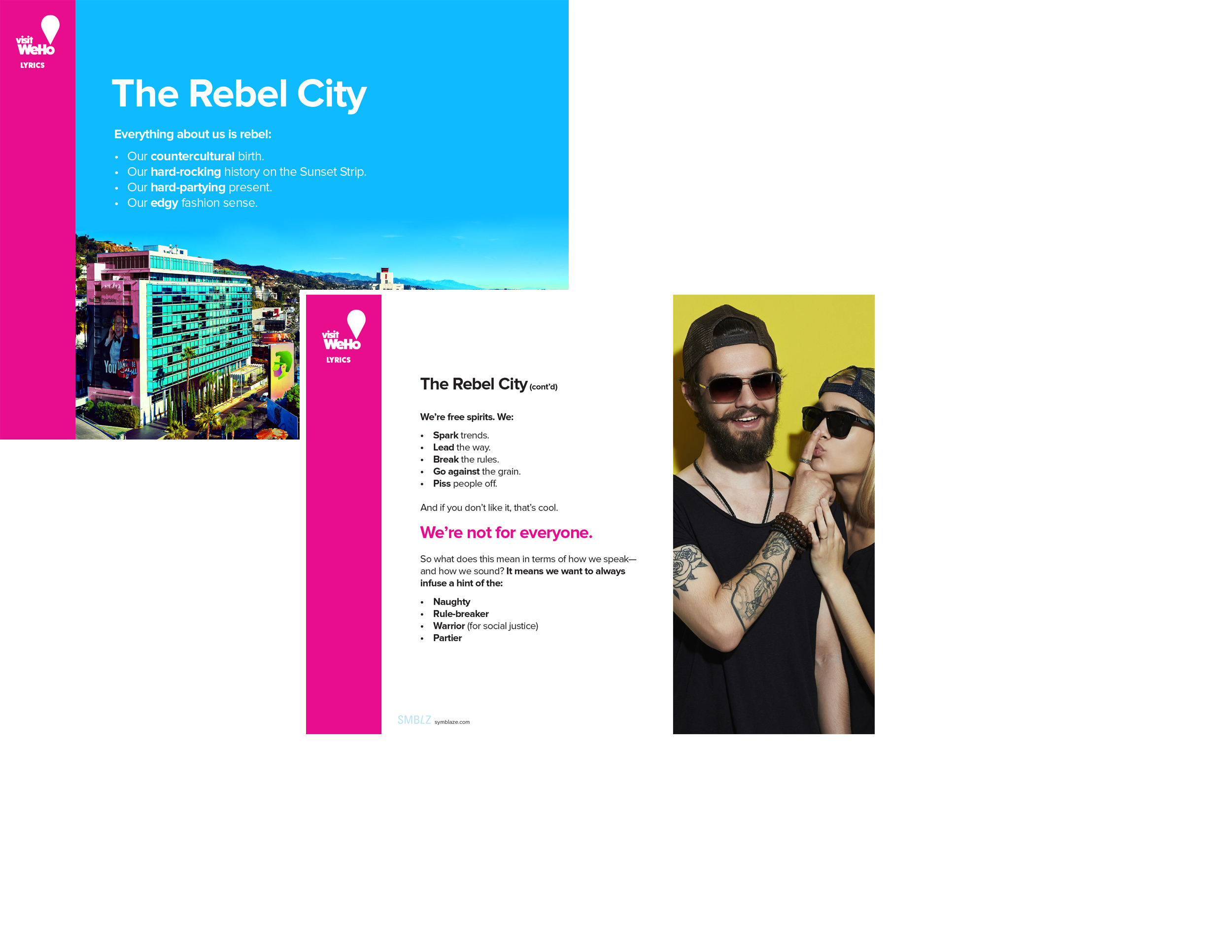
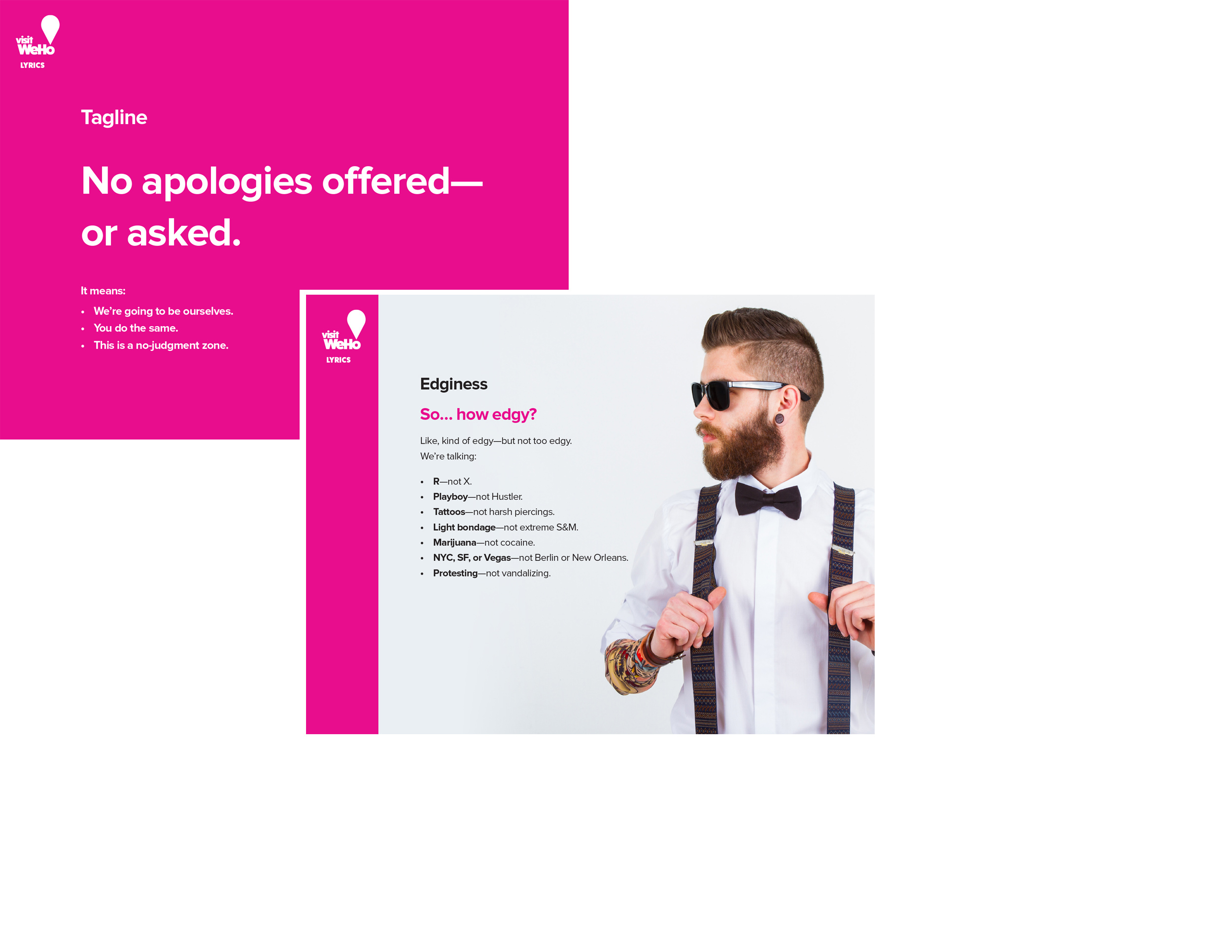
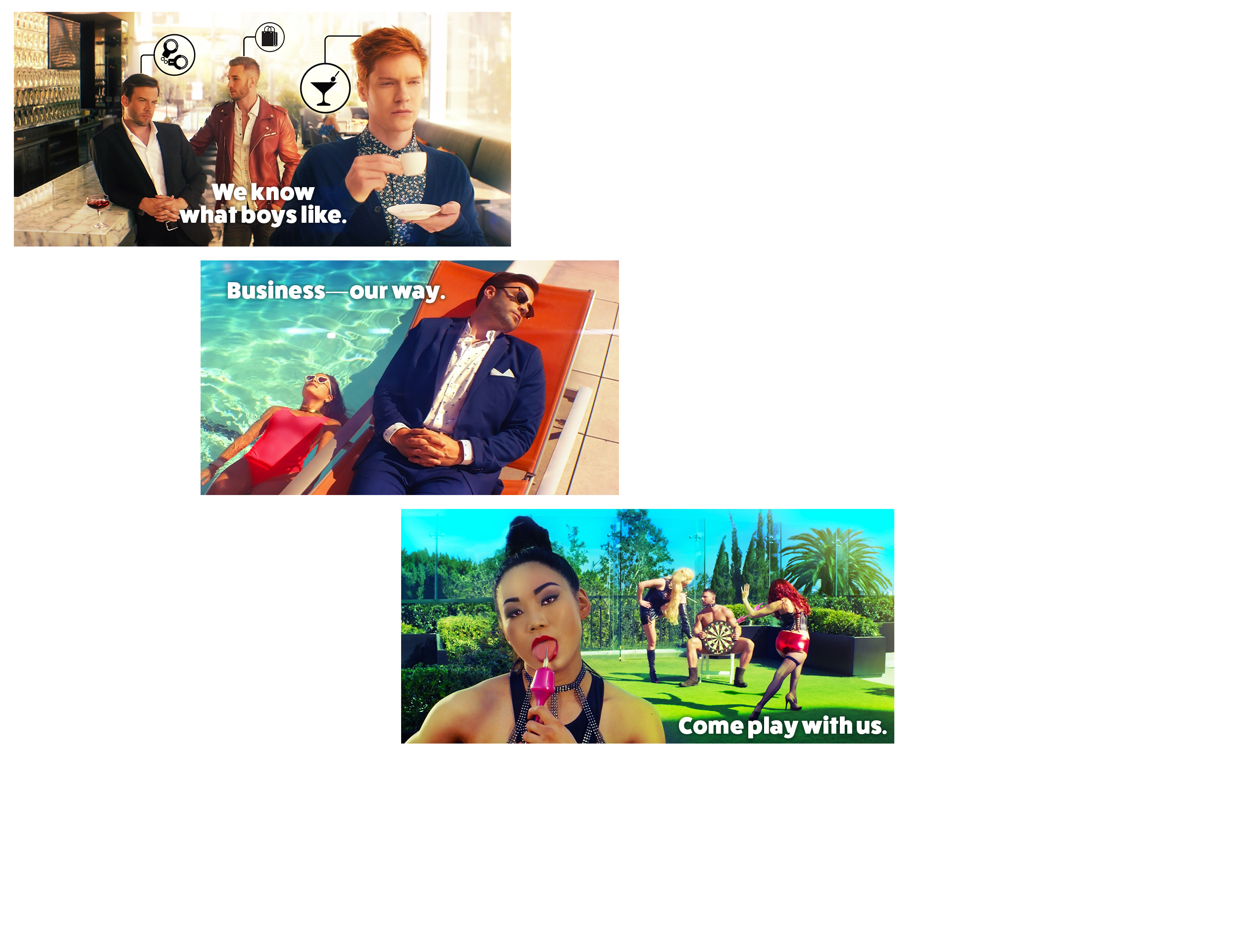
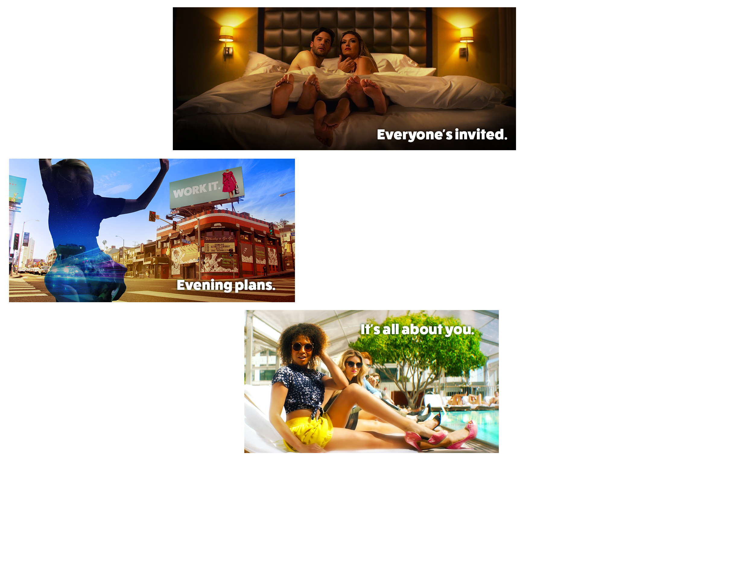
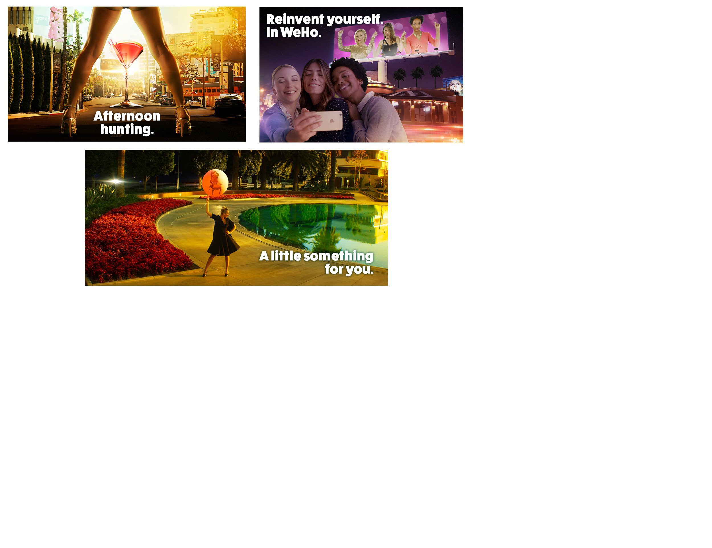
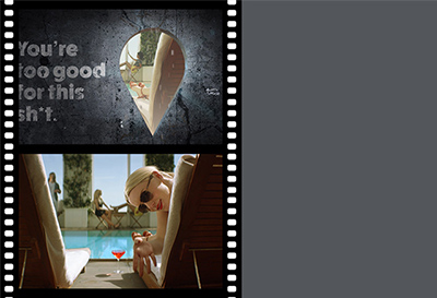
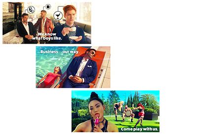
Brand Campaign: “You’re Too Good for This Sh*t”
An experience that contrasts the magical world of West Hollywood with your dreary, everyday life—to create a feeling of longing. Key components:- Mysterious social-media teaser campaign—to create curiosity.
- Provocative video that brings you “down the rabbit hole” & into the magic world of WeHo—to get people talking.
- Wide range of still images—from mild to wild—for different target audiences.
- Comprehensive display-ad campaign.
Deliverables & Services
- Brand concept & story
- Visual identity system
- Corporate identity system
- Brandbook
-
Complete ad campaign—including:
- Concepting
- Video
- Photography
- Online & print formats

-
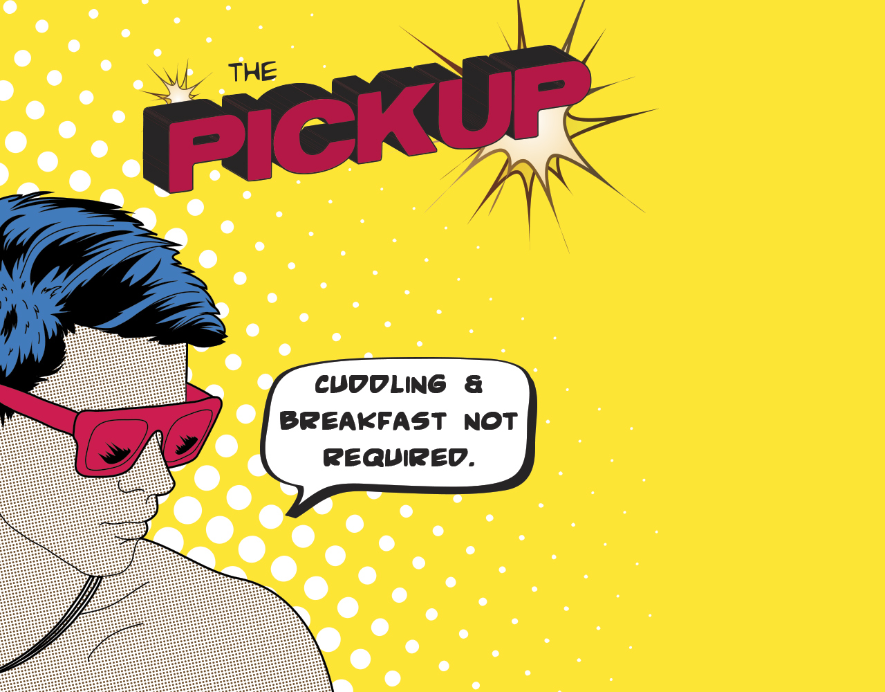
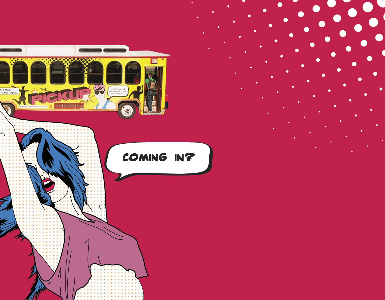
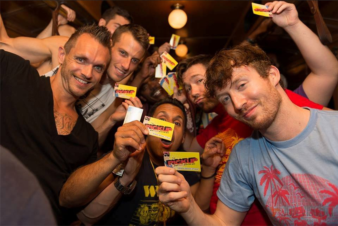
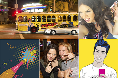
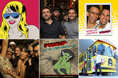
WEHO PICKUP TROLLEY
Client: City of West Hollywood
Challenge
Sell public transit to a skeptical audience—upscale Southern California nightclubbers who completely hate public transit—in order to reduce:
- Downtown traffic congestion
- Drunk driving
- City’s carbon footprint
Strategy
Use the power of brand to move the service to a more acceptable category—from transit to entertainment.
Solution
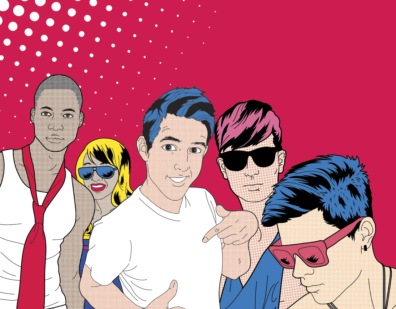
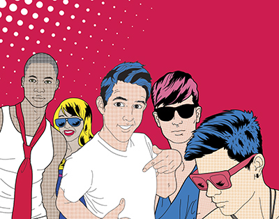
The WeHo PickUp—a hyper-targeted brand designed to appeal to a narrow, latenight audience:
- Suggestive name with many layers of meaning & many legs!
- Wisecracking, slangy, irreverent brand voice.
- Party-like rider experience: “Your night starts on the PickUp.”
- Striking visual theme (“West Hollywood characters in Roy Lichtenstein world”), designed to easily evolve with new colors & characters.
- Aggressive, ongoing social media push.
Deliverables & Services
- Brand concept & story
- Visual identity system
- Brandbook
- Website
- Experience design
- Ongoing promotion
- Social media
- Advertising
- Events


-
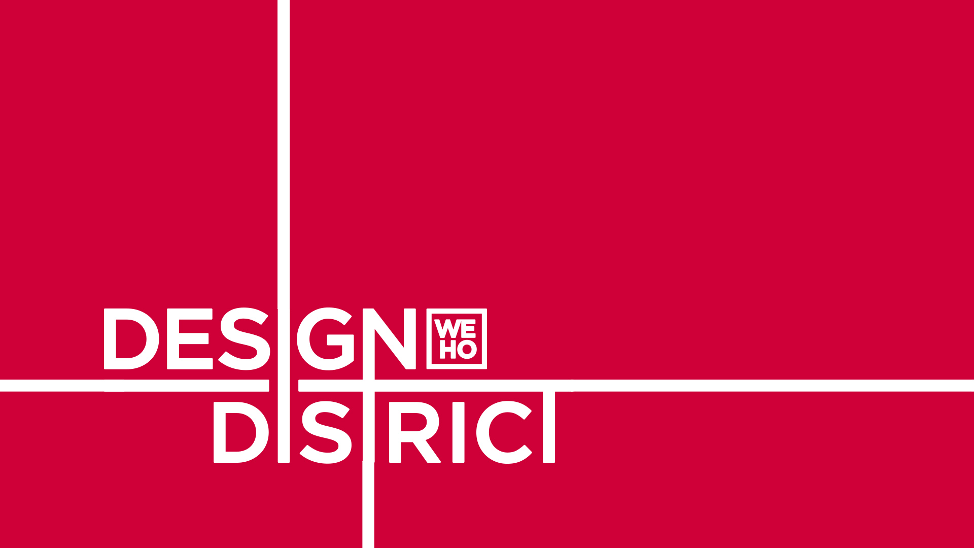
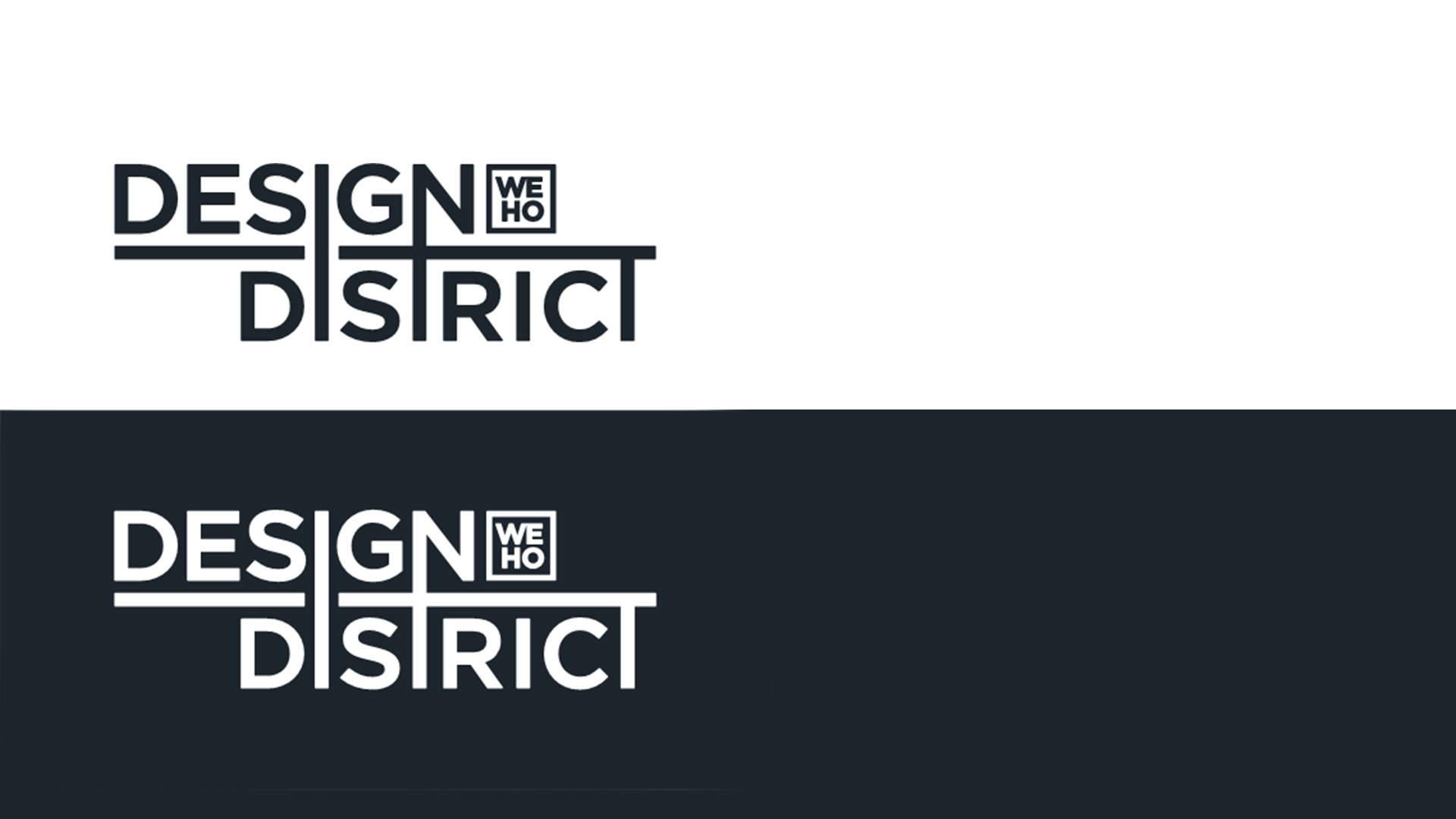
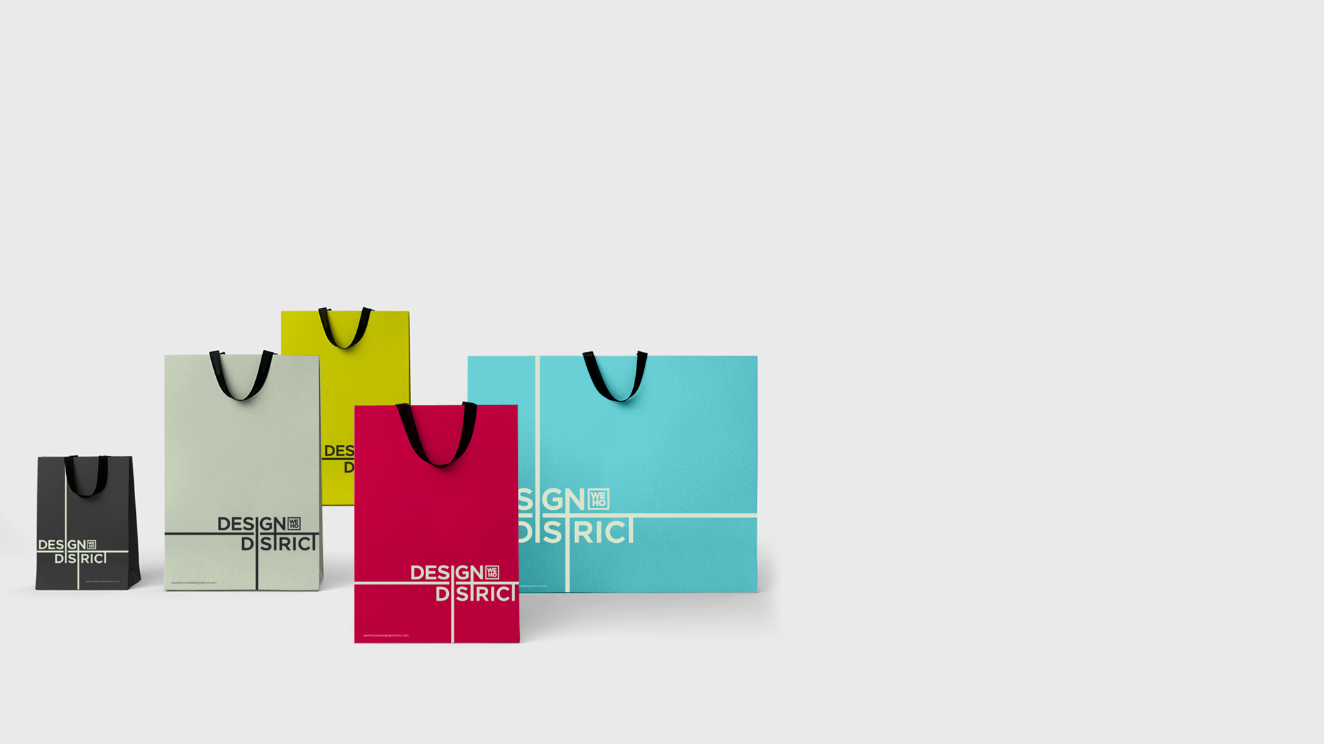
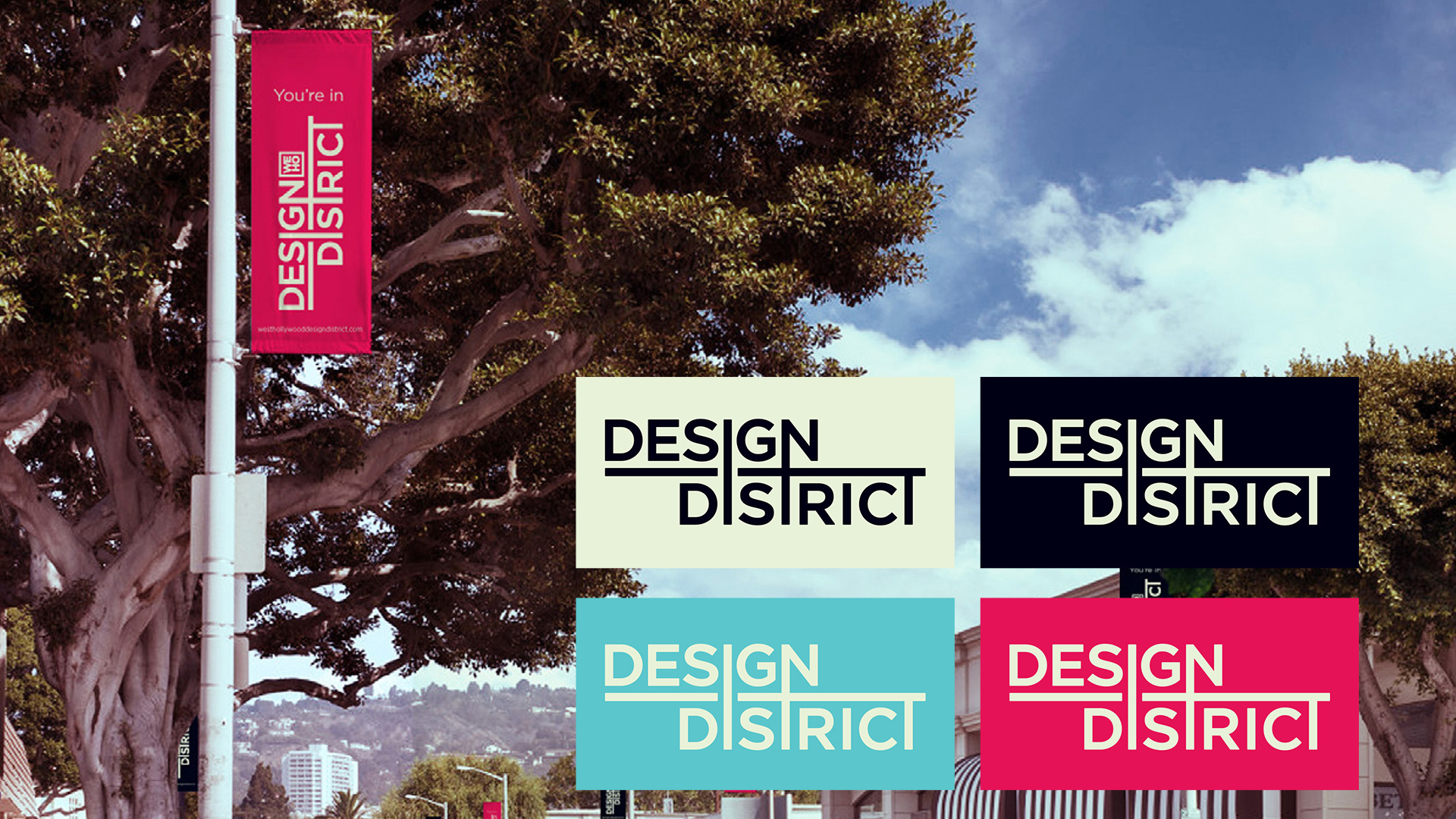
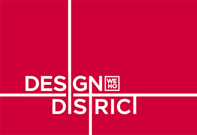
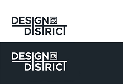
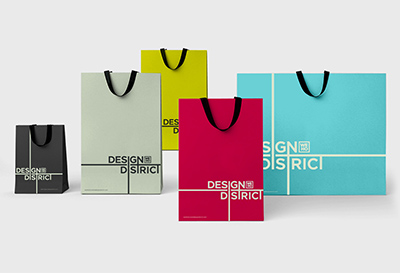
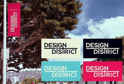
WeHo Design District Brand
Client: VISIT WEST HOLLYWOOD
Challenge
Revitalize a bloodless, stale Business Improvement District—adding new vibrancy, glamour, & cohesion.
Strategy
Create an identity that’s:
- High-end—but not uptight
- Luxurious—but not gaudy
- Vibrant—but not garish
- Confident—but not crass
- Distinctive—but not trying too hard
Solution
A fresh new identity that combines chic with bold:
- Logo
- Custom, san-serif type is warm & strong—yet clean.
- Extended stems & crosses of letters:
- Suggest urban
- Create infinite variety of elegant decorative patterns.
- Colors
- Foundational palette (pearl black & cream) is neutral & sophisticated.
- Accent palette is intense—but handled with care.
- Messaging & Voice
- Stakeholders were trained to talk about the District as a lifestyle destination that emphasizes high-end design.
- Mission was created to give equal emphasis to commerce, community, & trendsetting.
- Tonality was shifted from “generically cheery” to calm, cool, authentic, assured.
Deliverables & Services
- Brand positioning & messaging
- Visual identity system
- Brandbook
-
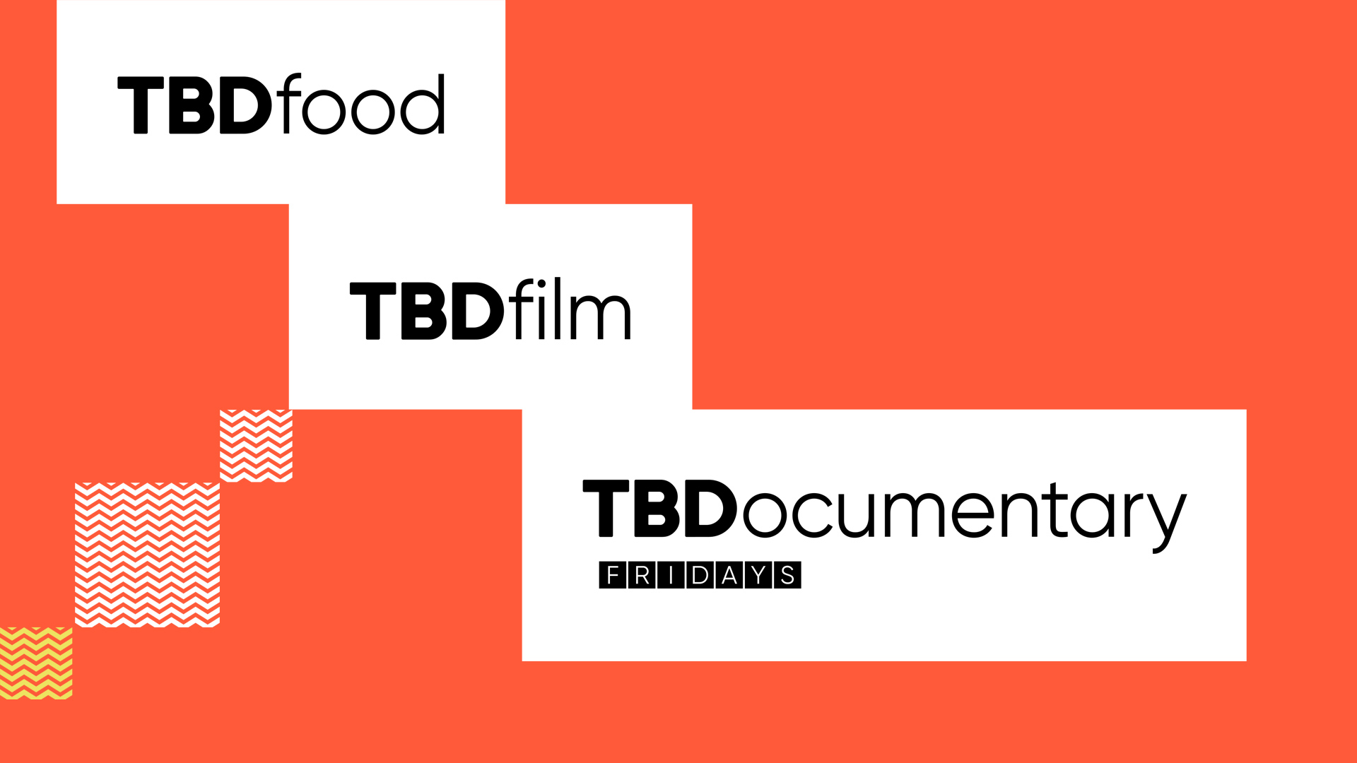
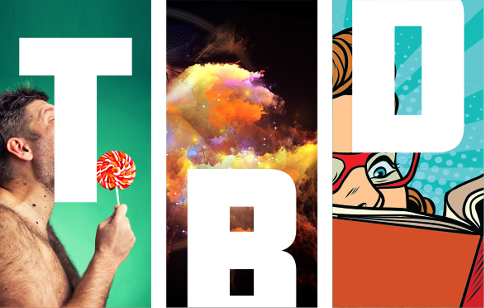
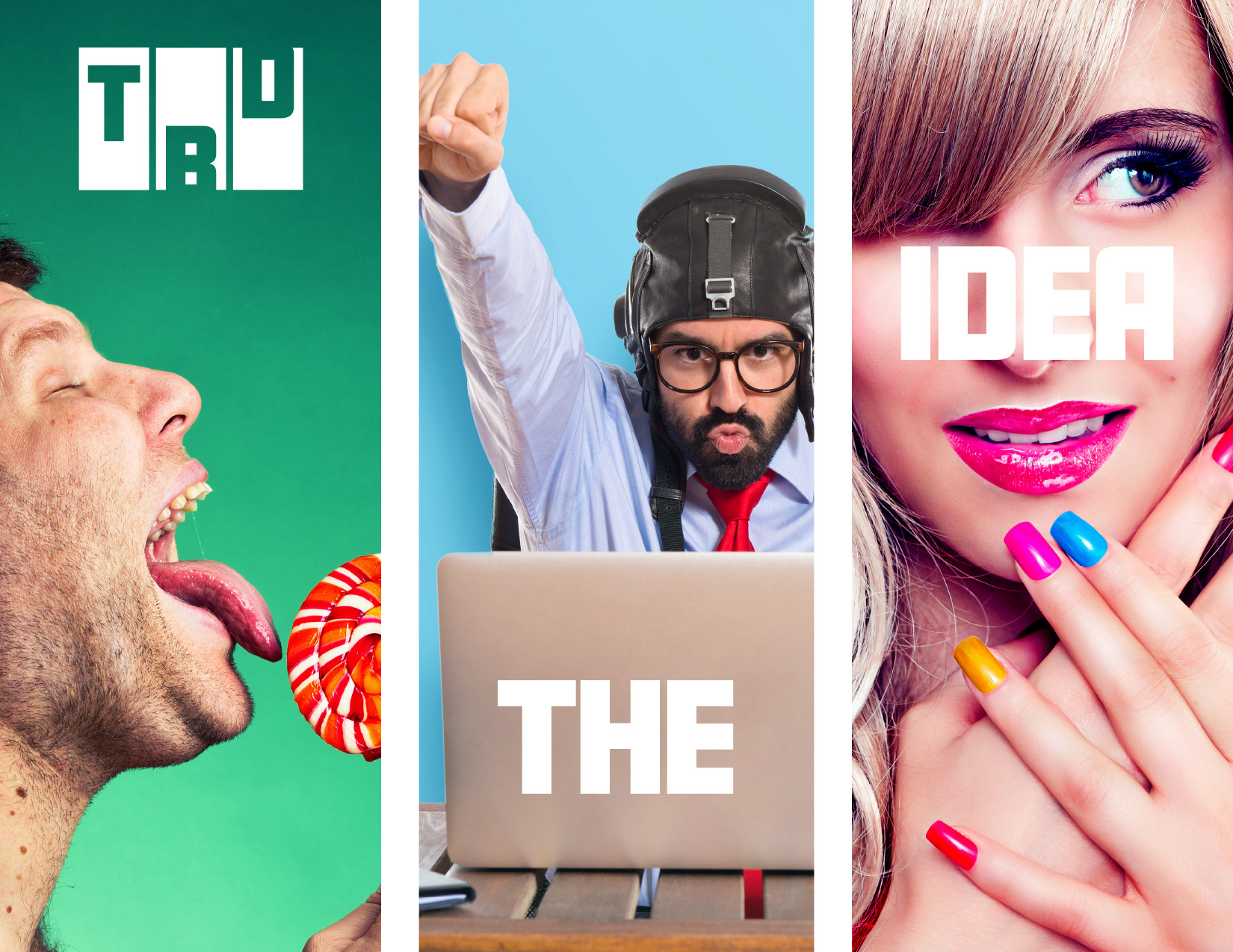
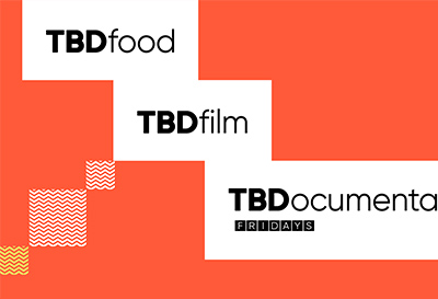
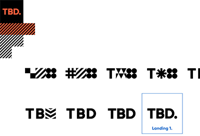
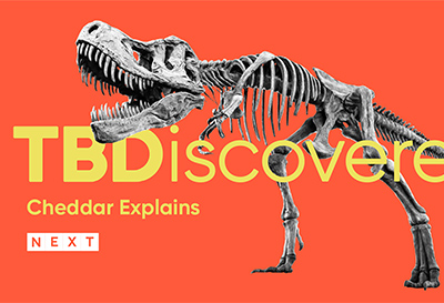
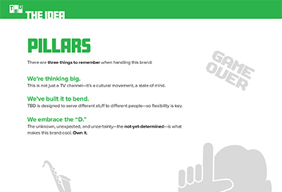
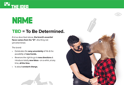
TBD Rebrand
Client: JUKIN MEDIA/SINCLAIR BROADCAST GROUP
Challenge
Transform a short-format TV channel for timewasters into something bigger—while staying true to its beloved roots.
Strategy
- Keep it light & fun, but add substance—transforming image from “stoner humor” to trendsetting, smart, informative, cool.
- Continue celebrating randomness of programming—but reposition it as rich variety (a TV “tapas bar”).
- Ensure elasticity—so brand can accommodate new & unexpected content opportunities.
Solution
We evolved the brand elements—bringing each to a new place while keeping a connection to its origins:
- Name’s meaning: To Be Determined à To Be Discovered (so viewer is driving experience, not network).
- Logo: slot machine with funny icons à cells with geometric patterns (creating cleaner, more abstract, more decorative feel).
- Colors: hard “crayon box” shades à softer, quirkier palette (to create more artisanal, curated feel).
Deliverables & Services
- New brand concept & evolved story
- New visual identity system
- New Brandbook


-
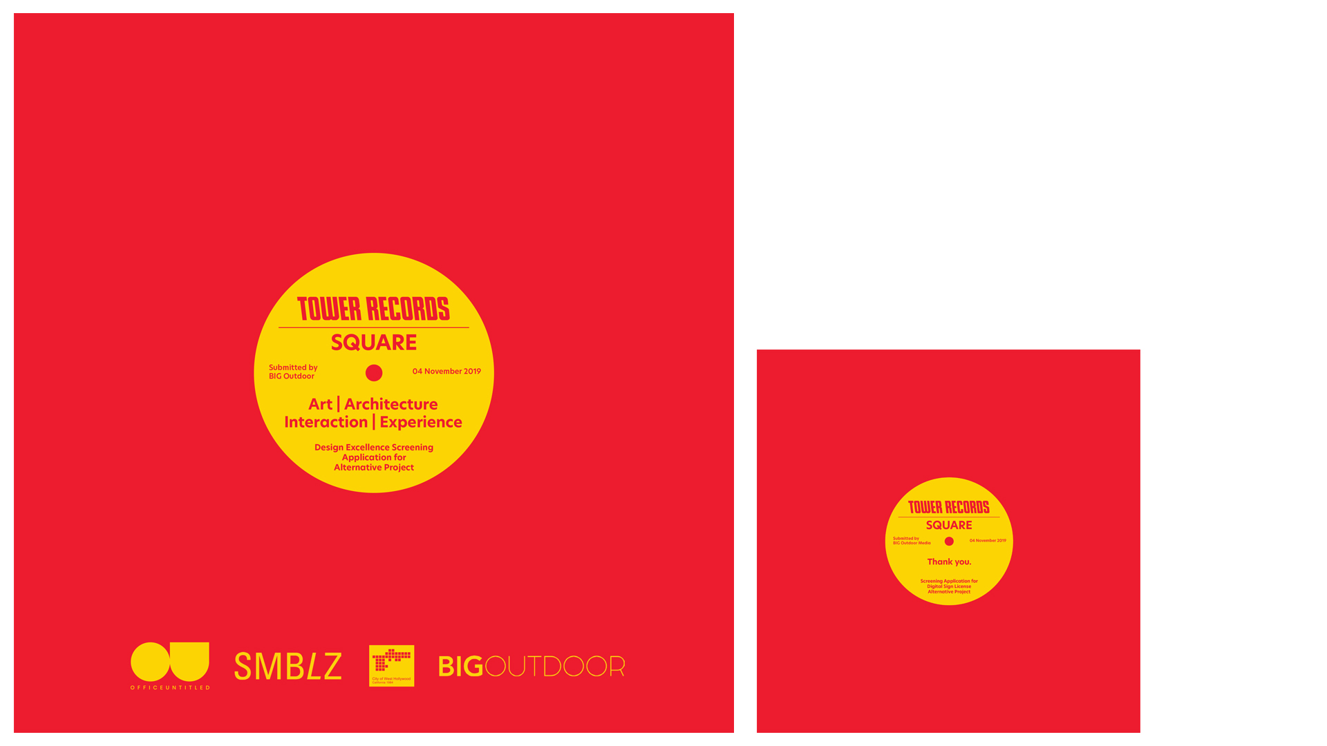
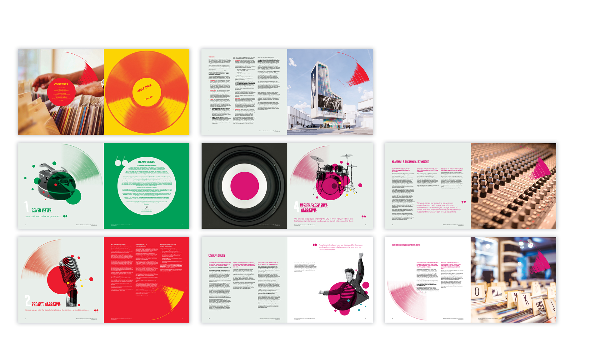
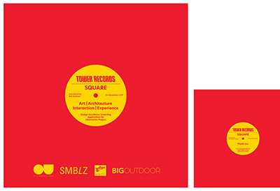
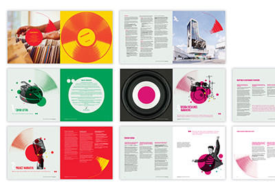
Digital Signage Application for the Iconic Tower Records Space
Client: BIG OUTDOOR MEDIA
Challenge
Convince City Hall that a new digital billboard on West Hollywood’s Sunset Strip is a good idea—in a city that demands innovative design & fetishizes its own history.
Strategy
Produce the best-written and most visually stunning application ever.
Solution
A gorgeous “coffeetable book” about the project—complete with:
- Evocative writing about the City’s history & how this project weaves into it.
- Inspirational description of the project & all the benefits it brings the City—in terms of art, design, sustainability, & community.
- Sumptuous, colorful layouts that properly frame the gorgeous project renderings.
We printed the book on high-quality stock with a Soft Touch Coating—making a sensual connection with the reviewer from the very moment they picked up the book.
Deliverables & Services
- Research
- Copywriting
- Design
- Print production & management
-
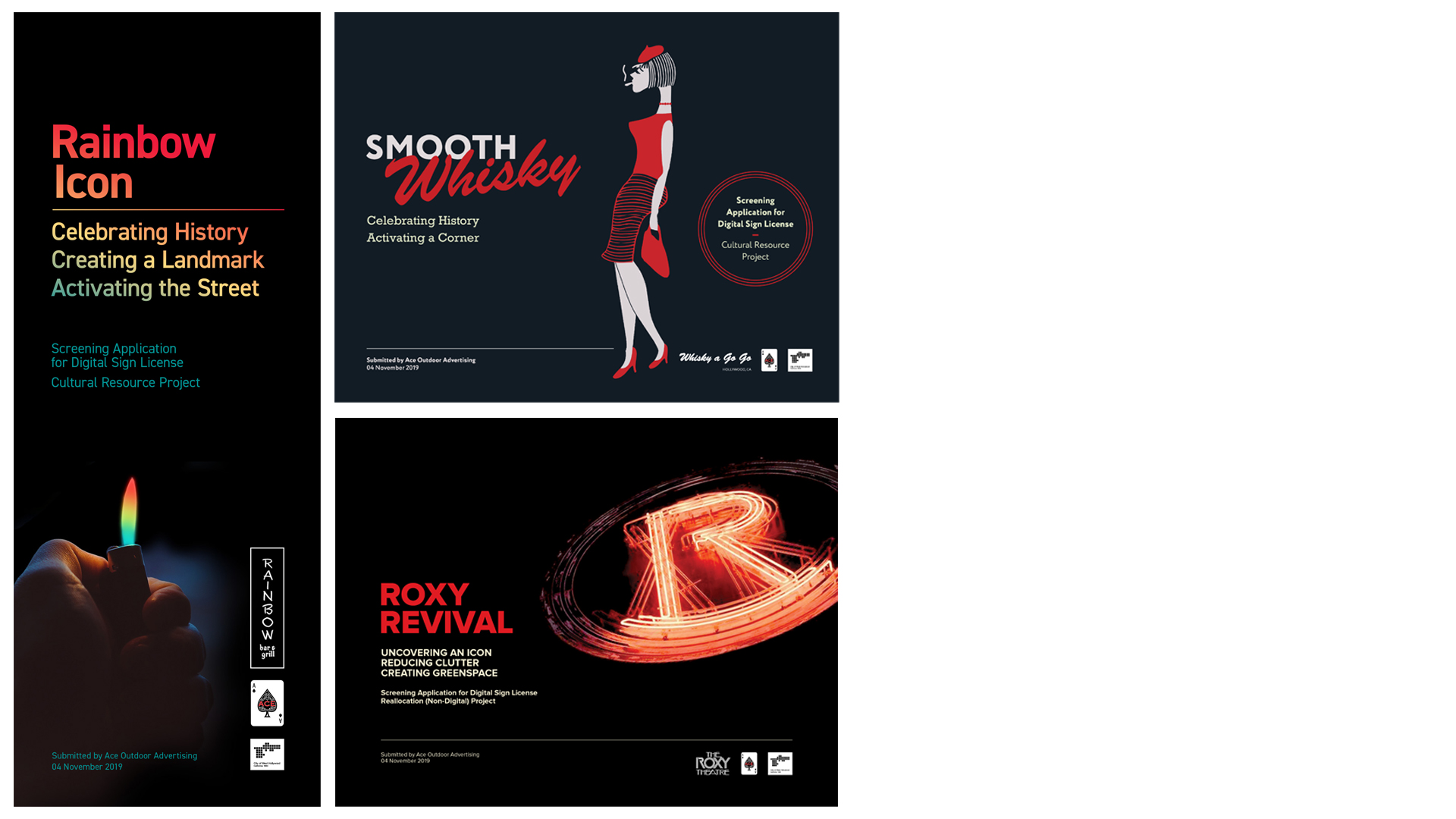
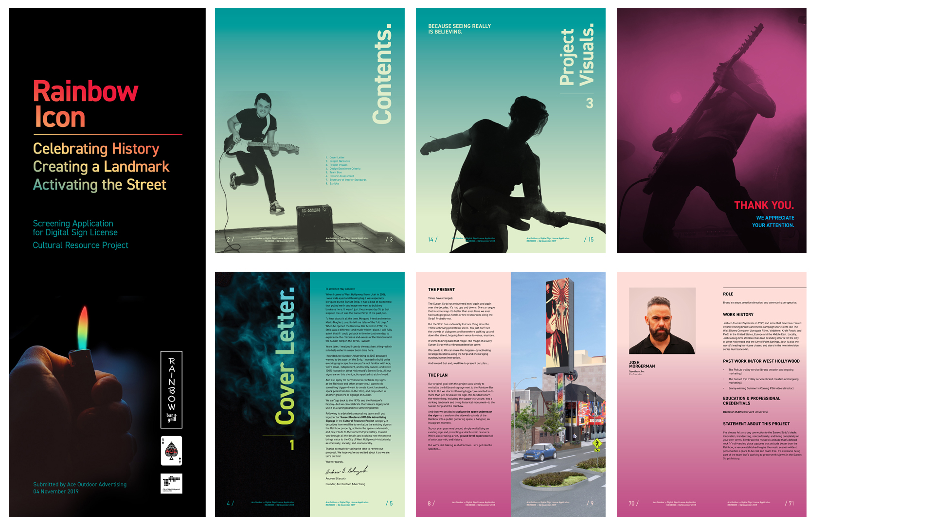
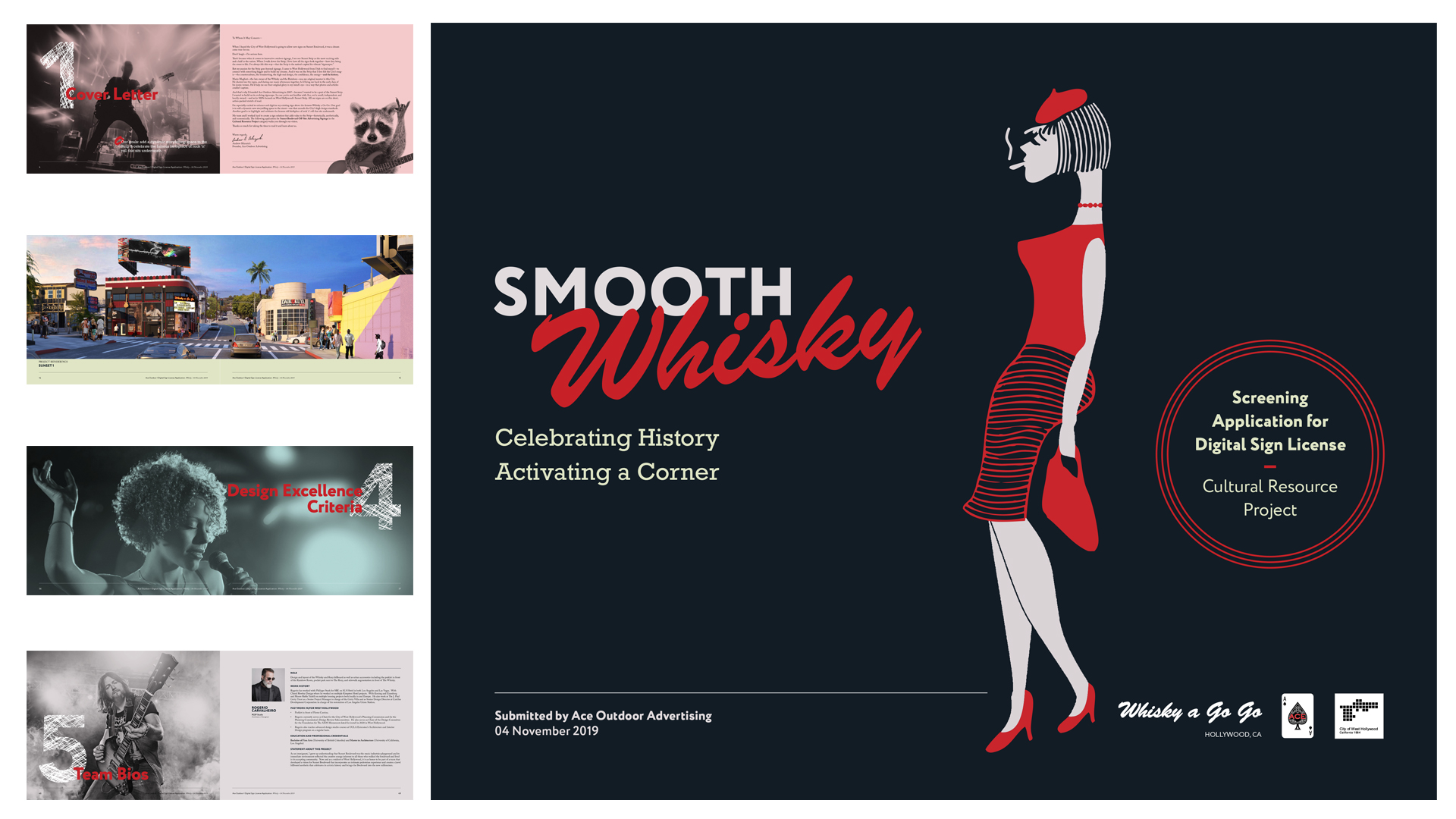
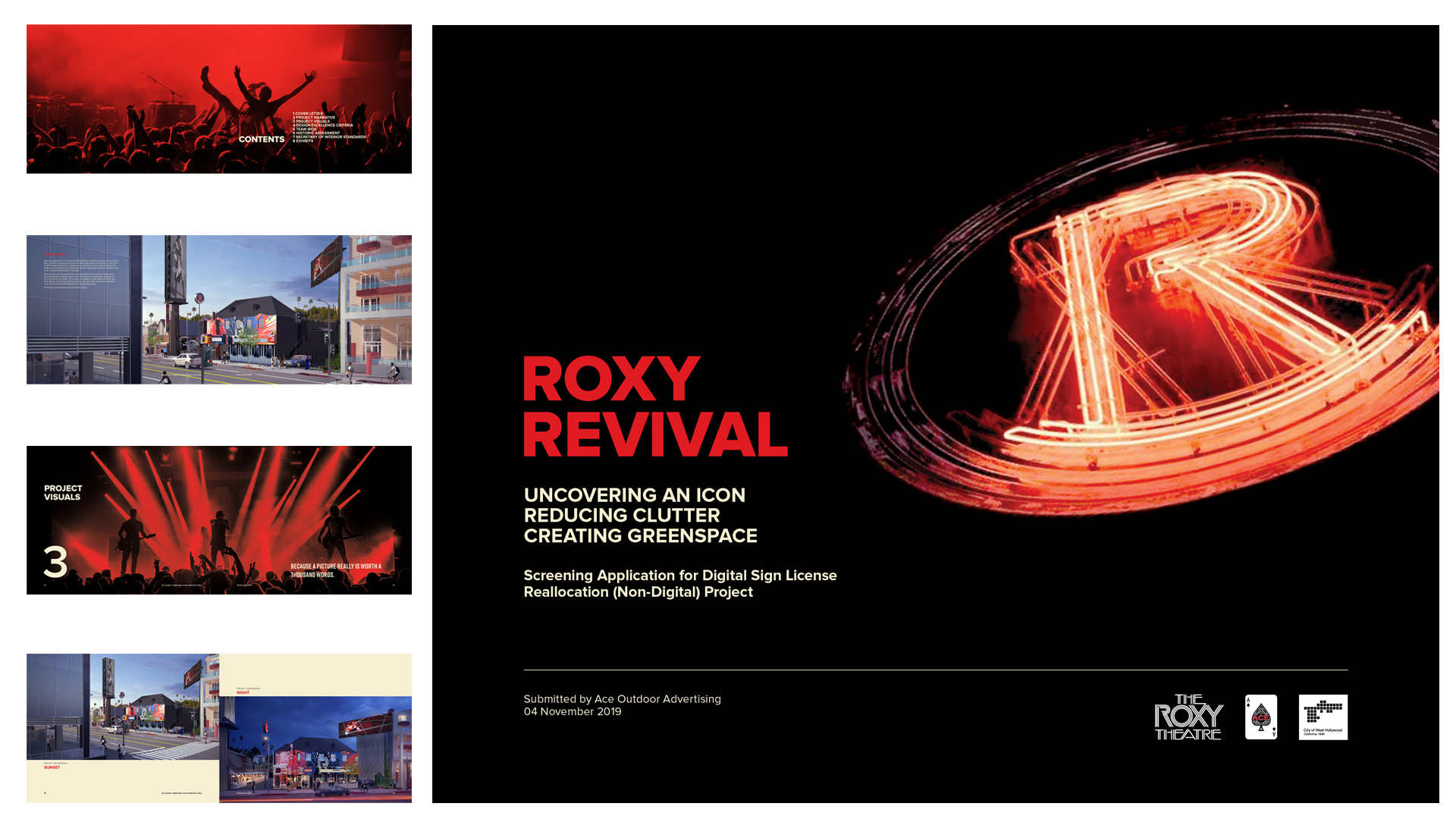
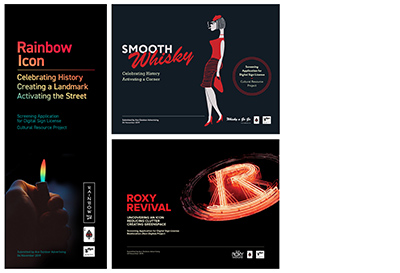
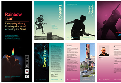
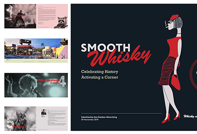
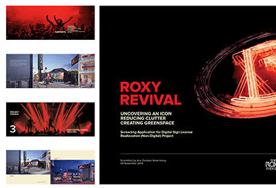
3 Digital Signage Applications for Whisky a Go Go, Roxy Theatre, & Rainbow Bar & Grill Spaces
Client: ACE OUTDOOR ADVERTISING
Challenge
Convince West Hollywood officials that new digital billboards at three historic Sunset Strip venues will enrich the city experience.
Strategy
Make the case with the elements the review committee cares about: the city’s history, beautiful design, and storytelling.
Solution
Three imaginative, eye-catching picture books—each telling the story of how the proposed billboard installation complements its historical host venue. Each book included:
- Vivid writing connecting the project to the city’s identity—and its rich past.
- Detailed description of the project & the benefits it brings the City—in terms of art, design, sustainability, & community.
- Striking layouts, bold imagery, & vibrant colors that give the reader the feeling of journeying through a story.
Each book had a completely different shape, look, & feel—to capture the unique vibe of each historical venue.
Deliverables & Services
- Research
- Copywriting
- Design
- Print production & management
-
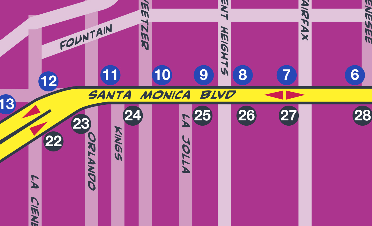
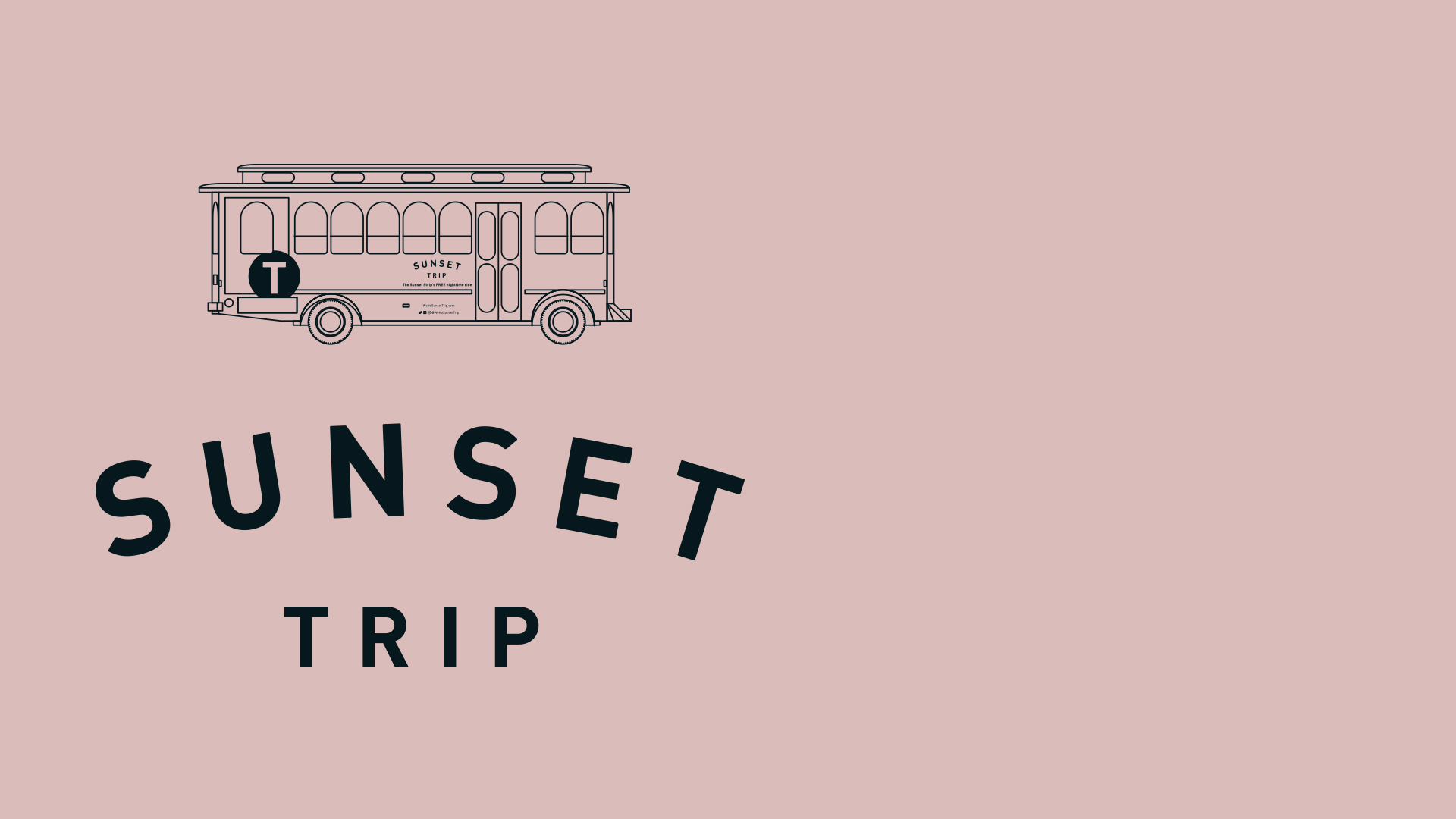
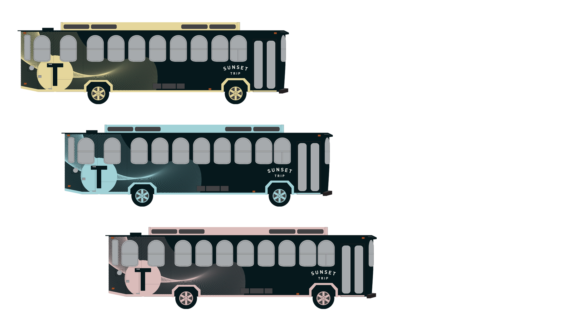
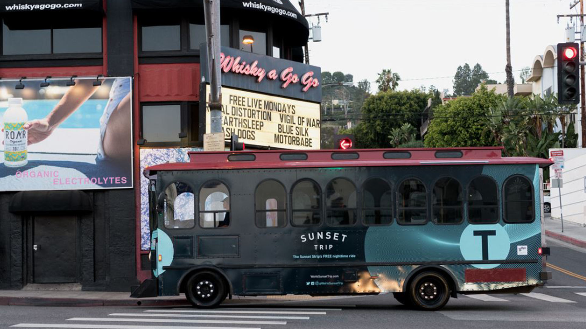
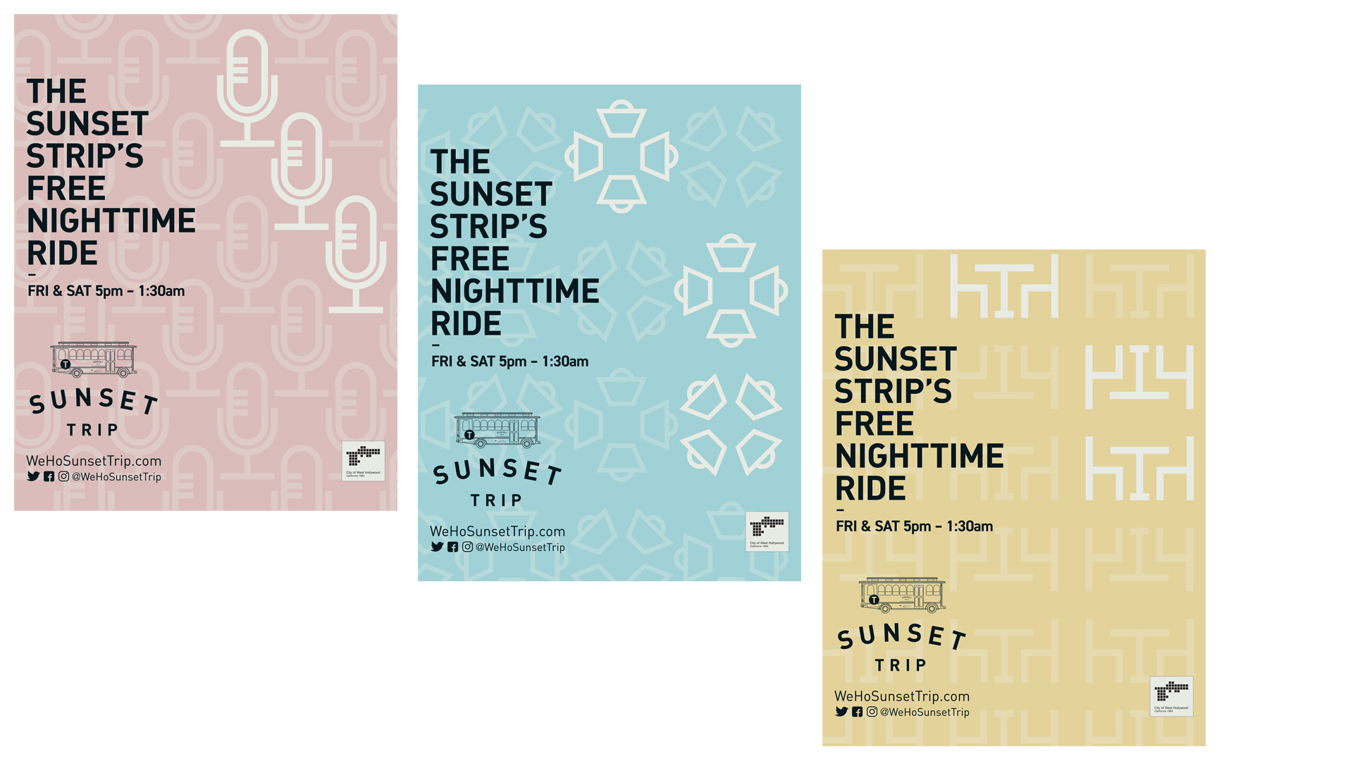
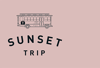
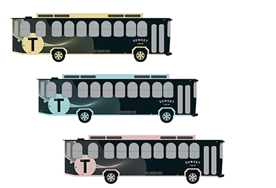
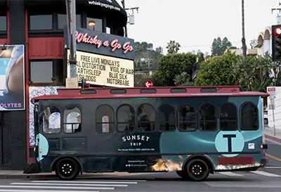
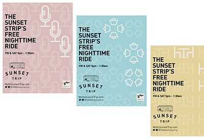
Sunset Trip Brand
Client: CITY OF WEST HOLLYWOOD
Challenge
Get an Instagram crowd to take public transit to their nightspots—in a scene where image is everything.
Strategy
Brand a bus service so it doesn’t feel like a bus service.
Solution
A sleek visual style:
- Crisp
- Hypnotic geometric patterns suggesting EDM (electronic dance music).
- Luminescent color accents on black.
- Generous negative space.
The right voice:
- Cool & understated.
- Not overly friendly.
- Not trying too hard.
An Instagram-driven experience—including onboard selfie contests.
Deliverables & Services
- Brand name
- Brand concept & story
- Visual identity system
- Brandbook
-
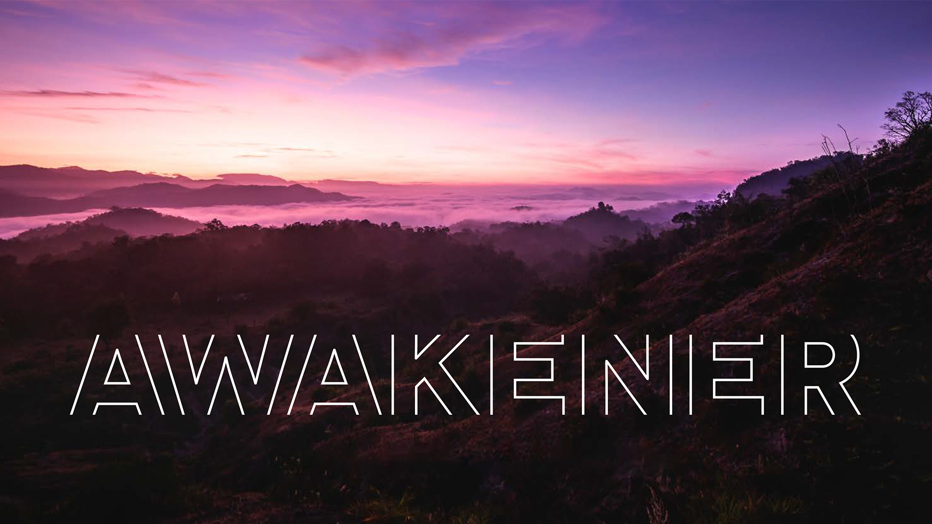
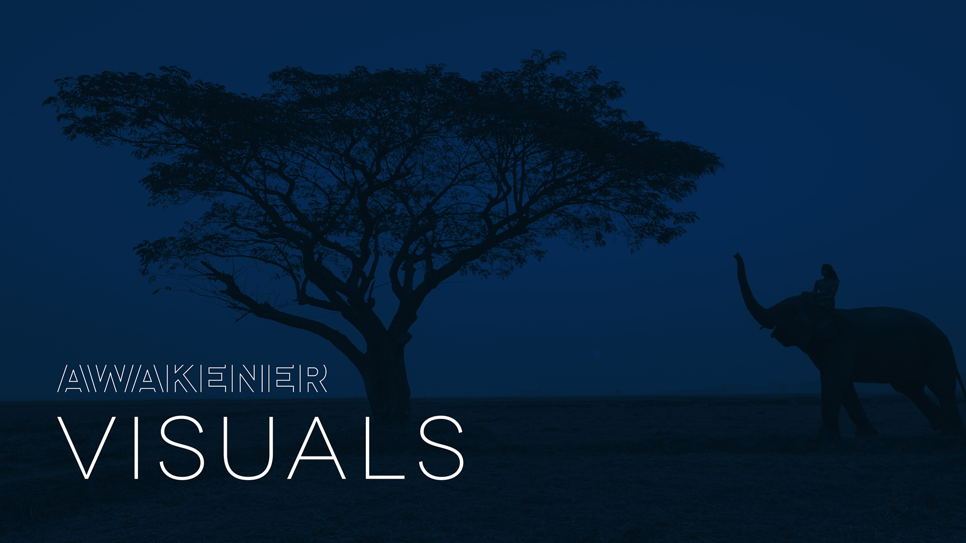
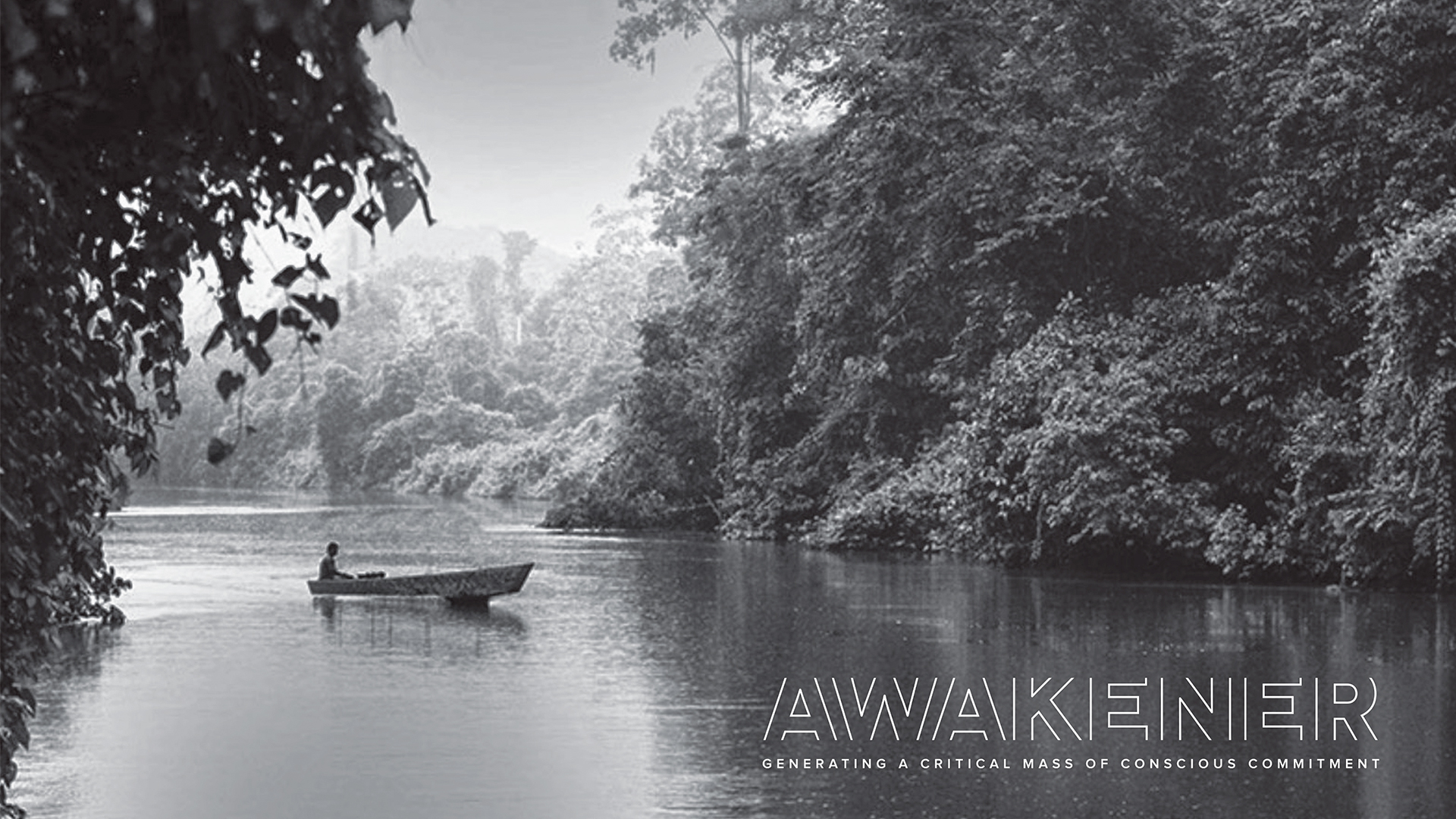
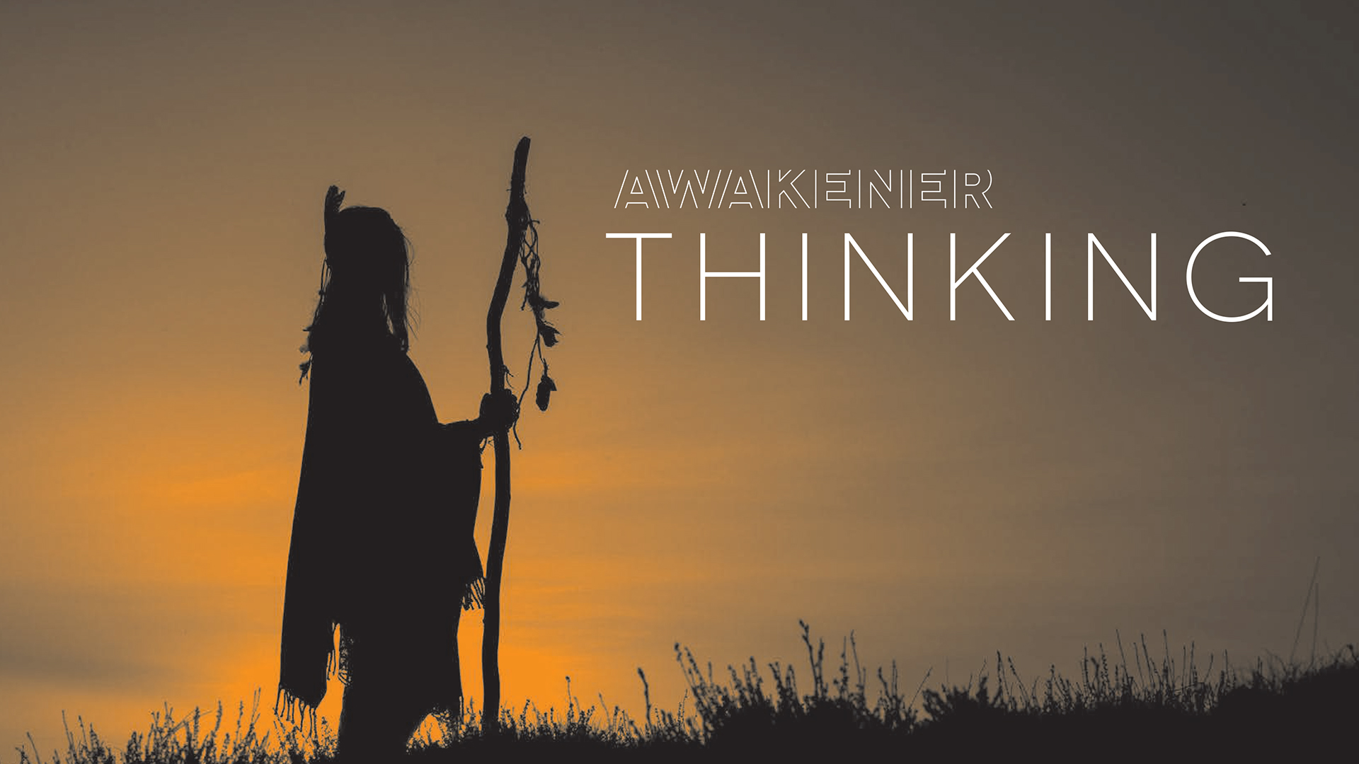
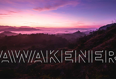
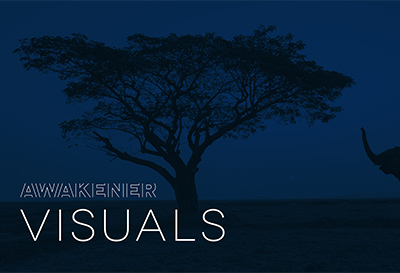
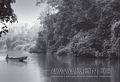
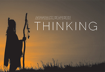
The Awakener Brand
Client: PACHAMAMA ALLIANCE
Challenge
Brand a personal-growth course to straddle the realms of spiritual and business—to resonate with diverse audiences coming from different places.
Strategy
Create a band identity that conveys strong purpose, quiet strength, & calm energy—all universally valued attributes.
Solution
An evocative look:
- Logo is a transparent vessel, capturing the moment of waking—as we open our eyes.
- Colors are soothing & calm—with only one warm shade.
- Image vocabulary emphasizes natural settings, uninterrupted space, vibrancy, & openness.
A balanced voice—one that finds the intersection of business & spiritual (yes, there is one!):
- Brilliant yet calming.
- Powerful yet benevolent.
- Confident yet nurturing.
Deliverables & Services
- Brand concept & story
- Visual identity system
- Brandbook
-
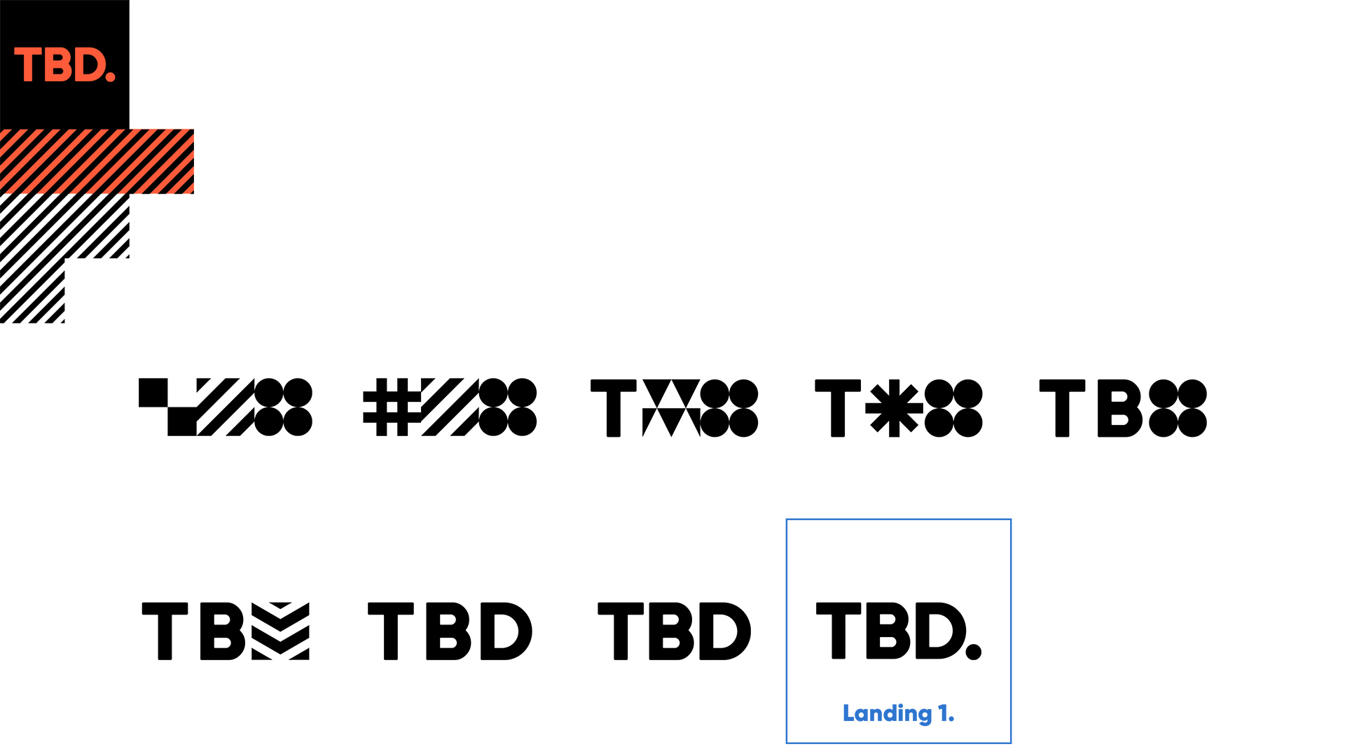
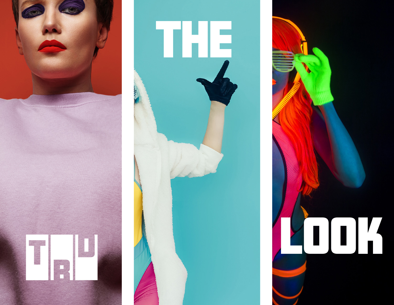
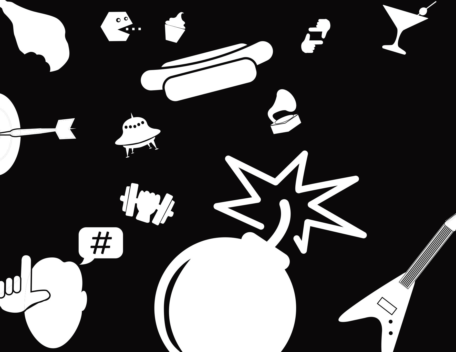
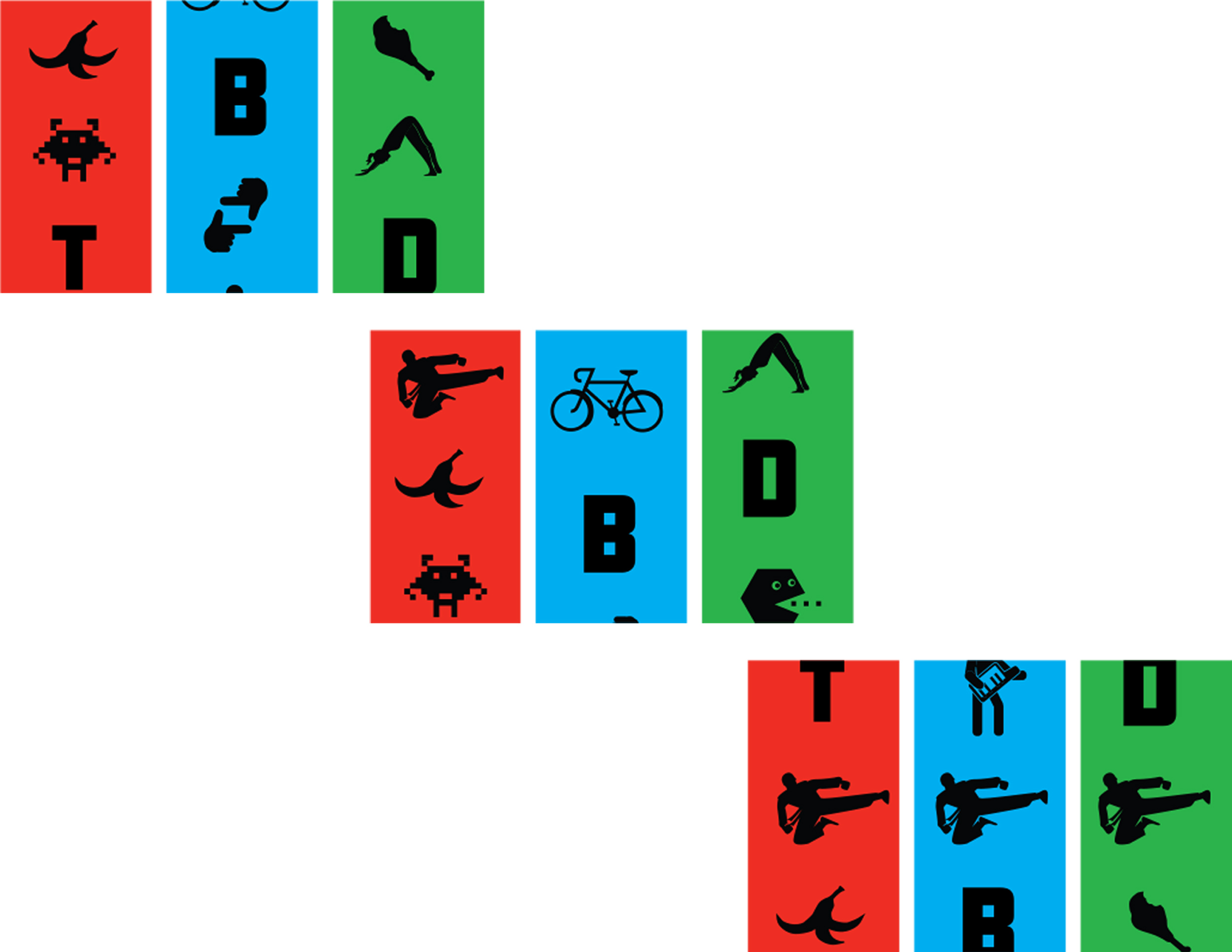
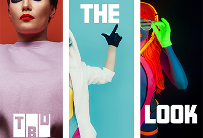
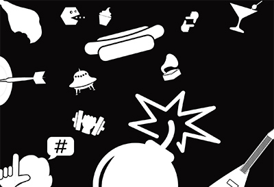
TBD Brand
Client: TBD TV Network
Challenge
Launch a broadcast brand that speaks to an impossibly diverse range of demographics—from stonerdudes to suburban moms.
Strategy
Create a visual identity that’s simultaneously:
- Chameleonic—so it can be anything to anyone at any time.
- Distinctive—so audiences always recognize it.
- Exciting—always teasing the next thing.
- Dynamic—coming to life in broadcast motion graphics.
Solution
An elastic, flexible brand:
- Slot-machine format:
- Suggests random chance.
- Promises surprise!
- Makes the perfect animation for transitioning between unrelated shows.
- Icon system allows infinite possibilities for introducing new show topics & moods.
- Icon style is versatile—ranging from conventional to freaky.
- New icons are constantly being added—so brand is always fresh & evolving.
- Aggressive colors grab the attention.
- Distinctive voice conveys a casual, mischievous mood.
Deliverables & Services
- Brand concept & story
- Visual identity system
- Icon system
- Brandbook
-
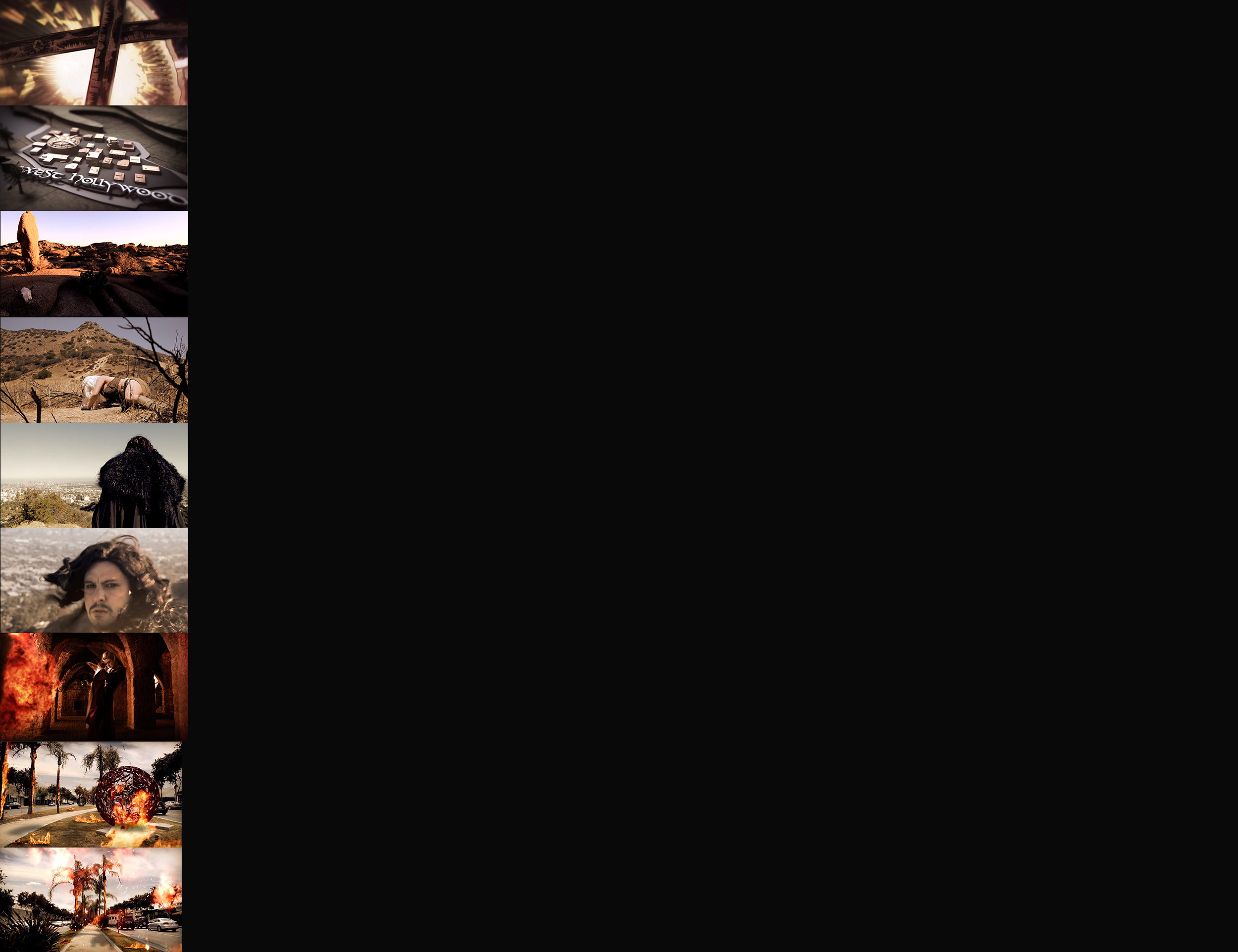
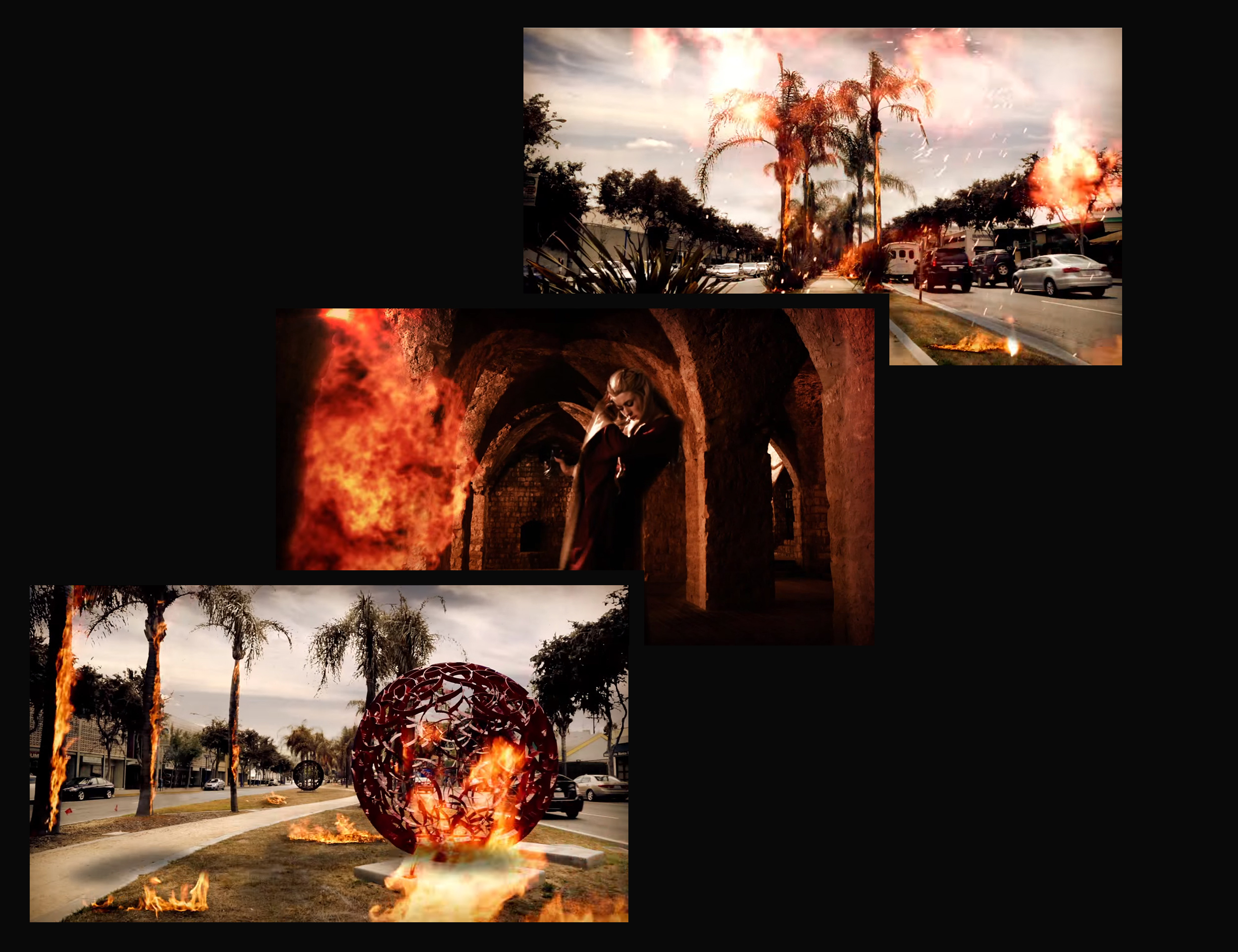
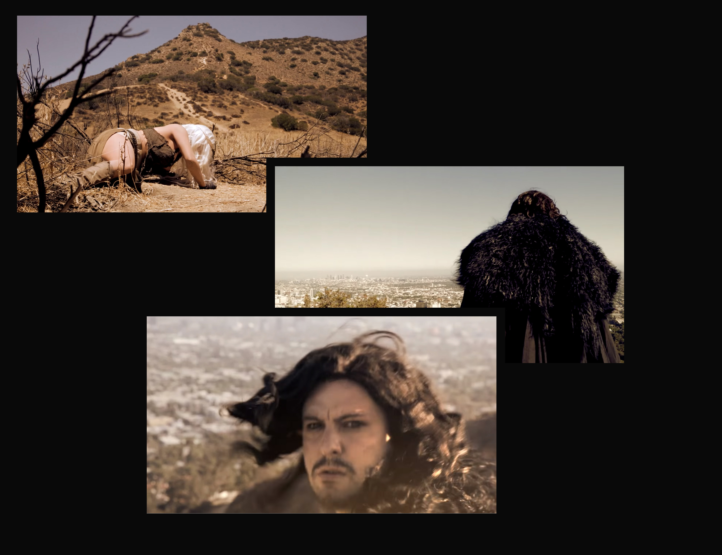
Drought PSA
Client: City of West Hollywood
Challenge
Drive water conservation in drought-stricken California—and generate buzz about this important topic.
Strategy
Create a novelty public service announcement that:
- Tells a story.
- Leverages the power of a popular niche brand.
Solution
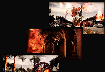
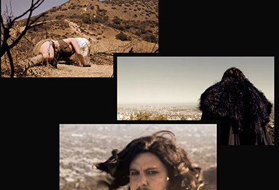
Public Service Announcement: “Winter is Here! But the Drought is Far From Over”
An unexpectedly cool video that:
- Recreates a “Game of Thrones” (GOT) mood—with music & graphics.
- Throws GOT characters into a modern, drought-stricken urban environment.
- Builds to a stunning, apocalyptic, Hollywood-style climax!
- Gets people reacting & talking!
Deliverables & Services
- 60-second video—including:
- Scripting
- Casting
- Directing
- Special effects
- Editing & post-production
Results
- Emmy Award for best Public Service Announcement (in L.A. area), 2016.
-
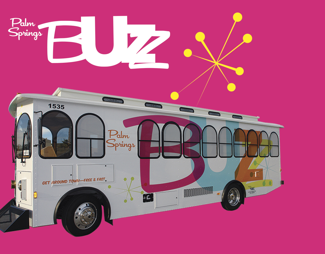
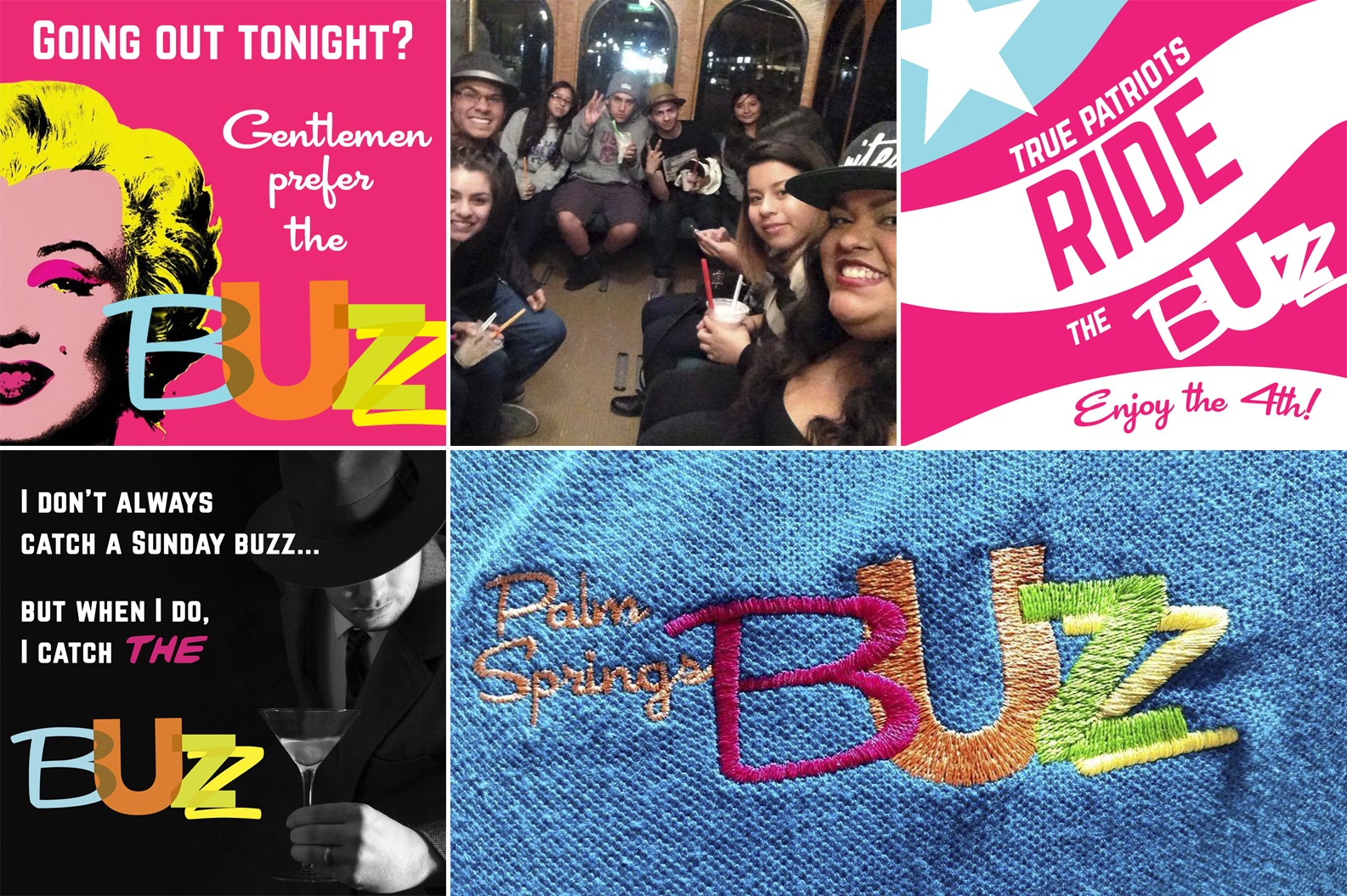
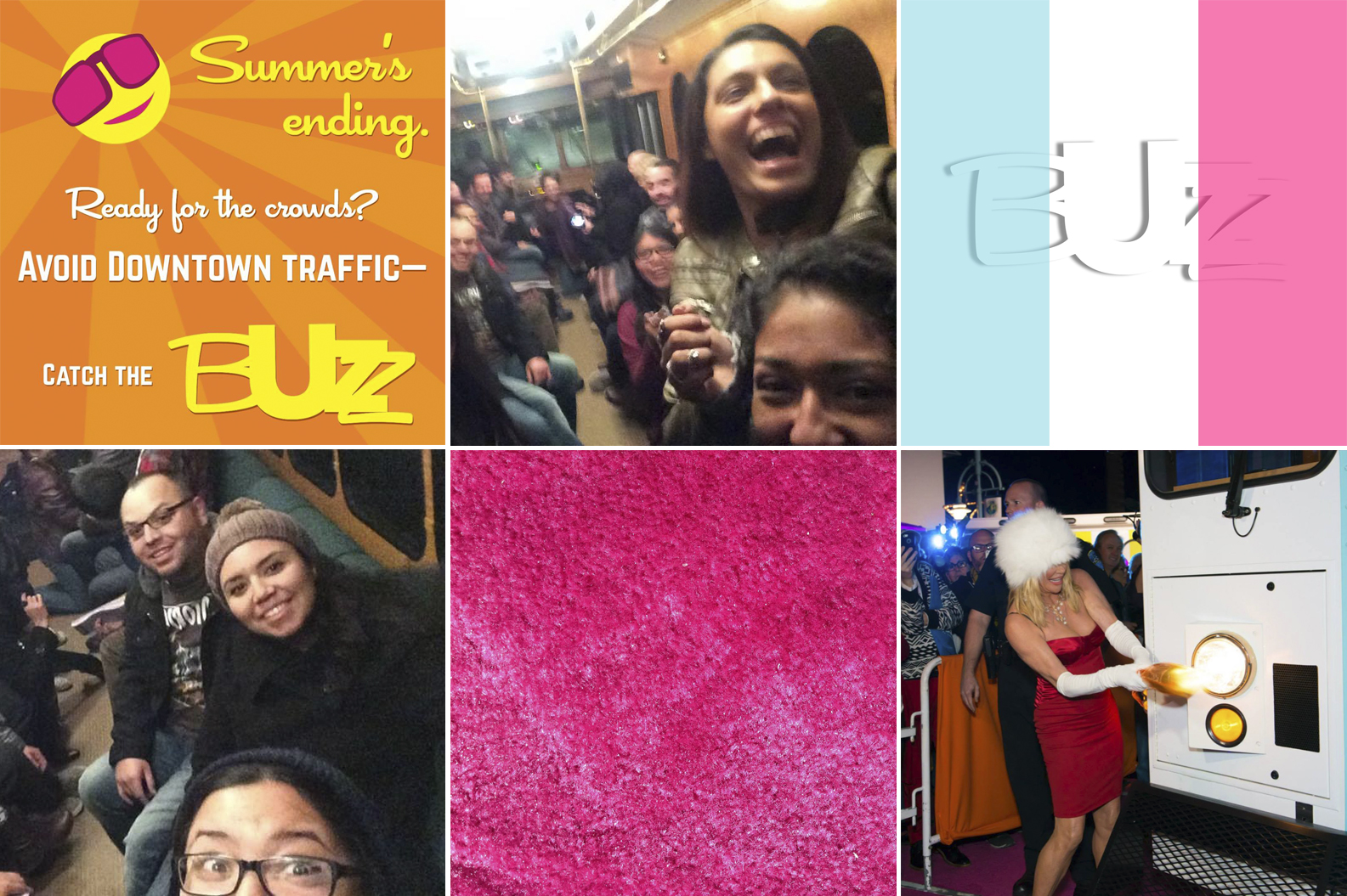
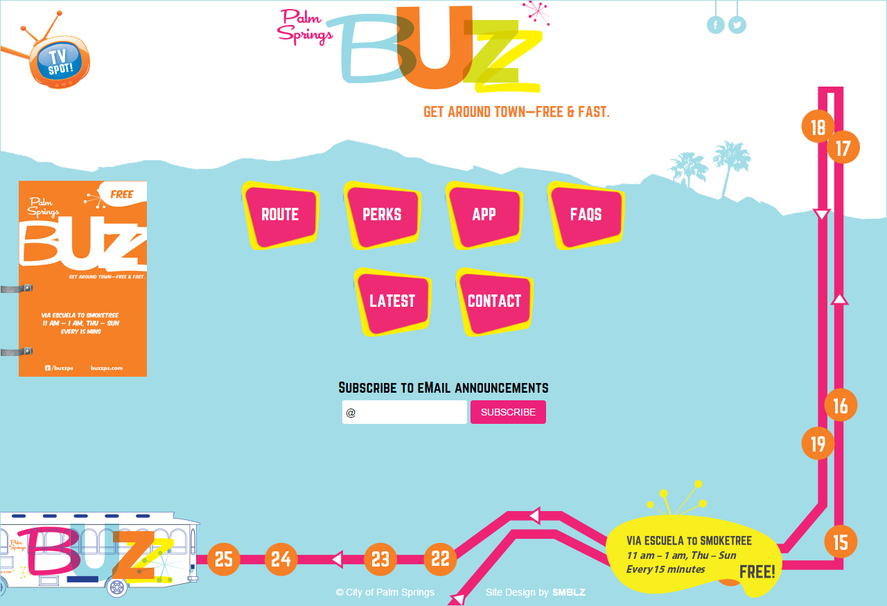
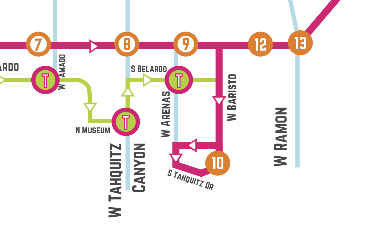
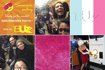
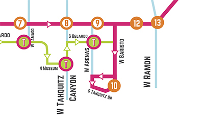
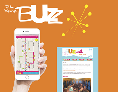
PALM SPRINGS BUZZ TROLLEY
Client: City of Palm Springs
Challenge
Help the transformation of a small desert resort town into an international destination city by launching a revolutionary public-transit system.
Strategy
Create a brand that:
- Feels nothing like public transit.
- Could only exist in Palm Springs—creating pride in residents & a memorable experience for visitors.
- Has broad appeal—to residents & tourists, hipsters & seniors, nighttime partiers & daytime shoppers.
Solution
The Palm Springs BUZZ—a bold brand that has broad appeal without feeling generic:
- Midcentury Modern aesthetic—a look so vibrant you see it coming a mile away.
- Bubbly, distinctive brand voice.
- Warm rider experience—one that feels more like a tour than transit.
- “Weaponized” color: nuclear-grade posters & memes that pop off social-media feeds.
- High-impact, celebrity-studded launch, followed by sustained outreach to businesses & residents—to instill long-term feelings of community ownership.
Deliverables & Services
- Brand concept & story
- Visual identity system
- Brandbook
- Website
- Experience design
- Ongoing promotion
- Social media
- eMail marketing
- Advertising (print, TV, radio)
- Public events
- Community outreach
- Loyalty program
- Mobile app design
Results
- 4-5K served on average weekend.
- 238K served in Year 1.
- 233K served in Year 2.


-
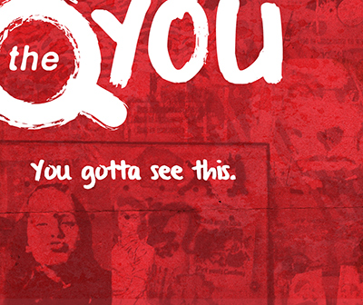
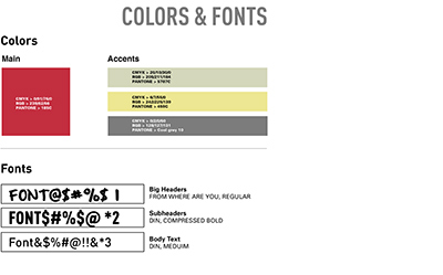
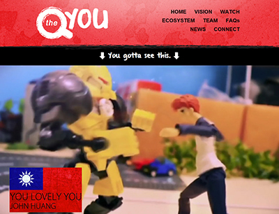
QYOU BRAND
Client: QYOU
Challenge
Launch a brand that speaks to Millennials. (But not American Millennials—worldwide Millennials across a wide range of cultures.)
Strategy
- Create a flexible, dynamic identity that can localize across non-Western societies—& keep up with fast-changing trends.
- Give it a grassroots, homegrown flavor—wherever it launches across the globe.
- Infuse rough, kinetic energy that conveys the feeling of user-submitted content.
Solution
The QYOU—a multicultural brand that shines bright for Millennial across 35 countries in 3 continents:
- Bold visual identity that pops in broadcast & digital channels.
- Ultra-flexible color palette—to account for different genres, audiences, & cultural contexts.
- Roadmap & guidelines for global localization.
Deliverables & Services
- Brand concept & story
- Visual identity system
- Website
Results
- 35 countries over 3 continents in Year 1.
- 250 new hours of content per month.
- 24/7 ad-free, linear-channel feed.

-
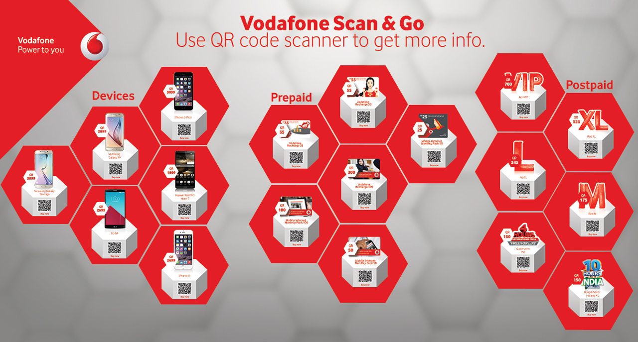
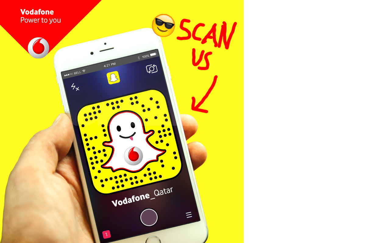
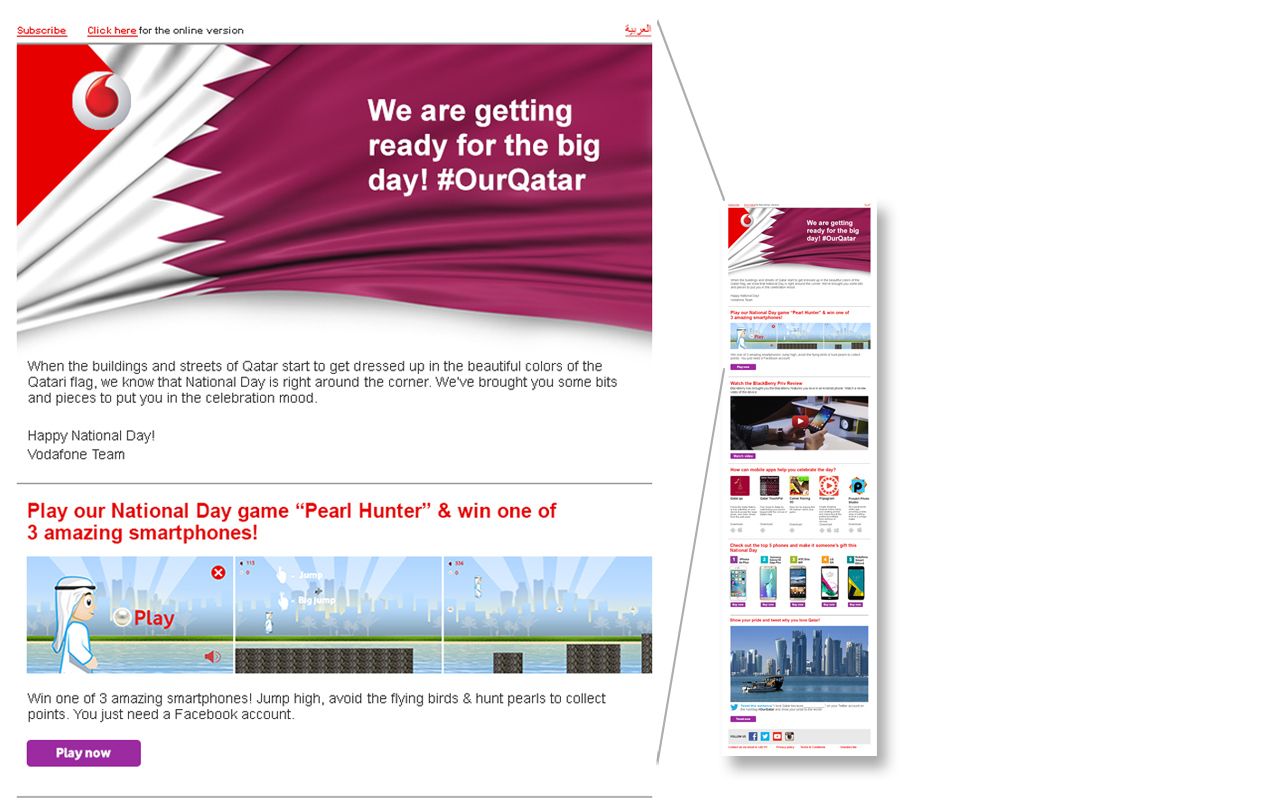
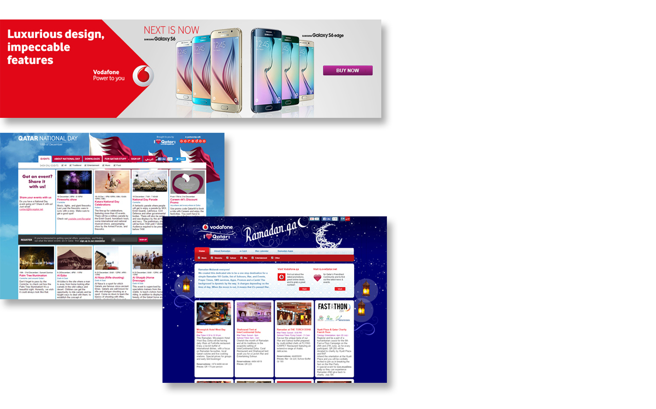
DIGITAL MARKETING
Client: Vodafone Qatar
Challenge
Tear marketshare from an entrenched, state-run competitor by extending a popular Western brand into an extremely conservative Middle Eastern market.
Strategy
- Understand the unique audience’s passions & very strict cultural boundaries—& work creatively within those constraints.
- Understand the different ways this unique audience interacts with technology.
Solution
Ongoing digital promotion of the brand using:
- Sleek-but-sexless creative—with vibrant color & imagery compensating for lack of sex appeal.
- Just enough Western/Anglo culture to make it “cool” to locals.
- Contests & communications timed with local/Muslim holidays.
- User experience design that maps to how local consumers use technology (very different than the West).
Deliverables & Services
- Websites
- Social media
- Web/mobile app design
- Advertising (display & social media)


-
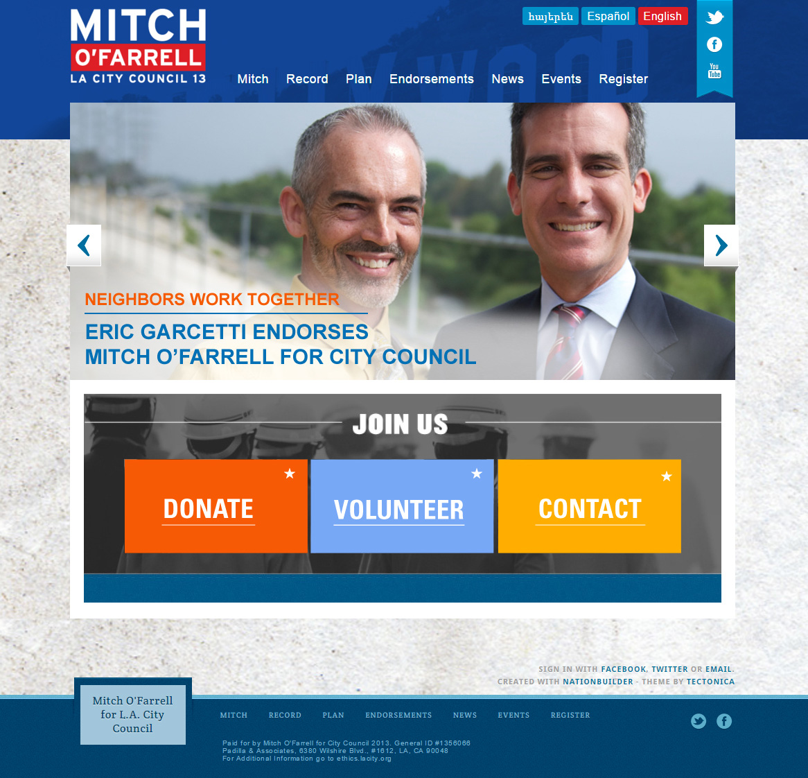
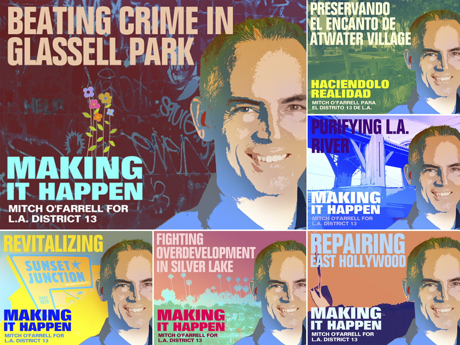
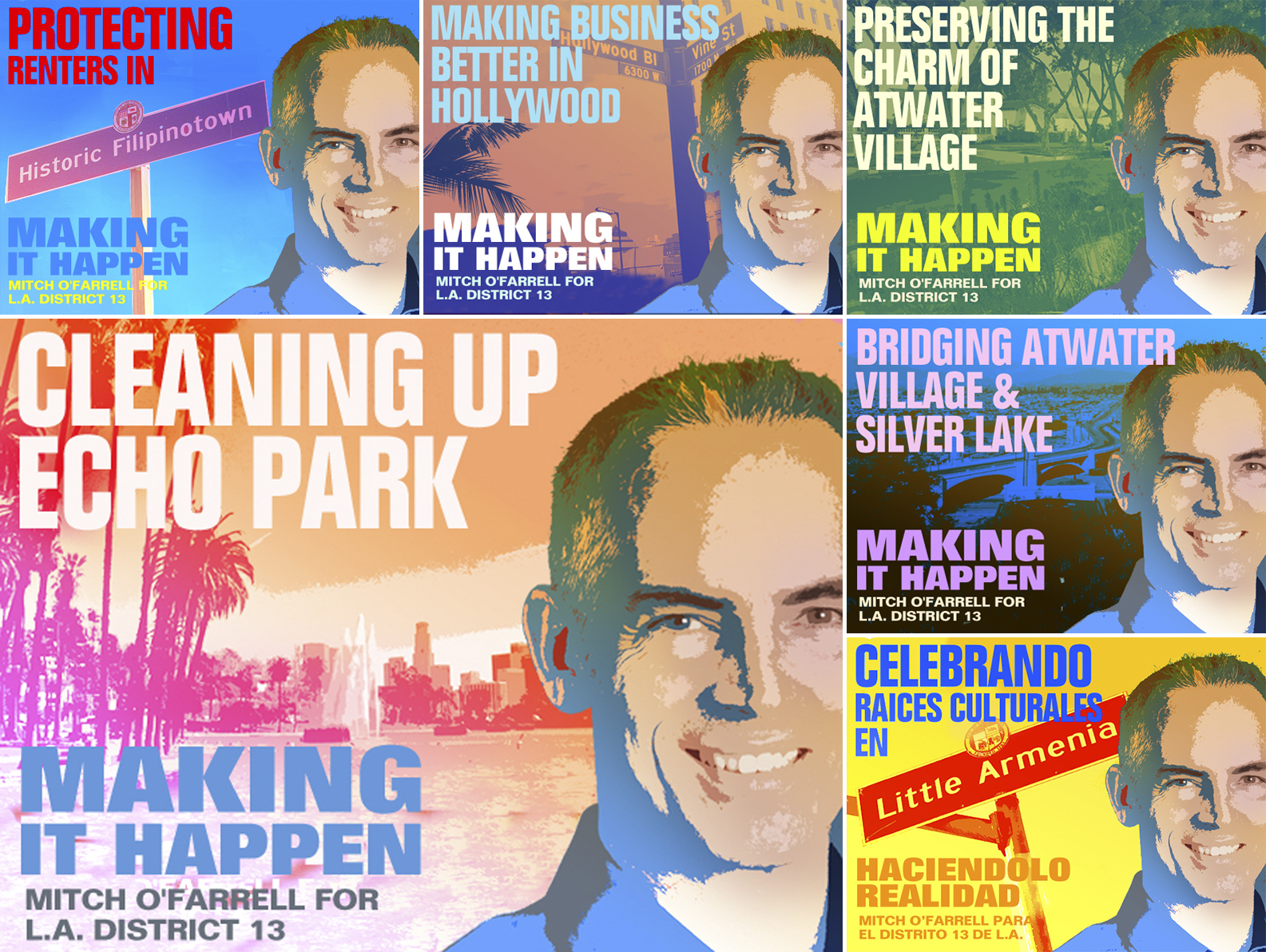
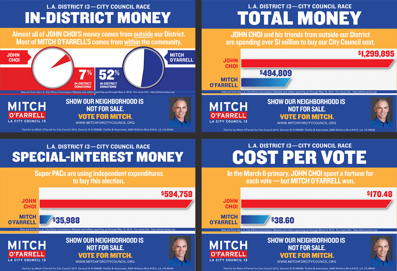
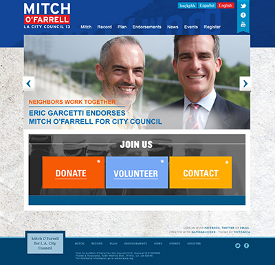
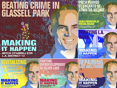
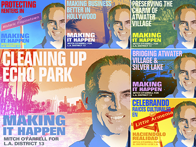
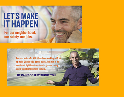
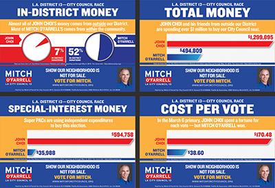
ELECTION CAMPAIGN
Client: Mitch O’Farrell – L.A. City Councilmember (CD13)
Challenge
In an extremely competitive race for L.A.’s District 13 City Council seat—the most highly-prized in the nation’s second-largest city:
- Primary election. Differentiate super-qualified, grassroots candidate from the other 11.
- Runoff election. Bring candidate to victory over an establishment opponent with tremendous financial & institutional advantages.
Strategy
- Create a powerful overarching brand message that segments naturally into neighborhood-by-neighborhood, block-by-block micro-messages.
- Pigeon-hole the opponent as the outsider/carpetbagger.
- Use a vibrant campaign style to break out of the “politics look”—to inspire not just the minds but the hearts of our audience.
Solution
The Making It Happen campaign—designed to illustrate the candidate’s record of service in (& passionate commitment to) each neighborhood, in every corner of the district.
- Central message filtered down to a series of powerful neighborhood stories illustrating candidate’s creative problem-solving, work ethic, & authenticity.
- Campaign art was extremely vibrant & neighborhood-specific, inspiring neighborhood pride & viral sharing.
- Devastating infographics used to damage opponent’s brand.
- Advertising across social media was hyper-geotargeted (neighborhood-by-neighborhood)
Deliverables & Services
- Campaign brand/messaging strategy
- Visual identity system
- Website
- All digital communications
- Social media
- eMail campaign
- Advertising (TV spots, social media)
Results
- Victory—despite being outspent by well over $1 million: 53.1% to 46.9% (runoff)
- Post-election—Councilmember O’Farrell engaged SMBLZ to create the official Website for CD13!
-
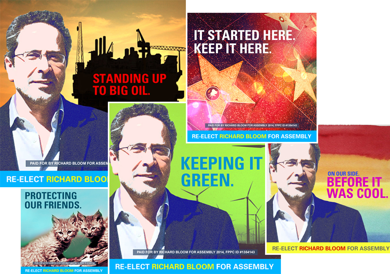
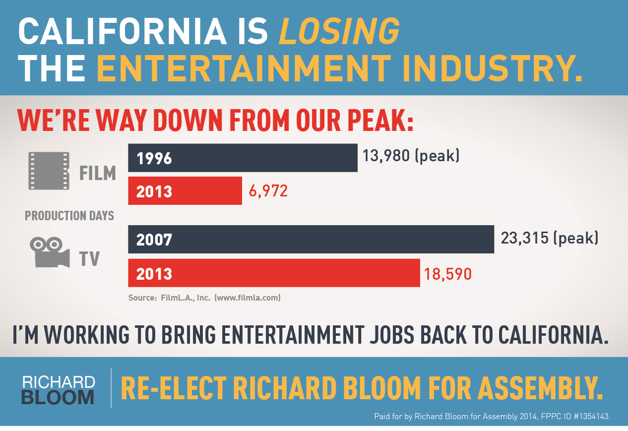
REELECTION CAMPAIGN
Client: Richard Bloom – California Assemblymember (AD50)
Challenge
In a race for reelection to California’s State Assembly seat for District 50:
- Keep a popular incumbent’s activist/maverick brand “real”—even as he works within the Sacramento establishment.
- Promote incumbent’s cause-driven messages without doing any damage.
- Run up the victory margin to give the Assemblymember an unequivocal second-term mandate.
Strategy
- Drive engagement & action among high-propensity voter segments.
- Bring issues to life visually in a creative District.
Solution
Dynamic, efficient reelection campaign waged largely via social media, entailing:
- Ongoing series of highly-targeted communications about the hot-button issues high-propensity voter segments care about.
- Mix of colorful, viral memes; photo/text posts; & polls.
- Laser-targeted social-media advertising (targeted by demographics, interests, location)
Deliverables & Services
- Brand & messaging strategy
- Visual identity system
- All social media
- Advertising (social media)
Results
- Blow-out victory, by 40+-point margin: 71.5% to 28.5%
- 200%+ increase in social media followers.


-
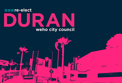
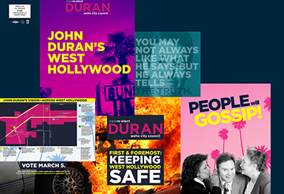
REELECTION CAMPAIGN
Client: John Duran – West Hollywood City Councilmember
Challenge
In a race for West Hollywood City Council, win reelection for a colorful incumbent under attack by a hostile insurgent.
Strategy
- Remind voters why they like the incumbent.
- Connect him to the City’s brand.
- Put the opponent on the defensive with hard-hitting counterpunches.
Solution
Comprehensive mail campaign that reflected the candidate’s unique brand:
- Bold, striking design drawing powerful connection between the candidate & the City’s creative roots.
- 90% showcased candidate’s achievements & inspirational vision for the City’s future.
- 10% tore the opponent’s sails down with gloves-off counterattacks.
Deliverables & Services
- Brand/messaging strategy
- Visual identity system
- Mail program (8 pieces)
Results
- Victory—by a surprisingly comfortable margin.
-
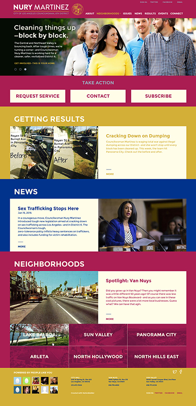
BRAND STRATEGY & WEBSITE
Client: Nury Martinez – L.A. City Councilwoman (CD6)
Challenge
Help a City Councilwoman use digital channels to better serve her under-engaged, under-served, multilingual constituency—in one of the toughest parts of L.A.
Strategy
- Map messaging to resident’s basic needs & concerns: City services, economic revitalization, pollution, safety.
- Center the brand on competent delivery of City services—not “fancy ideas.”
- Leverage the Councilwoman’s style—plainspoken, down-to-earth, to-the-point.
Solution
A new, bilingual Website that combines:
- Brand positioning centered on three primary themes: watchdog, workhorse, optimist.
- Simple architecture focused on delivery of services—not policy talk.
- High-impact before/after galleries to break language barriers & illustrate successes visually.
- Easy-to-use tools for requesting services & getting heard.
Deliverables & Services
- Brand/messaging strategy
- Website
-
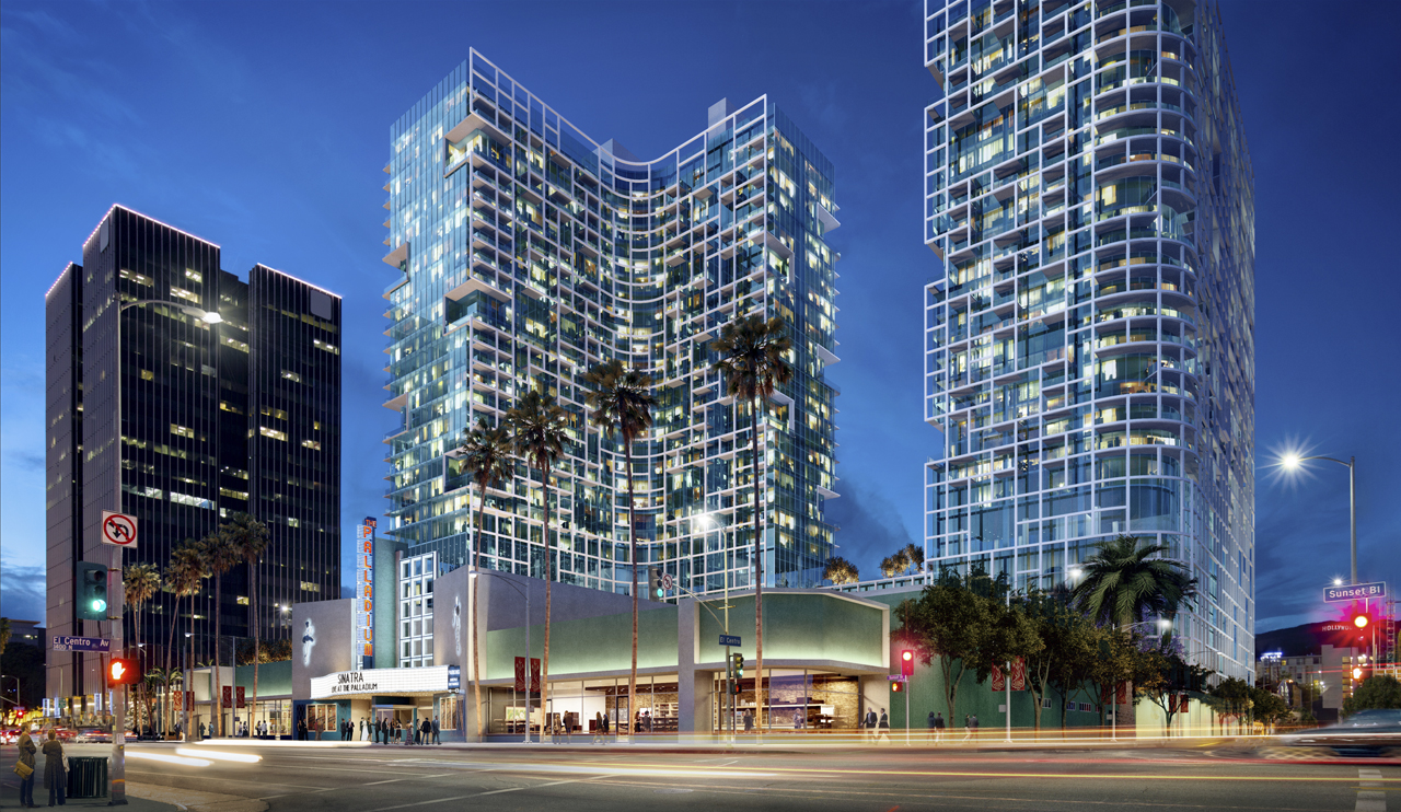
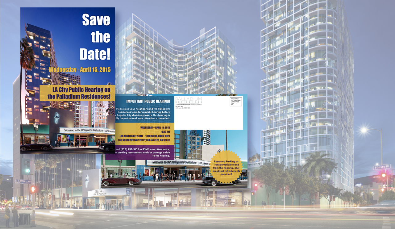
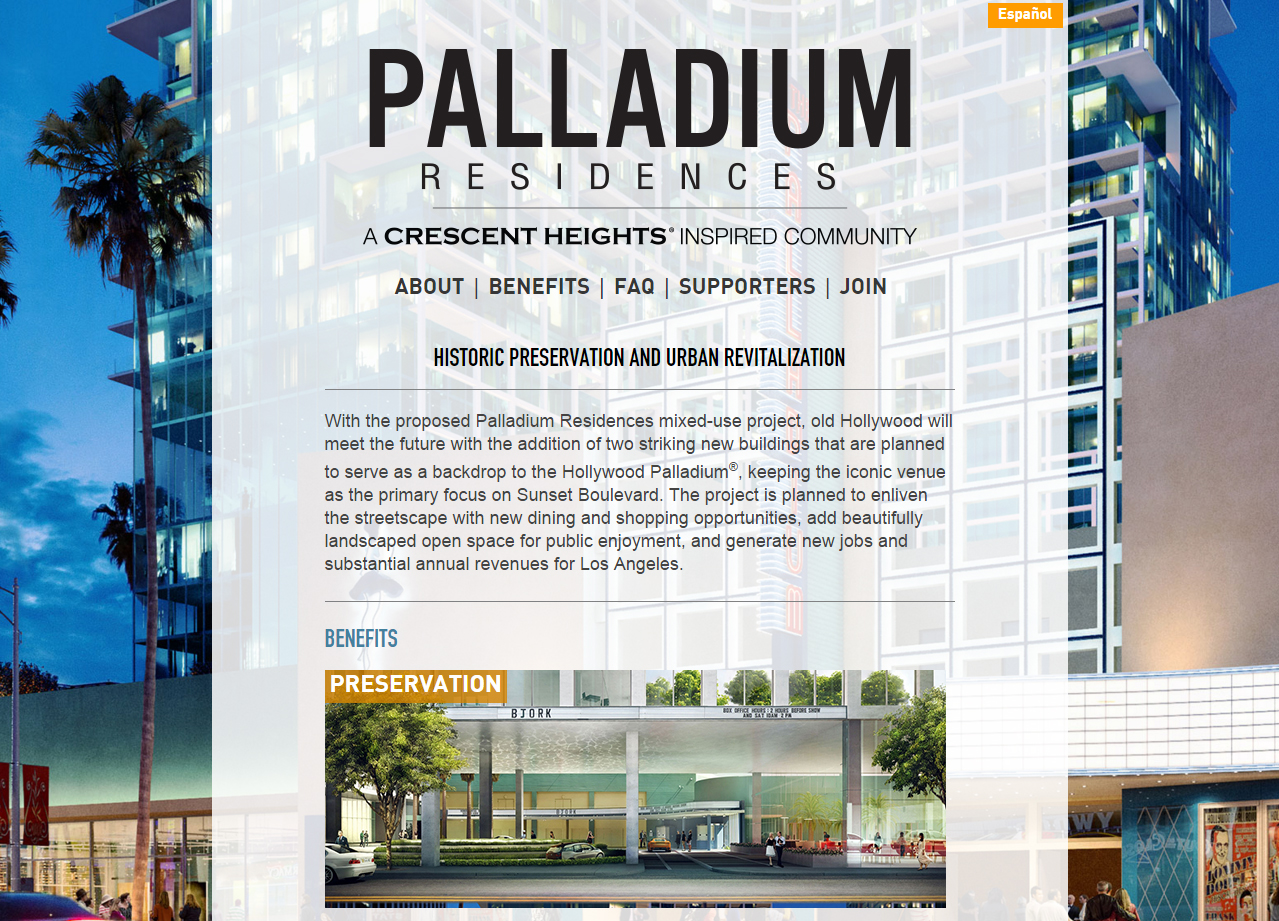
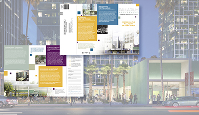
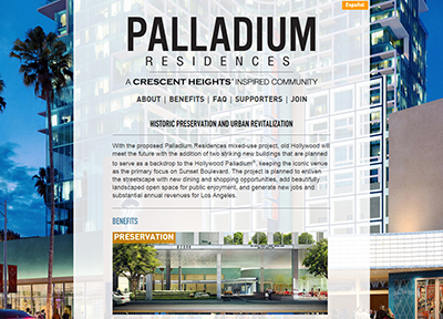
PALLADIUM RESIDENCES: BRAND CREATION & OUTREACH
Client: Crescent Heights LLC
Challenge
Overcome strong opposition to win the support of residents for the preservation and large-scale commercial development of an iconic Hollywood landmark.
Strategy
- Demonstrate the project’s benefits to residents.
- Engage residents in the dialogue & the process.
- Wrap the project into the preservationist narrative.
- Make the wider case for urban neighborhood revitalization to skeptical residents anxious about change.
Solution
An integrated, bilingual (English/Spanish), multichannel campaign including:
- Vibrant identity system designed around client logo.
- Print pieces showcasing the project’s architectural, aesthetic, economic, & community advantages.
- Historical backstory—so preservationists understand what’s at stake.
- Eye-catching mail with bold, simple calls to action.
- Inviting, easy-to-use Website that draws community members into the conversation.
Deliverables & Services
- Visual identity system
- Mail program
- Website

-
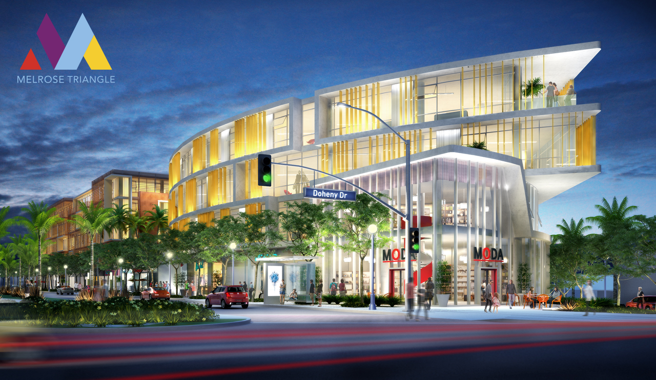
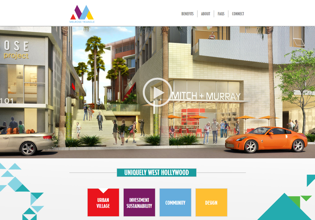
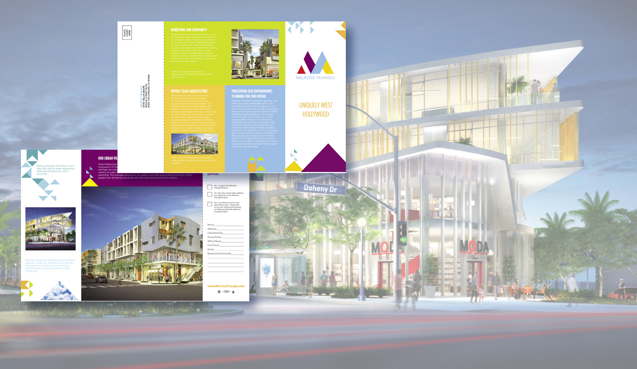
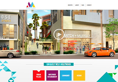
MELROSE TRIANGLE: BRAND CREATION & OUTREACH
Client: The Charles Company
Challenge
Win the support of an engaged, skeptical community for the commercial redevelopment and revitalization of West Hollywood’s languishing “West Gate”.
Strategy
- Understand the audience—a super-engaged, knowledgeable constituency that approaches all development projects with skepticism.
- Map messaging to resident hot buttons: aesthetics & community-serving features.
- Engage the audience—pull them into the process.
- Earn neighborhood trust.
Solution
An integrated, multichannel campaign including:
- Colorful brand elements to frame the action.
- Gorgeous mail showcasing full-color renderings that brought the project to life.
- Pleasant, easy-to-use Website that drew users into the future experience.
- Clear benefits communication across all touchpoints.
- Aggressive community outreach & strong calls-to-action on all communications—to invite everyone into the process.
Deliverables & Services
- Visual identity system
- Mail program
- Website
Results
- Approval from City Council—with minimal community opposition.


-
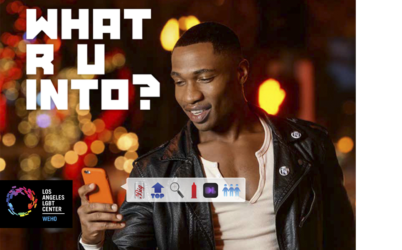
WEST HOLLYWOOD LOCATION: LAUNCH CAMPAIGN
Client: LA LGBT Center
Challenge
Open a sex-health clinic and attract a diverse clientele weary of safe-sex messages.
Strategy
- Move from medical tonality to lifestyle/entertainment tonality.
- Move from traditional, fear-based teaching to two-way dialogue.
- Micro-target to each audience segment with distinct messaging.
- Remember: sex sells.
Solution
A sexy, high-impact campaign of attraction, including:
- Nightclub-style advertising & promotion.
- Provocative communications that open discussion, without judgment.
- Sexy, charismatic brand advocates prowling the town.
- Perk program designed to drive economically-challenged men to the clinic for testing.
- High-profile launch event & press opportunities.
Deliverables & Services
- Brand/messaging strategy
- Targeted media strategy (print, outdoor, social media)
- Street team program
- Loyalty program, including brand development
- Launch event
Results
- We don’t have official metrics yet—but since launch, the clinic has been so packed you need to make an appointment days in advance, & walk-ins are advised of long waits!

-
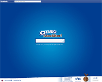
OREO - OREO Associator 2013 Campaign
Client: Mondelez
Challenge
Continue building emotional bond between consumers and the brand. Remind consumers about the Oreo ritual.
Come up with an activity which inspires internet users to: Slow down and play.
Strategy
Create playful and engaging Facebook application which:
- Educates users and makes them think about the Oreo brand
- Creates an opportunity for the families to spend time together
- Offers a chance for users to compete within families or with their Facebook friends
Solution
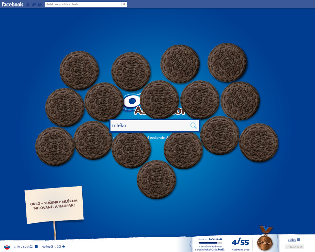
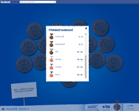
OREO ASSOCIATOR
Media: Digital (Facebook app)
We prepared an application which made people think about the world of Oreo and the Orea ritual.
Users were asked to guess Oreo-related words and type them into the application. Points were awarded for correct words and the users‘ Oreo statuses were improved.
Cool on-screen animations were triggered by typing words into the app. More than fifty different animations were created for:- Correct words
- Chosen explicit words
- All other words
The Winning Mechanic was to guess all of the Oreo words. 124 users who guessed all the correct Oreo words were rewarded with great prizes – Oreo biscuits.
Media Support
- Facebook advertising
- External banner campaign
Results
Web Stats
- 124,677 visits
- 86,164 unique visitors
- 03:04 average visit duration
- 789,714 word searches
- 13,460 number of times that the word „milk“ was found
Visit site

-
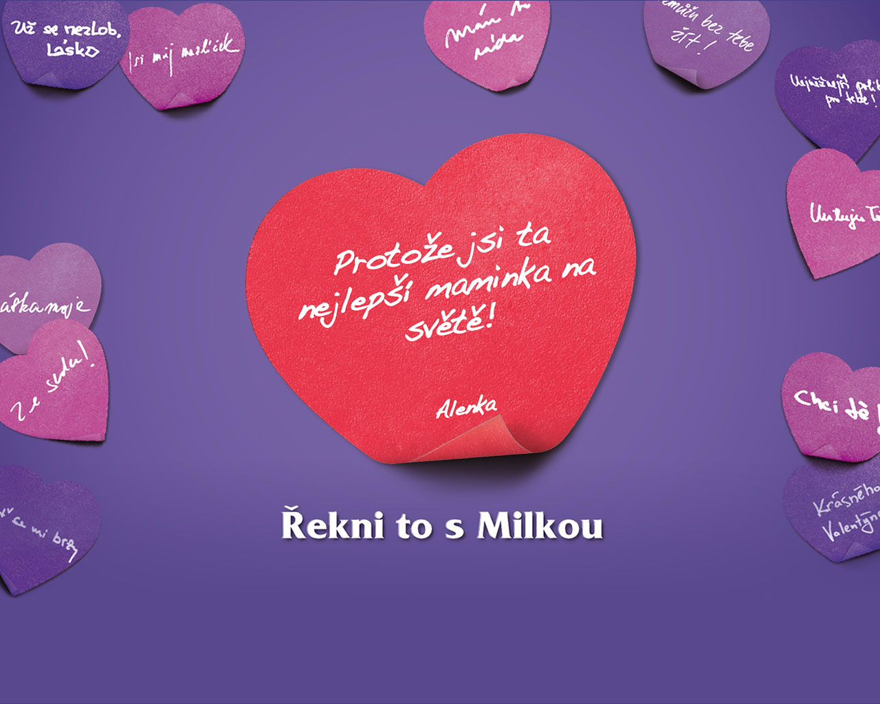
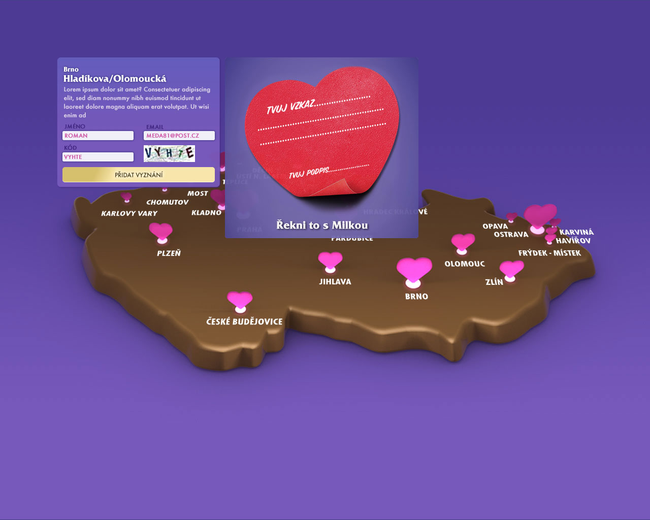
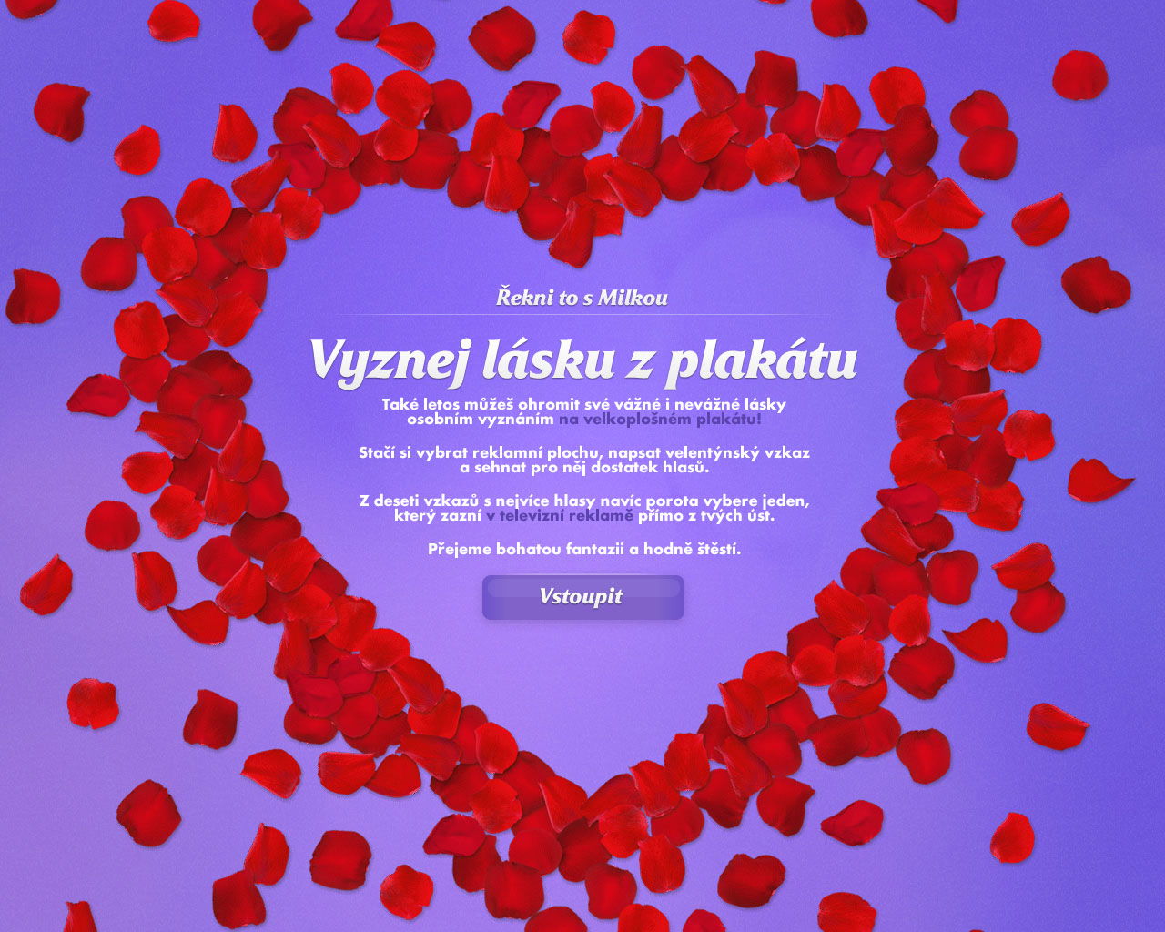
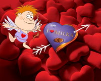
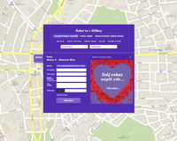
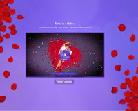
Milka - Valentine's Day 2010 Campaign
Client: KRAFT FOODS
Challenge
Increase sales & brand awareness in the 3-week period around Valentine's Day—especially among the 15-30-year-old segment.
Strategy
Emotionally connect users to the brand with a personalized, high-impact experience.
Solution
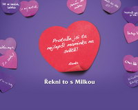
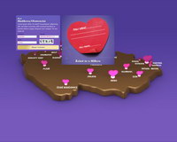
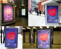
Milka Love Notes
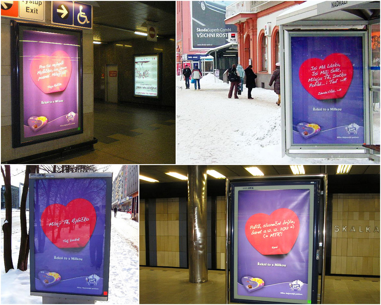
Media: Outdoor + Digital (eCard)
- We selected 148 citylights in Czech Republic, 114 in Slovakia.
- On the microsite, each user selected a citylight (on a chocolate map) & wrote their love note.
- Each user spread their confession via social media. Other users voted for the best confessions.
- Winning love notes were posted on citylights the night before Valentine's Day.
- Those who didn't get their note on a citylight could send their affections via a sophisticated "singing Cupid" eCard.
Media Support
- Display advertising
- Viral spread
Results
Web Stats
- 15,050,994 page views
- 4,212,778 visits
- 2,061,260 unique visitors
- 26,172 love messages
- 1,262,042 votes
- 123,336 eCards sent
Market Share Increase
- Czech Republic: 7%
- Slovakia: 11%
Visit site
-
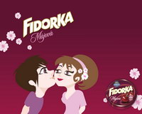
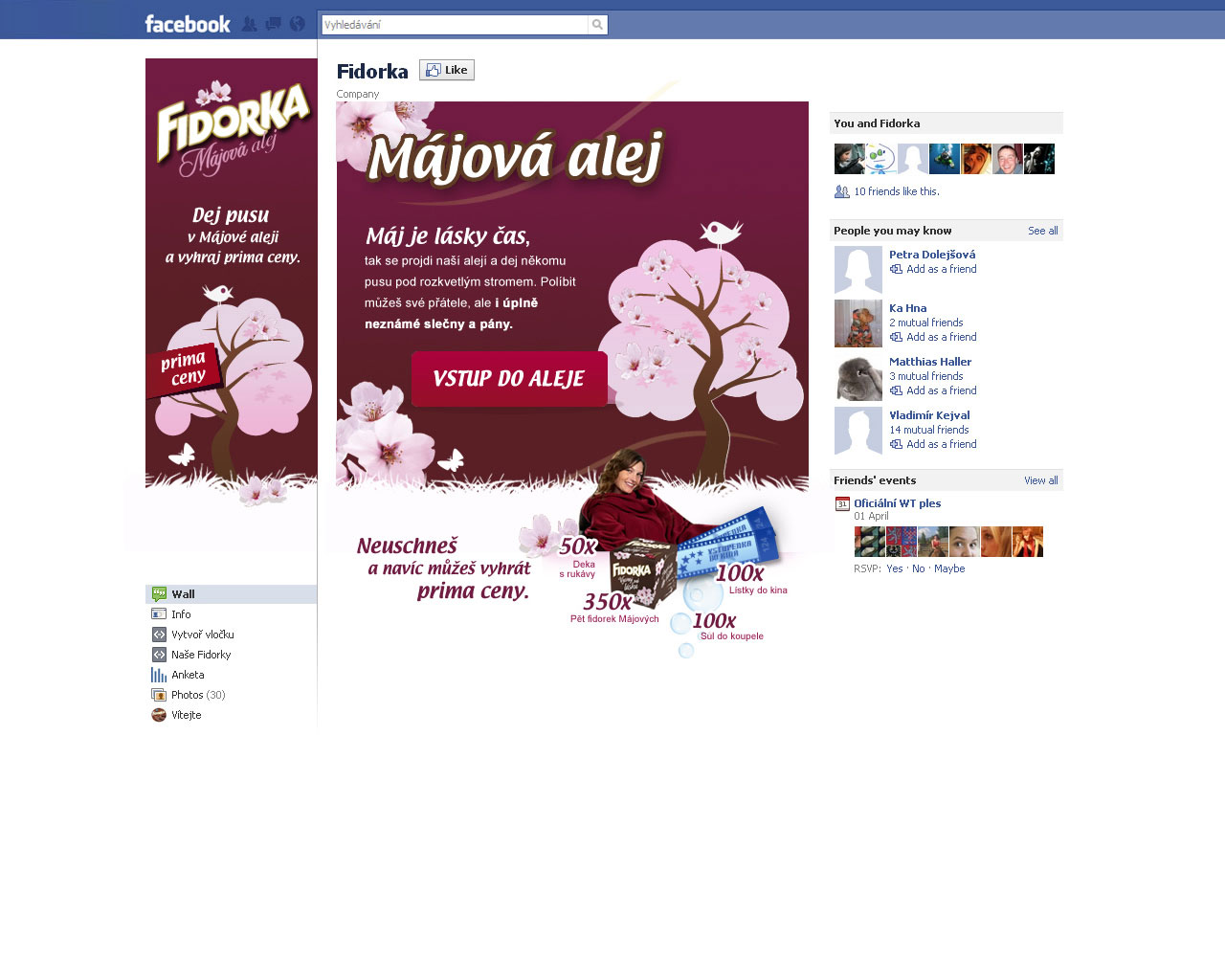
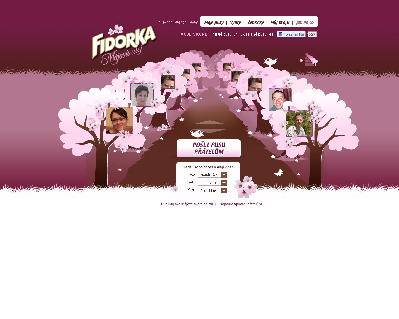
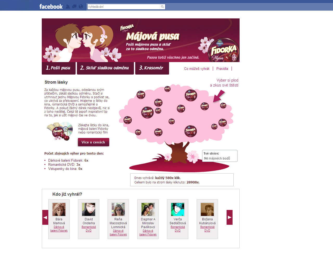
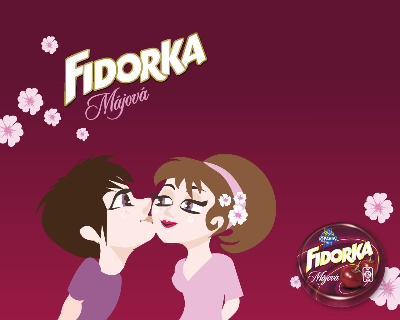
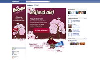
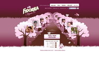
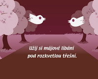
Fidorka - Spring Love 2011 Campaign
Client: KRAFT FOODS
Challenge
- Support sales goals for special, limited-edition product—& dramatically spike brand awareness—during May.
- Emotionally engage users with the brand—particularly 25-34-year-old women.
- Entertain existing Facebook fans & continue to grow fanbase.
Strategy
Revive the previous year's send-a-kiss mechanic—but with a richer user experience and heightened peer-to-peer interaction.
Solution
Fidorka Kissing Promenade
Media: Digital (Facebook App)
- Each user created a quick profile with basic info & photo.
- Profiles appeared in a gallery shaped like a garden promenade.
- Users could stroll the promenade & send kisses to friends & strangers alike.
- Recipients could accept or reject kisses.
- Prizes were awarded each day for the 100th, 300th, or 500th kiss (depending on traffic).
Results
Web Stats
- 500,551 kisses sent!
- 716,104 page views
- 78,692 visits
- 28,118 app users
- Almost 5,000 new fans on brand's Facebook page
- 64% repeat users—meaning they liked it!
Visit site
-
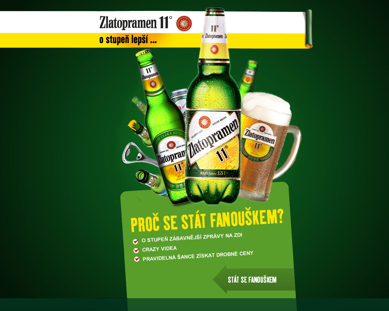
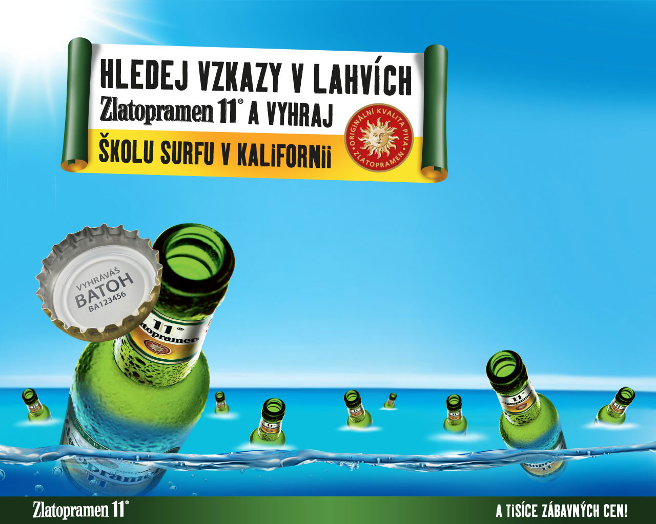
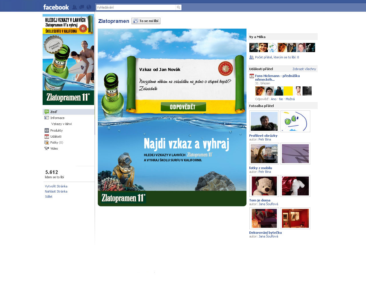
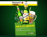
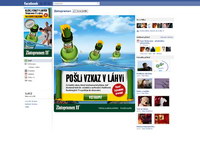
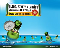
Zlatopramen 11 - "Message in a Bottle" Campaign
Client: HEINEKEN
Challenge
- Support ATL campaign & spread the word about a summertime contest.
- Make local-beer brand more appealing & "cooler" to younger demographic.
Strategy
- Create a festive Facebook environment to "de-age" the brand.
- Give Facebook fans cool new ways to message each other.
- Engage & build the fanbase by creating greater identification with the brand.
Solution
Zlatopramen Message in a Bottle
Media: Digital (Facebook App)
- Special message tool enabled users to send funny, branded, pre-written messages Re: summer, beer, & fun.
- Messaging theme: "I'm a Zlatopramen fan & I'm not afraid to admit it!"
- Each user who sent 11 messages unlocked product codes for prizes.
- Grand Prize: 11 days in California & surfing school
Media Support
- Display advertising
- Viral spread
Results
Web Stats
- 171,983 total clicks (on display ads)
- 18,158 messages sent
- 4,097 app users
- 2,494 product codes collected
- 2,423 new fans on brand's Facebook page (from 0)

-
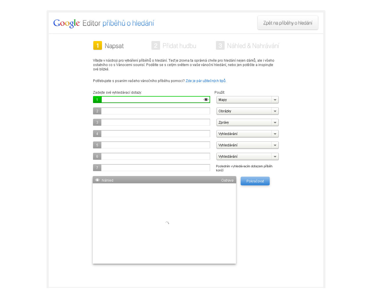
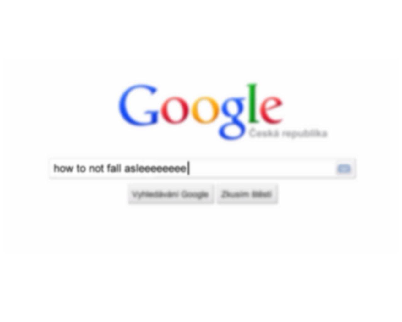
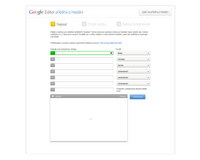
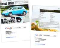
Google Search - "Search On" Localization Campaign
Client: GOOGLE
Challenge
- Drive awareness & market share for Google Search.
- Make an international brand relevant to a local (Czech) market.
Strategy
Inspire
- Make an emotional connection.
- Make it about more than technology.
Educate
- Teach about benefits & everyday usefulness.
Change
- Erode the ingrained "comfort zone" with local search tools.
- Spur ordinary people to try something new.
- Create new user habits.
Solution
"Search On" Localization Campaign
Media: Video (TV & Online)
Creation
- Localized international video ads to fit regional sensibilities.
- Conceptualized & produced new video ad for local market.
Deployment
- Harnessed social media for fast, efficient deployment.
- Also deployed in cinemas & on TV.
- Created custom YouTube channel—including engine for creating your own "Search On" video stories.
Media Support
- Video ads
- Classic display ads
- Facebook app
- Viral spread
Results
Market Share Increase
- Increased from 35% to 50%.
-
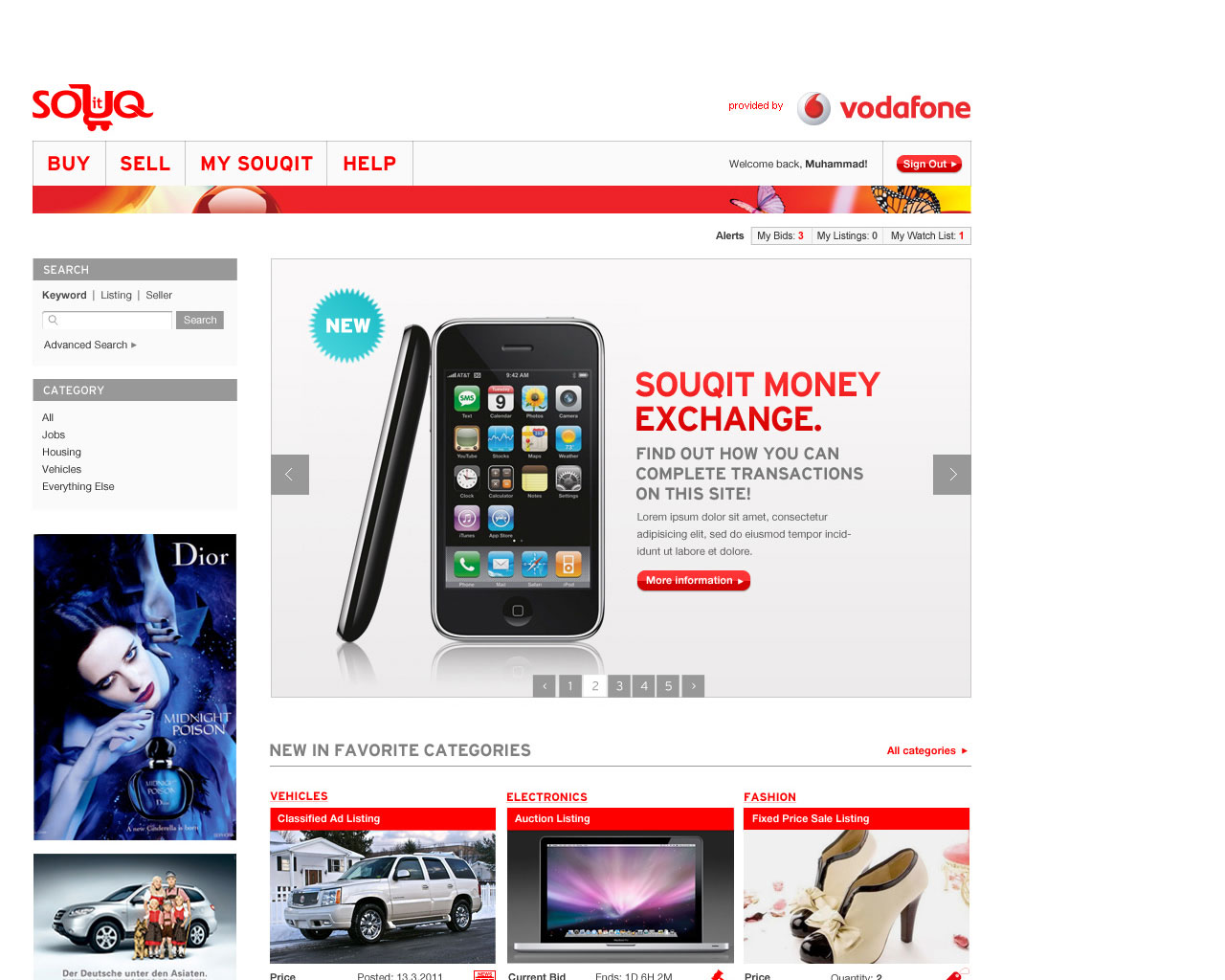
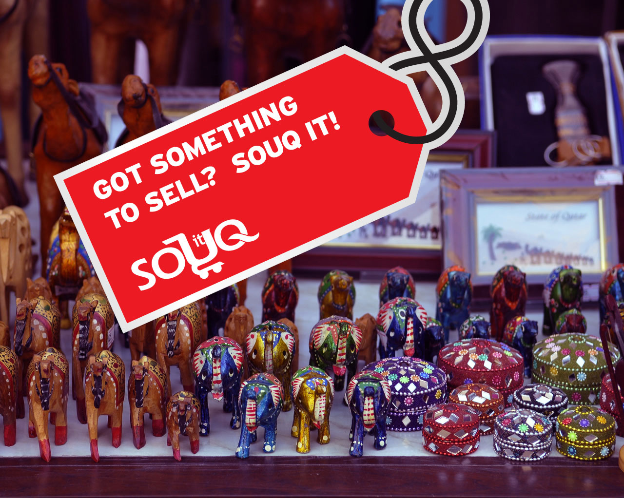
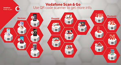
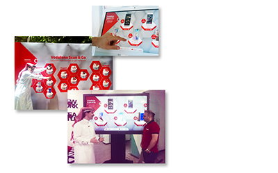
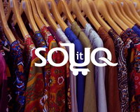
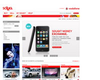
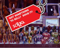
Vodafone Qatar - Souqit.com
Client: VODAFONE
Challenge
Create goodwill toward a foreign brand (Vodafone) by:
- Bringing innovation to the local market.
- Trying new & daring experiments.
- Enriching the lives of ordinary people. ("Make a world of difference for all people in Qatar.")
Strategy
Apply a popular community-engagement model that's worked spectacularly in other markets: an auction site.
But customize the experience for this market:
- Keep it simple. This audience was not familiar with auctions, so we needed to introduce it on a basic level.
- Cater to a multilingual audience. It wasn't enough to have dual Arabic & English versions—we had to enable an Arabic-only user to sell to an English-only user.
- Produce great User Experience. A differentiator for this market & a way to make an emotional connection.
- Learn from the mistakes of competitors. The other regional online marketplaces all had major flaws—which we made sure to avoid.
- Connect people. Design the solution for long-term growth into a community—not just a marketplace.
Solution
Souqit.com—the place to buy & sell in Qatar.
Branding & UX Design
- The solution is a highly-customized implementation of a popular auction platform.
- A unique dual-language, mirror-image Homepage ensures all first-time visitors feel welcome.
- Standard auction processes (listing, bidding, etc.) are simplified compared with Western versions—so as not to scare off first-timers.
- Cool APIs
- Google Map API allows users to plot locations visually in a nation that lacks physical street addresses.
- Google Translate API enables easy communication/commerce between users of different languages.
- Facebook Connect reduces barriers to entry & allows users to easily tell friends about their transactions.
Visit site
-
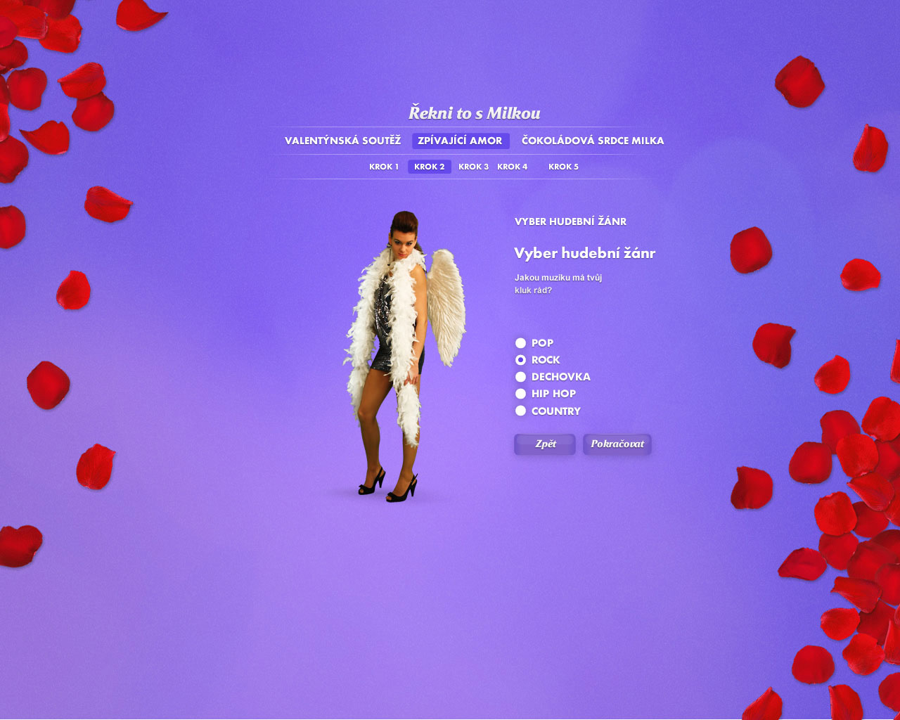
Milka - Valentine's Day 2011 Campaign
Client: KRAFT FOODS
Challenge
Increase sales & brand awareness around Valentine's Day—especially among the 15-30-year-old segment.
Strategy
Build on the previous year's campaign successes by recycling the good stuff—& adding a whole new chapter.
Solution
Milka Love Notes & Singing Cupid
Media: Outdoor + Digital (Video eCard)
- As in the 2010 campaign, users with the most votes had their love confessions posted on the citylight of their choice. (148 citylights in Czech Republic, 114 in Slovakia)
- Part 2 had an elaborate eCard—a music video the each user personalized. Users selected:
- Cupid's gender
- Music style (rock, pop, hiphop, country, folk)
- Recipient's name, eye color, hair color
- Personalized message
- Users sent the eCards and/or shared them on Facebook.
Media Support
- Display advertising
- Direct mail
- Viral spread
Results
Web Stats
- 6,533,712 page views
- 1,949,519 visits
- 762,024 unique visitors
- 110,362 Cupid eCards sent
- 184,950 visits to product page
- 32% open rate on direct mail
- 40,887 eMail addresses harvested
Visit site
-
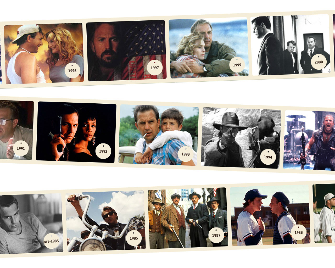
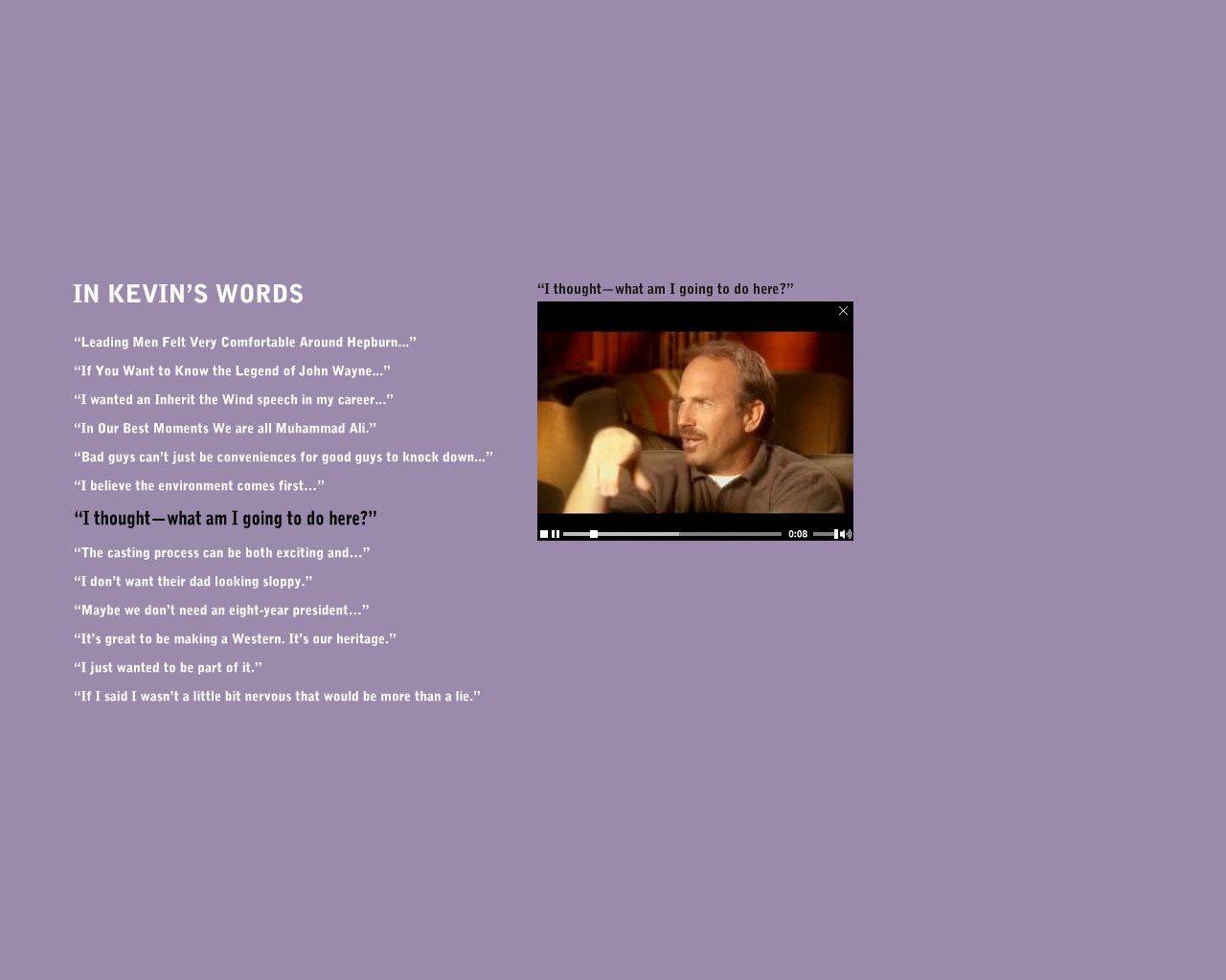
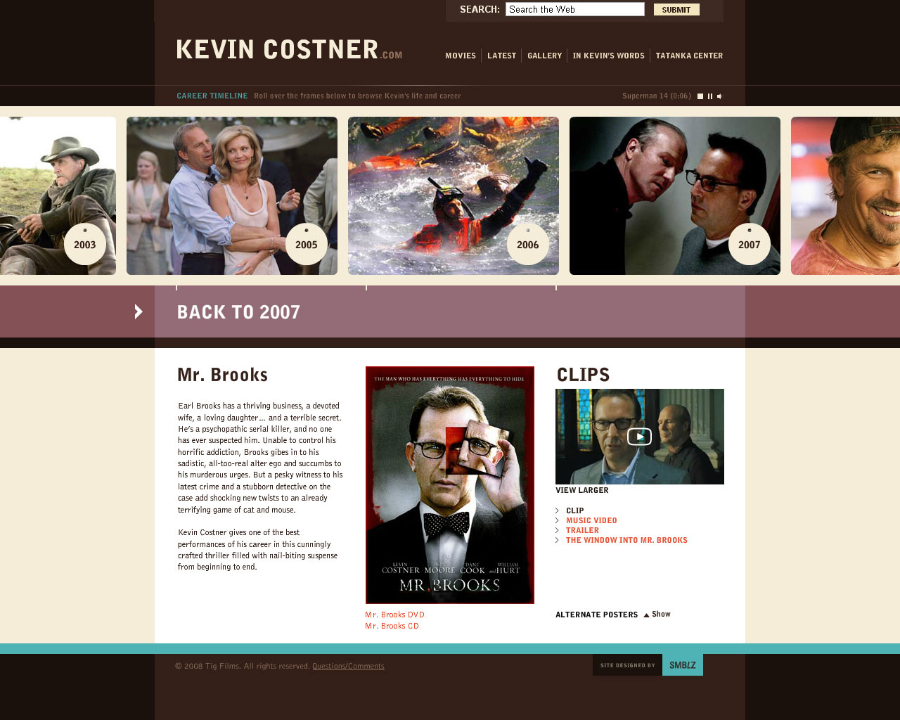
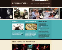
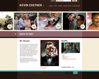
Kevin Costner - KevinCostner.com
Client: TIG PRODUCTIONS
Challenge
Revive interest in a Hollywood legend's past and present work—by speaking to two disparate audiences:
- Older fans who grew up with his movies.
- Younger audiences who aren't acquainted with his work.
Strategy
Create an online experience with wide appeal.
This involved:
- Creating a sleek, modern interface that would appeal to younger, 'Net savvy users.
- Keeping it simple—and loading it with plenty of nostalgia content—for the long-time fans.
Solution
KevinCostner.com
Branding & Website
- The solution is a gorgeous multimedia museum of Kevin Costner's entire career—rich with imagery, sound, & video.
- Large, visual navigation grabs the user's attention.
- Film content can be easily accessed by year or title.
- Modular structure allows easy addition of future years/films.
- Minimalist photo gallery allows easy browsing of huge collection.
A conscious decision was made to avoid community features, like forums or commenting—and instead allow the fansites to manage that aspect of the experience.
Visit site

-
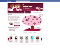
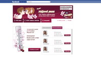
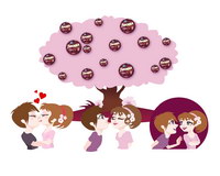
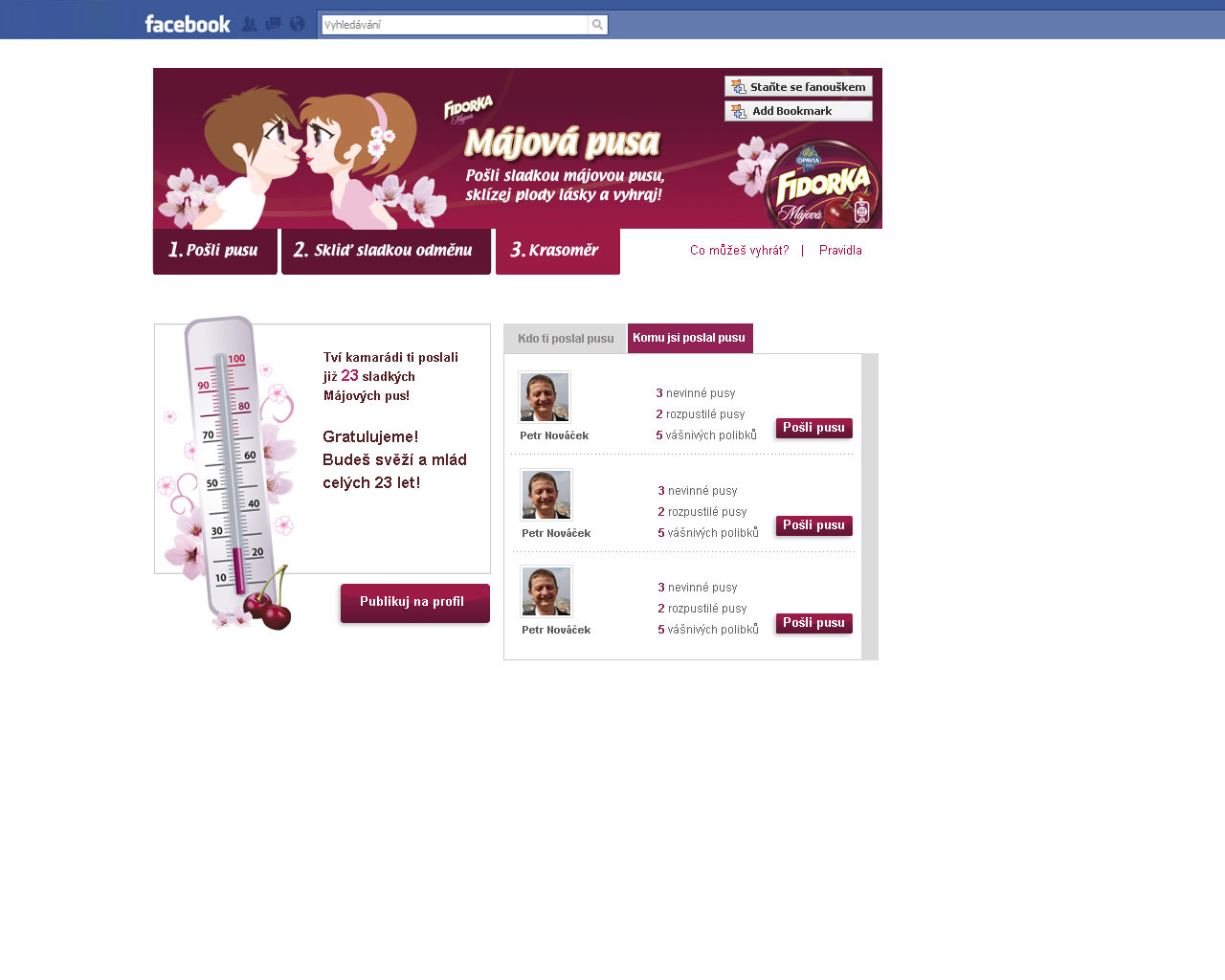
Fidorka - Spring Love 2010 Campaign
Client: KRAFT FOODS
Challenge
- Support sales goals for special, limited-edition product—& dramatically spike brand awareness—during May.
- Emotionally engage users with the brand—particularly 25-34-year-old women.
- Launch the brand's Facebook page and build fanbase.
Strategy
Harness the fast power of Facebook to ignite a digital wildfire—with a single, simple app.
Solution
Fidorka Kissathon & Tree of Love
Media: Digital (Facebook App)
Three components:
Send a Kiss
- Users sent kisses to friends—passionate, friendly, or goofy.
- Kisses appeared on Walls.
- For each kiss sent, the sender collected a point for the Tree of Love.
Tree of Love
- Users could harvest "sweet rewards" (prizes) from the tree—by clicking hanging chocolates.
- Each Send-a-Kiss point allowed one try.
Beauty-O-Meter
- Widget that forecasted how young & beautiful you'll stay, based on number of kisses received (based on local folktale).
Results
Web Stats
- 1,250,446 kisses sent!
- 30,840 new fans on brand's Facebook page (in 4 weeks)
- 253,329 app users
- 26,793 eMail addresses harvested
- 33rd-most-successful app around the world in "Just for Fun" category
Visit site